This post was written by Tiago Luchini. Tiago is the Technology Partner at Work & Co, where he leads the software and development process from technical discovery through product launch. He has led engagements with Google, Apple, the NBA and Virgin America.
Complexity and friction often make interactions with technology frustrating. Unfortunately, complexity is everywhere. Choices are everywhere, too, from development platforms and API design to selecting features to either build now or add to the roadmap. Instead of getting paralyzed when building a new product, we view these decisions as choosing the best tools for each job, and simpler is often better.
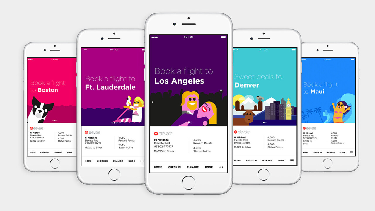
For Virgin America, this thinking began two years ago when Work & Co helped launch the very first responsive airline website, and most recently for the launch of their new mobile app, for which I, as Work & Co’s Technology Partner, lead the development.
For most folks, air travel has become a “must-do” rather than an “enjoy-to-do.” From booking tickets to checking in and dealing with day-of realities like flight updates and security lines, air travel can be exhausting. For Virgin America, the focus is on making flying fun again, and tech-forward interactions are key to reimagining the entire flight experience. As such, their new mobile app had to become a traveler’s companion: contextually aware and fully personalized, it would help guests seamlessly arrive at their destination.
To create an app that travelers would actually enjoy using, we’ve set seven principles for design and development that led us to the decision to build native apps for iOS and Android. Read on to find out how we’ve built a simple, intuitive app to make flying fun again.
1. Lead with simplicity
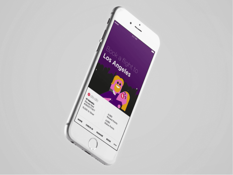
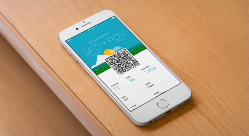
Though the app is powered by complex legacy systems and elaborate logic, the user shouldn’t feel any of that. Every choice we made was geared towards simplifying the travel experience, whether booking, managing, or boarding. Booking a flight takes less than 60 seconds, and so does finding critical flight information while running around an airport. In order to achieve this, we needed to gather all sorts of data, develop business intelligence, sort through many complexities – but design it to return only the essentials to the user.
2. Make it fast
Speed can make or break a user experience. For Virgin America, this means having your most important information available at your fingertips without having to load anything. Whether booking months ahead of time or finding your gate immediately upon arriving at the airport, the app must quickly deliver the information you need, exactly when you need it. To make the app fast, reliable, and efficient, we paired native code with the processing power, memory, storage, and sensors of the user’s hardware.
3. Survive dead zones
If a traveler is in transit with no service with which to look up critical flight information, it’s unacceptable to leave them hanging. To make information persistently available regardless of an active network connection, a native app is a must.
4. Collect contextual clues
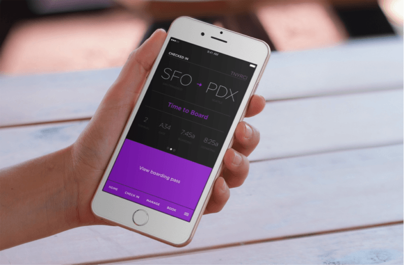
By knowing where you are in your journey, apps can intelligently understand what’s most important for you. Location-awareness plays a big part in that. Increasingly, web apps are able to grab locations through the browser, but constantly asking for a user’s permission online can be a non-starter since speed is of the essence. Alternatively, native apps can access the device’s GPS more seamlessly, and save users’ preferences. Virgin America’s app shifts mode prior to check-in so that the most critical features for your day-of-travel are immediately available.
5. Give quick updates
Push notifications are a powerful way to keep users updated of important, personalized information on the fly. Virgin America’s app needs to be able to show robust notifications regarding flight information whether the user has the app open or not. While web browser notifications are increasing in popularity, they’re still no substitute for native notifications. Native push notifications are not only broadly available on all platforms, but also allow users to interact with the content in ways that are still not possible with web-powered notifications.
6. Have fun with it
With Virgin America’s fun and playful aesthetic, integrating unique animations, videos, and transitions were essential for making the user experience more delightful. But it’s also critical that these interactions do not get in the way of, or slow down, users’ tasks. Running animations and video over the web on a mobile device is still a clunky experience. Few have figured out a smooth way to autoplay video, for instance, but with a native app it can be seamlessly integrated.
7. Simplify your backend
While redesigning the Virgin America website two years ago, our team built new infrastructure, designed APIs to grab data from disparate legacy systems, and developed a shared layer of business logic and transitions. This shared layer went on to become the “backbone” that powers both mobile experiences, and serves up a unified blend of three critical data sources:
- Virgin America’s API that accesses historic and future flight information including upgrades, prices, and seats;
- The current state of the app, such as who’s logged in, what time it is, and the location of the device;
- A CMS which holds content like icons, maps, copy, offers, deals, and much more.
The beauty of this shared layer is that data sources, infrastructures, and backend business logic can be collectively updated across all platforms at once, removing the need for each app OS to be maintained independently. Furthermore, development for both iOS and Android occurred simultaneously, which reduced costs, sped up deployment, and reduced maintenance.
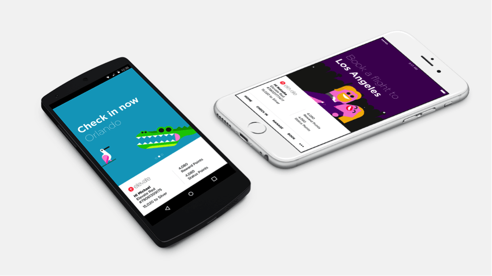
With so many ways to build a mobile app, it’s always helpful to choose your priorities at the onset of any project. For both Virgin America and Work & Co, we prioritized simplicity and contextual personalization, while also designing interactions that help travelers have fun when they’re on the move. From there, it was a matter of choosing the best technologies for the job with a constant focus on how to remove complexity – technically as well as for the user.
Work & Co is hosting a table at TNW Momentum’s After Hours session. Learn more about their approach to digital product development from Work & Co’s Founding Partner – sign up now.
Get the TNW newsletter
Get the most important tech news in your inbox each week.


