Back in October last year we caught up with June Cohen, Executive Producer of TED Media at TED, to get a sneak peek at what the fully redesigned TED.com website might look like. Now, it’s launch day and live to everyone.
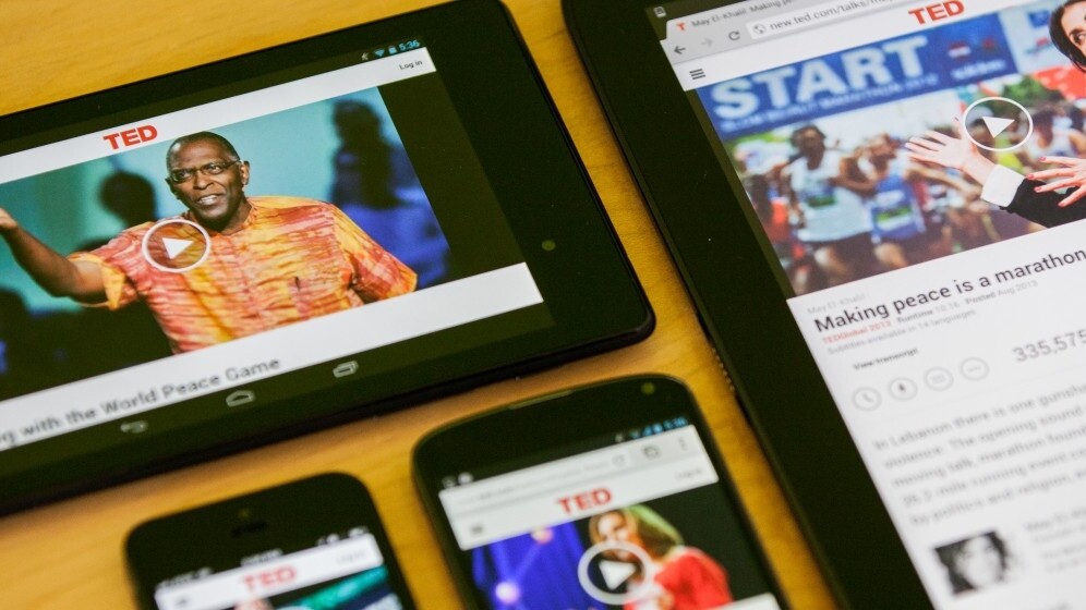
As well as revamping the general look and feel of the site as a whole, there are a few under-the-bonnet changes – like making it dynamically adjustable to any screen size for mobile and tablet visitors. That aside, here are a few things to check out.
Lookin’ Good
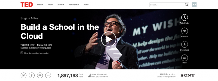
Yes, the general design and navigation of the site is easier now, but there’s also a new video player to provide you with uninterrupted, high-resolution TED and TED Talks content. As an added bonus, it introduces variable bit-rate streaming to ensure that users with a slower connection aren’t sat around all day waiting for the higher quality stream to load.

There’s also now a video thumbnail feature that allows you to scroll down the page to read information about the video you’re watching, but docks a floating mini version at the top of the screen so you can keep half an eye on it.
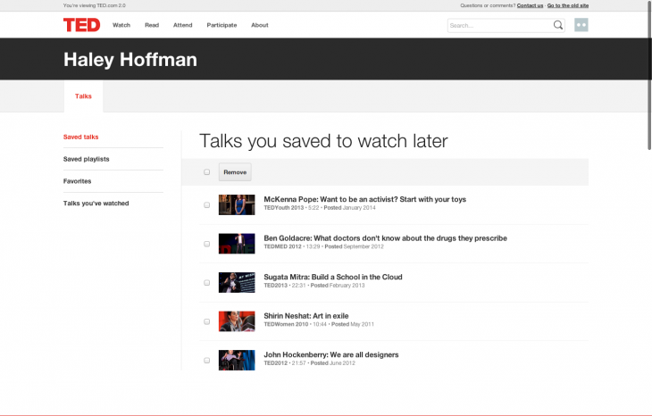
Also new to the video player is a ‘watch later’ feature. You can probably guess what that does.

That’s deep, man
When I was talking to Cohen last year, what struck me is that for many people a visit to the TED.com home page is only the start of the journey; it might spark an idea or thought that viewers want to know more about, or research in depth.
As such, the team has worked to provide context and materials around each of the talks. For example, users can now dig into recommended reading lists from the speakers (here’s Sir Tim Berners-Lee‘s on the open Web).
As with other parts of the new platform, this is still a work in progress and new materials are continually being added, but having the option is a good way to provide a scientific papers and other documentation for people that want to check out the sources.
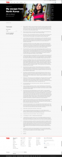
TED has also recognized its global audience with the platform refresh, and TED Talk videos now include a transcript in a wide range of languages. The transcript is interactive too, so if you want to jump ahead to a specific part of the talk, just clicking the sentence will jump to that point in the video. This is incredibly useful, and essentially allows the contents of any TED Talk to be fully searchable. Check it out for yourself here with this presentation (on the importance of preserving languages, no less) given in Arabic at TEDxBeirut.
Social TED
TED is also now a lot more social than it used to be, and while it allowed you to share links to videos before, now it will provide you with metrics and other stats to encourage users to share more content, more often. Each user gets personal sharing links for each talk for tracking how many video views they’ve driven and there’s a counter displayed next to the video to keep you up to date.
The organization said that it has done this to “celebrate the power of individuals” under its ‘Ideas worth spreading’ mantra. A little recognition can go a long way.
Today’s unveiling marks the new-look site opening its doors to all for the first time since the re-tooling process began, but it doesn’t mark an end point. Now, it’s over to the massive army of TED volunteers to keep the video transcriptions coming in hundreds of languages, and down to the speakers to keep adding related reading and source lists. If it can does this, it has a chance of completing its metamorphosis from thought-provoking video repository into a more complete research tool and cementing its relevance for the future.
Get the TNW newsletter
Get the most important tech news in your inbox each week.


