You may not be aware, but most well-known brands have strict rules about exactly how they want to be represented by people they work with. Technology companies are no different, and perusing brand guideline documents uncovers exactly how some of the best-known names in tech want to be treated when it comes to their logos and trademarks.
Here we take a look at some of the most interesting – and sometimes odd – brand protection rules out there in the tech world.
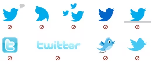
Bird love: Twitter loves its bird logo and doesn’t want you messing with it. While you’re allowed to use it to represent the company’s brand, there are some definite no-no’s:
Don’t:
- Use speech bubbles or words around the bird
- Rotate or change the direction of the bird.
- Animate the bird.
- Duplicate the bird.
- Change the color of the bird.
- Use any other marks or logos to represent our brand.
Tweet with a capital ‘T’: Meanwhile, did you know that Twitter owns a trademark on the word ‘Tweet’? In fact, the company insists that if you’re talking about tweeting on Twitter, it should with a capital ‘T’. “I was Tweeting about the birds that tweet outside my window each morning.”
Here on The Next Web, you may well have seen a mixture of capitalized and uncapitalized ‘tweets’, depending on the author of individual posts. My personal opinion? ‘Tweet’ may be a trademark but it just looks ugly when used with a capital letter in the middle of a sentence, and jars with everything I was taught about capitalization in English lessons at school.
 Don’t Facebook me: Sentences like “I Facebooked her” and “The class updated their Facebooks” don’t make much sense in reference to the social networking giant, and Facebook’s keen to make sure they’re not used:
“Do not use Facebook, or any other of our trademarks, as a verb. And don’t pluralise them either. Trademarks may not be modified in that manner.”
Screenshots: Meanwhile, you know those screenshots from Facebook you sometimes see, where users’ names have been blurred out for privacy reasons? Strictly speaking, Facebook says your should either get permission from that person and then show the screenshot unaltered, or not publish it at all.
“Screenshots must be unaltered, meaning they cannot be annotated or modified in any way from their appearance on Facebook.
Screenshots with personally identifiable information (including photos, names, etc of actual users) require written consent from the individual(s) before they can be published.
Screenshots of any Facebook profile will need written consent from its creator before use.”
Oh, and you’re supposed to fill in this form if you want to use a screenshot from Facebook in any kind of media. Given that tech blogs such as us publish screenshots from Facebook every day to report on the news, it’s clear that the company doesn’t enforce this all the time, but it’s interesting to see that the rules are there if they want to use them.
Apple
Don’t make Apple products look ugly: Apple has a lengthy document [PDF link] detailing how Authorised Resellers and other partners can use its brand and display its products.
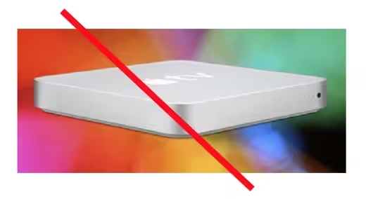
It’s all pretty sensible suff about positioning of logos, choice of font and the like, but one thing that caught our eye is how Apple products must never be displayed in marketing materials against a “busy, colorful, or cluttered” background. Apple even provides an example of a suitably gaudy-looking Apple TV.
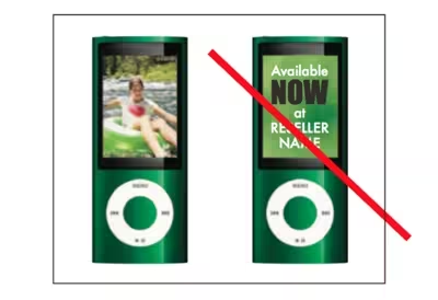
Oh, and modifying an image of an Apple product to suit your own needs as a reseller is equally forbidden:
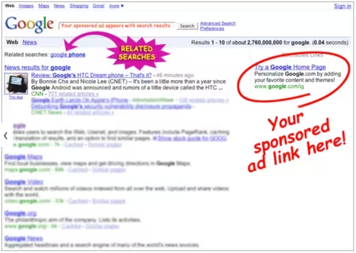
Altering Google screenshots: Like Facebook, Google isn’t keen on ‘altered’ screenshots of its site being published. However, it goes into a bit more depth about exactly the kinds of screenshots that are acceptable:
“When we say “unaltered”, we mean no superimposed graphics, photos, or ad copy on the screenshot and no changes to the way our product looks. We also don’t give permission for advertisers to use our Google search results page in connection with advertising products or services (for instance, showing a top ranking on Google).”
+1s or +1’s?: As we reported last year, if you’re wondering whether you should be “+1ing” or “+1’ing” on Google+, Google has a deliciously grammar-nerd-tastic document explaining all.
Amazon
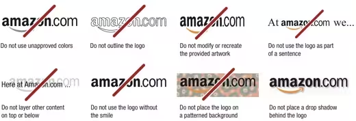
Don’t mess with our logo, man: As so many businesses sell products on Amazon.com (sorry, Amazon insists it should be ‘at‘, not ‘on’ Amazon.com), it’s put together a PDF document detailing exactly how to advertise your presence on the retail giant’s site. Like Twitter, it lists examples of forbidden uses of its logo.
Microsoft
The Microsoft guide to writing about Microsoft: Developed a Windows app? Don’t call it a Windows app – Microsoft won’t like you. As its trademark guidelines explain:
“Microsoft trademarks identify specific products and services. Do not refer to applications, services, or hardware devices that work with Microsoft products incorrectly. For example, do not refer to products or services that work with the Windows operating system as ‘Windows applications,’ ‘Windows services,’ or ‘Windows hardware.'”
Correct: SpreadsheetXYZ is a Windows-based application.
Incorrect: SpreadsheetXYZ is a Windows application.
Oh, and if you’ve created a presentation using Microsoft Office, don’t go around telling people that it’s ‘a PowerPoint’.
Correct: This presentation was created using PowerPoint presentation manager.
Incorrect: Widget Software Company included some PowerPoints in its presentation.
Foursquare
 Foursquare is foursquare, not Foursquare: It looks like Foursquare had fun creating its branding guidelines. Witness the BrandBook [PDF link], which explains exactly how the company likes to be referred to by its business partners and others working with it.
In amongst all the obvious stuff about not modifying its logo and making sure the right font is used in marketing materials (Gotham and Gotham Caps, if you’re interested), is a single paragraph that has cause the biggest rift in team relations at The Next Web that we’ve ever seen.
“Keep ‘foursquare’ in all lowercase letters. Foursquare should only be capitalized when at the beginning of a sentence, and never ever listed as ‘FourSquare’. Ever.”
I totally understand that ‘FourSquare’ looks silly, but ‘foursquare’, all lower case? Really?
Now, if you’re a business that has a partnership with Foursquare, then I totally understand why you’d want to be entirely on board with how the location startup wants to be presented – it would be foursquare all the way. But in news reporting? No way.
I agree with our West Coast Editor, Drew Olanoff, on just about everything – his insistence on writing ‘foursquare’ is the one thing I just can’t get on board with. Drew used to work in tech PR and knows the frustrations caused by journalists writing company names incorrectly. I understand – the first time I covered SoundCloud, their PR rep emailed me to politely ask me to cap the ‘C’ (I’d written ‘Soundcloud’) – that’s fine, but an entirely lower-case name in news reporting is insane.
If you’ve never heard of the company and see a sentence like “Three new cities have got their own foursquare badges,” it looks like ‘foursquare’ is just some generic thing, or something relating to the playground game of handball, not the name of a company – or it just looks like we forgot a basic rule of grammar that names of companies should start with capital letters. We don’t have a strict style guide at The Next Web, but if we ever do, there will be a special Foursquare clause in there.
Capital F, for F’s sake.
Image credit: Associated Fabrication
Get the TNW newsletter
Get the most important tech news in your inbox each week.
