All forms of design serve to communicate meaning in some way, but every genre has to be handled differently, case by case. And so, just like how packaging and product design live in different worlds than the Web, book cover design involves a unique challenge: summing up thousands of words in a single image.
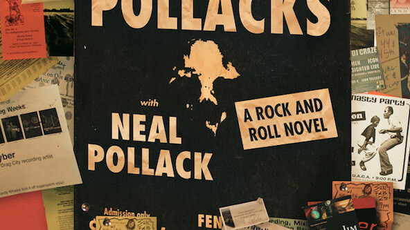
Even in the face of a declining industry, literature and books, especially their digital counterparts, will always serve a purpose. Because of this relevancy, Talking Covers, “a blog where authors, designers, and artists join to discuss a particular book cover,” has our attention.
Edited by author Sean Manning, Talking Covers is a surprisingly insightful collection of gorgeous cover designs paired with intimate thoughts on how they came to be.

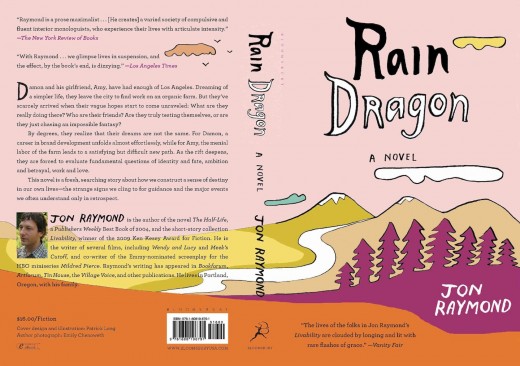
In this new book, Rain Dragon, I was lucky enough to work with yet another friend, the amazing artist and illustrator Patrick Long. For a long time, I’d known that I wanted a cover that echoed the product design of 1970s health food containers, specifically the original carton for Nancy’s Yogurt, an esteemed brand in this region (and also, incidentally, founded by Ken Kesey’s brother). The book involves organic farming and the branding thereof, and so this direction seemed both appropriate and pleasing (source).
Take a look via the link below and let us know your thoughts in the comments! Sometimes it’s best to look outside your medium (hint, Web designers, hint).
h/t @Quarterly
Get the TNW newsletter
Get the most important tech news in your inbox each week.


