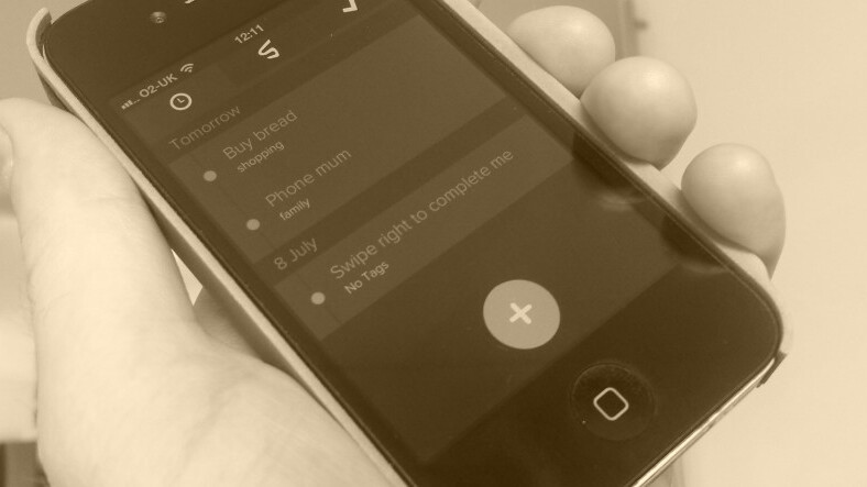
 Any.DO, Clear, Todoist, Wunderlist…the list of mobile to-do list apps extend far beyond the length of my arm. But Swipes brings another compelling proposition, and if you’re on the lookout for a new list-based ‘get things done’ tool, it’s worth your time.
Optimized for iPhone and iPod touch, Swipes is free to download and takes a cue from other well-known to-do list apps out there. But it brings more than enough of its own zing to the table..
How it works
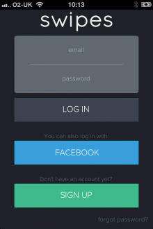
The sign-up process is pain-free, letting you create an account by email or with your Facebook credentials.

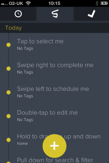
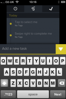
When you launch the app for the first time, you’ll see a list of items already populated in your stream, which are really just instructions to introduce you to the functionality of the app. ‘ Tap to select me’, ‘Swipe right to complete me’ and so on help guide you through the initial familiarization phase. It will take you seconds to master.
To create a new task, tap the giant ‘cross’ button in the bottom center and enter some keywords.
When you start interacting with the app properly, you’ll see it does have some of the same ‘actions’ as other similar tools, popularized by the likes of Clear. But while Swipes lacks the intricate design panache of Clear, it brings in a host of new features that really should be imperative to any to-do list app, such as tagging and scheduling.
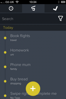
To add tags to a task, tap it once and then choose from the existing list or add a new one – this could be anything from ‘travel’ to ‘school’ and beyond.
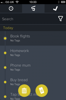

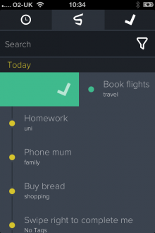
Swiping right adds a task to your ‘done’ list, while holding it for a second lets you reorder it up or down your list of priorities. And swiping left lets you schedule an item.
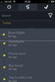
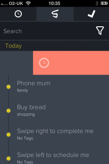
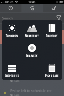
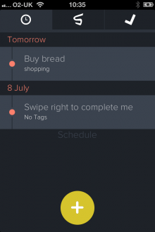
The scheduling feature lets you choose from a list of generic timeframes, such as ‘Tomorrow’ or ‘In a Week’, but you can select a specific time and date too.
It is a little confusing here though – for some reason you can’t schedule anything for ‘Today’, whenever I tried, it would automatically just move it to tomorrow. But in actual fact, all today’s tasks are contained within the main central tab and these can be scheduled separately by double-tapping the item.
Across the top of the app you’ll see a 3-itemed menu bar – scheduled items, today’s items and completed tasks, which gives you easy access to the main components of Swipes. It would be nice to have a separate ‘account’ option to let you tweak the settings, and even remove tags you’ve created. As things stand, I see no obvious way of editing and deleting tags.
The handiwork of Denmark-based Kasper Pihl Tornoee, Swipes has been beautifully crafted and is very easy to use. As noted already, however, it doesn’t quite have the same smoothness and attention to ‘design detail’ as Clear and it does tap similar functions, though that’s to be expected from any new to-do list app.
However, the fact that it has scheduling is a major plus-point and it has been slickly constructed. Oh, and it’s free do download too which might sway this for some people.
Finally, if you’re a stickler for cross-platform apps such as Any.DO, Tornoee says that he’s currently creating a “full suite of products”, which will kick off with the Web and Android next. And though he says Swipes will always be free to download, they will introduce additional ‘premium’ features such as collaboration and team-centric tools.
Meanwhile, check out the official Swipes promo video below.
Disclosure: This article contains an affiliate link. While we only ever write about products we think deserve to be on the pages of our site, The Next Web may earn a small commission if you click through and buy the product in question. For more information, please see our Terms of Service
Get the TNW newsletter
Get the most important tech news in your inbox each week.

