Only three or four years ago, mentioning the phrase ‘cloud storage’ would produce shrugs and vacant stares from most of the general public. Oh, but how times have changed. With Apple, Google and Microsoft all entering the fray with their own homegrown services, the marketplace for cloud storage has suddenly become very crowded.
SugarSync, however, has experience on its side. The company has been operating since 2008, only a year after one of its most reputable rivals, Dropbox, opened its doors and started making cloud storage a normal part of computing and daily Internet use.
Although it has never had quite the same amount of hype surrounding it, SugarSync thrives on one standout feature; the ability to synchronise any folder with the cloud. Almost every other competitor requires users to store their data in a pre-determined folder, which is fine but a little tiring if you don’t want to permanently live out of it. Until now, SugarSync has used a file management client that allows consumers to select any number of folders for cloud storage. It takes a little while to get your head around it, but in practise it’s infinitely more powerful.
Now, SugarSync is launching version two of its desktop, web and android apps in beta. It’s a huge revamp, keeping all of the service’s functionality but slapping on a new interface design and structure. The company says it’s been built for general consumers, rather than businesses, to try and make the whole service feel more accessible and intuitive. Oh, and there’s more than a few new features thrown in for good measure too.

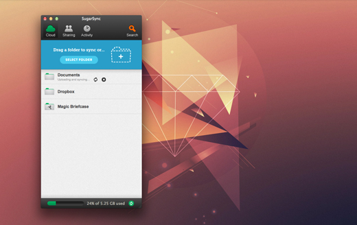
The new SugarSync looks a lot like an instant messaging client such as Skype or Adium. It takes up much less room than the pervious SugarSync Manager and is designed to be kept on the desktop as a reminder of where your data is being held.
“We felt that people weren’t really living in the cloud,” Laura Yecies, CEO of SugarSync said. “They had a little bit of data in the cloud, but they were still encountering some challenges that kept them from really living there with large parts of their data. So that was our design goal; easy to use, but also easy to get your primary data into the cloud.”
Any file that is linked to SugarSync can be seen in the Cloud tab. New users will start with a Mobile Photos folder, which will sync to your smartphone like Photo Stream on iOS, a My SugarSync folder for content held across all devices, as well as a web archive for content saved only to the cloud. Existing users, however, will have all of their original preferences and folders preserved when they update.
One of the most significant changes is the blue area for drag and drop syncing. It works exactly as you would expect and is clearly designed at newcomers to cloud computing. Even so, I found myself using this tool fairly frequently throughout testing. Documents and images are often dumped onto my desktop as a temporary measure, and if I need to rush out it’s nice to be able to just drag them all onto SugarSync and trust that they’ll be on my smartphone later.
Click a folder once, and it’ll display whether it’s synced to your current device, what other devices it’s synced to, as well as the option to view the contents of the folder locally.
This is where SugarSync has really put some work in. Viewing the folder will open the SugarSync Drive and show all of its contents as if it were stored locally. It’s not a perfect solution, but the ability to dig down into your file hierachy and find specific documents is a welcome feature.

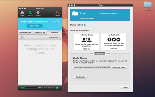
Sharing a multitude of different file types has never been particularly easy in the cloud. Dropbox has nailed it to some extent with specific shared folders and email invitations, but there is still plenty of room for improvement. With version two of SugarSync, sharing is emphasized by the dedicated tab placed in the centre of the new manager. Here, you can review exactly which folders you have access to from other users, as well as the content that you’re sending out to other people. For the latter, this includes public links too, which is a nice touch.
More often than not, it’s the same selection of people that you’re sharing content with. Family for photographs, line managers and colleagues for work; the usual suspects. The Contacts section layered under the sharing tab retains information for everyone that you’ve shared data with in the past, allowing you to simply drag and drop a folder on top of them whenever you want to share again. The accessibility and privacy options are what you would expect, but there’s a couple of surprising features too, such as the ability to notify them directly through Twitter or Facebook.
The last tab in version two of SugarSync tracks your activity. The list curates the history of every device you have connected through the cloud, including documents you have moved, edited or added. Particularly useful if you’re collaborating with other people, or want different versions of the same file saved to numerous devices.

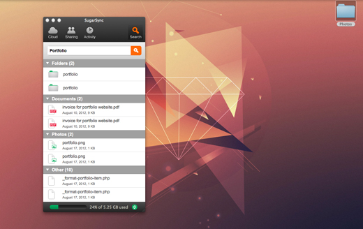
Throw in a robust search feature and the SugarSync beta suddenly looks very attractive in comparison to some of its competitors. The service is available as an app on pretty much every mobile platform (Windows Phone is the only one missing) but it’s important to note that the version two interface is only available on Android from today. The rest, SugarSync promises, will be coming soon.
“We let you work the way you want to work,” Yecies said. “So if you have your data organised somewhere on your computer, that’s fine. We don’t force you to change what data you put where to get the benefits of cloud. You can leverage your existing structure, you can put data only in the cloud, or you can keep it local. I think we’re just very flexible to meet people’s needs.”
Yecies told me that she feels the biggest challenge for SugarSync, as a startup, is getting the word out. With version two of the beta, they have a great opportunity to grab to turn a few heads and grab a bunch of new users. Whether they can stand above the likes of iCloud and SkyDrive though, is an issue that won’t be going away anytime soon.
➤ SugarSync (Android / iOS/ BlackBerry)
Image Credit: Klearchos
Get the TNW newsletter
Get the most important tech news in your inbox each week.


