Yaniv Tross is the CEO of Tross Creative House, a creative agency for tech, based in Tel Aviv, Israel.
User experience (UX) meetings are usually pretty passionate affairs. That’s not surprising when your dear product is being challenged inside and out.
It’s like that friend who points out flaws in your soulmate – you’re in love and it makes you blind. Now you’re being asked a lot of questions that make your perfect product suddenly seem weak. And so what began as a UX meeting quickly disintegrates into a product/market meeting, which turns into a discussion about consumer needs and ends with a completely new idea. Focus becomes a distant memory.
I’ve been to over 500 hours of these meetings with founders. Personally, it’s my favorite part of the day. It’s a real brain challenge where super-motivated, highly intelligent entrepreneurs make their passionate case.
There are some things that have withstood the test of time. So I put together a few of the recurring quotes that are just plain wrong.
Disclaimer: Ideally, product decisions are made based on data and intense testing. But that’s not always the case. Some of these quotes refer to products that don’t have a large user-base yet.
“It’s really for everyone”
Here’s a list of things that are extinct and are never coming back: dinosaurs, privacy and products that everyone uses. To create a great user experience, you need to figure out who’s going to be using it, when they’ll be using it, what they’re doing right before they use it and whether they prefer french fries or onion rings.
We all want to create products with many types of users, but there’s absolutely no product that everyone uses on launch day. Design your product for your early users and modify it when you have different needs from other demographics.
“This feature is just as important”
The only two identically important features are on and off. Otherwise, no two features are created equal.
If you don’t know which of your features is the most important, you don’t know what your product is. Obviously, it’s possible (and even likely) that you’re wrong about what your key feature is (and your user activity will point you in the right direction) but you need to work off an assumption.
Startup founders tend to prioritize the features that are most complex and have the most lines of code. It’s only natural to want to showcase the feature that took longest to develop.
And obviously, they’re ALL important. But do your product and users a favor and be the Darwin of features and select the strongest to survive.
“A competitor already did that, so it needs to be different”
No, it doesn’t. Familiar environments are a way of making users feel at home. If there’s a competitor that your users know well, you can use it to your advantage and shorten the learning curve.
Innovative design is always welcome, just make sure your solution is actually better and you’re not just doing it to be different. Keep in mind that if your competitor is large and established they probably learned from a long list of mistakes to get where they are. The important thing is that it will be functional and user-friendly.
Along those same lines is…
“They’ll learn to use it this way”
No, they won’t. Studies show that users are definitely willing to learn new workflows and interfaces, as long as it takes less than hitting the back button. When you’re used to one thing, it isn’t easy to get used to something new. Even if it is worth it.
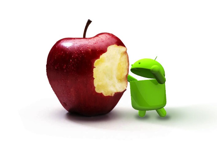
If you’ve ever switched from iOS to Android, try to remember that frustrating first week. If you were forced to make a decision after trying it out for just a few seconds, you’d never have made the switch.
And if you went the other way, from Android to Apple, how long did it take you to stop looking for that super-convenient back button? The only reason you committed to the switch was the wad of cash you already put down for your new device.
It’s every UX designer’s dream to create the next revolutionary user experience – just make sure it’s worth it.
“It’s just a gimmick”
It might be a gimmick, but it’s not “just” a gimmick. There are many examples of gimmicks that were the defining difference between a product’s success or failure. Users need something to talk about when they show their friends. Give it to them.
Not every product needs a gimmick, in fact, the reverse is usually the case. But in an oversaturated market, it’s a great way to stand out. Users are much more willing to invest in a good product they can talk about than just a good product.
“We’ll handle marketing strategy once the product is ready”
A great product is the biggest factor for success, but it’s far from being the only one. Your logo is just a symbol, your video will get watched once per user, and your website is just a stage in your funnel. Your interface is the only marketing tool that users interact with again and again, which is why it needs to be an expression of your message.
If you’re trying to be the “fastest type of X,” it better not be clunky. It doesn’t actually need to be fast and smooth, it just needs to feel that way.
Promises need to be kept, but more than that they need to be marketed to your user.
“It’s not a bug, it’s a feature.”
Haha. Didn’t know that one. Almost funny enough to cover up an issue that’ll push your users to quickly lose their patience.
No product, no matter how carefully planned, can have a great user experience if it has serious bugs. Most users are not the forgiving type. In a world where every user with 300 followers on Twitter is “an influential blogger,” it’s 300 times as important.
“Don’t interfere/I trust whatever you say”
Your product is meticulously planned out? Perfect, now’s the time to change it.
It’s not easy, but staying flexible when designing user experience and interface is critical to a product’s success. On the other hand, don’t forget who’s calling the shots.
UX isn’t a vision on its own, it’s the materialization of the founders’ vision. If a founder isn’t involved in the UX process they might as well just call it quits now.
Good UX designers can think of a thousand different ways of creating your product, your job is to navigate them through that sea of options. They should be passionately rallying for support for their ideas and designs, and you should be listening to the reasons behind their decisions.
A sign of a terrible UX designer is complacency and the inability to argue their case. But that’s also true for entrepreneurs.
“So we’ll push back launch date a few months”
Learn to let go. So what if your app can’t do a triple backflip on its own and that idea you had yesterday is going to take your product from awesome to super-awesome? Nobody will know if they don’t get to see it.
Your team, supporters and investors all need some catharsis, even if it’s not perfect. Product fatigue is real, and can be detrimental to your team. As the old saying goes, “a soon to be launched product is the enemy of a good one.” We even made a video about it.
What other things have you heard about UX design that are totally wrong? Share in the comments below.
Top image credit: Shutterstock
Get the TNW newsletter
Get the most important tech news in your inbox each week.


