Apple is a company known for placing huge value on design, crafting its computer and smartphone products in a way that resulted in a pleasant experience for the user, but looks and feels like they couldn’t be designed any other way.
Apple’s design conflicts are well known. Its co-founder Steve Jobs was famous for his penchant for making sure things looked right. Jobs once made sure that the circuit boards inside the first Macintosh looked beautiful — arranging them be clean and orderly — despite knowing that a large percentage of owners would never open up the computer and even see them.
Plenty of Steve Jobs anecdotes have been bandied about since his death but the tale of how an Apple logo was specifically placed upside down, only to be rectified years later, had escaped us.
Our interest was piqued by a Bloomberg piece on Apple’s cult status in Hollywood and increased presence in many blockbuster films. Bloomberg’s Peter Burrows and Andy Fixmer detailed an internal struggle that Apple marketing manager Jon Holtzman experienced in the nineties when trying to place products in Hollywood films.
Holtzman lobbied Apple executive to make product placement a high priority in the company but when it came to loaning the computers to studios, the logo on its Powerbooks would appear upside down to the camera in the films in which it was featured.
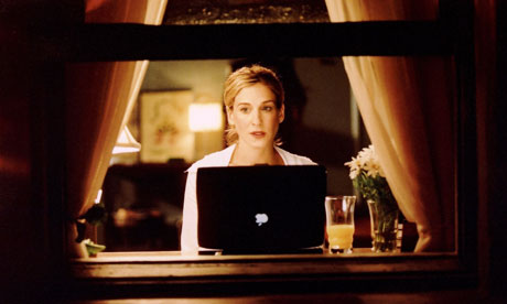
The problem for Apple’s marketing manager is that this was a conscious decision, so he had to place stickers that showed the logo the right way up over the original on the company’s Powerbook products.
Holtzman again urged higher-ups to right the wrong, but it wasn’t until 1997 — when Steve Jobs returned to the company — that it was changed for good.
Can We Talk?
Following the publication of the Bloomberg editorial, former Apple employee Joe Moreno provided more insight into just what happened inside 1 Infinite Loop.
Moreno shares in his blog post that over a decade ago, the design teams at Apple held talks over the placement of the logo on the back of the company’s notebooks. Using Apple’s internal system called Can We Talk? employees asked:
Why is the Apple logo upside down on laptops when the lid is open?
Moreno writes:
We were told by the Apple design group, which takes human interface issues very seriously, that they had studied the placement of the logo and discovered a problem. If the Apple logo was placed such that it was right side up when the lid was opened then it ended up being upside down when the lid was closed, from the point of view of the user. (If you’re currently using an Apple laptop made in the past eight years, then close the lid and you’ll see that the Apple logo will be upside down from your point of view, but right side up when opened)
Why was upside down from the user’s perspective an issue? Because the design group noticed that users constantly tried to open the laptop from the wrong end. Steve Jobs always focuses on providing the best possible user experience and believed that it was more important to satisfy the user than the onlooker.
Obviously, after a few years, Steve reversed his decision.
Moreno references Sex And The City as one of the most obvious examples of the upside down logo. He also joined ex-Apple advertising guy and Steve Jobs colleague, Ken Segall.
Apple’s upside-down thinking
Segall penned a similar post at the end of last year entitled: “Apple’s upside-down thinking” which acknowledged that Apple had “made a few mistakes in its day.”
Segall recalled one time, during one of his agency’s scheduled meetings with Steve Jobs, where the Apple co-founder asked for advice “on what he felt was a conundrum”:
Which was more important — to make the logo look right to the owner before the PowerBook was opened, or to have it look right to the rest of the world when the machine was in use?
Look around today and the answer is pretty obvious. Every laptop on earth has a logo that’s right-side up when the machine is opened. Back then, it wasn’t so obvious, probably because laptops were not yet ubiquitous.
Because the user would be able to see the logo the right way up, it gelled with his priority that the customer experience must always be put first. So, the logo was to be placed upside down.
The logo stayed that way until later Powerbook models were designed, when Jobs decided to reconsider his decision.
When you visit a coffee shop or a college campus, the glowing Apple logo on the back of a MacBook appears like it has been that way forever. This wasn’t the case.
Both Moreno and Segall both look back on the decision with mixed feelings.
Moreno concludes in his post: “Opening a laptop from the wrong end is a self-correcting problem that only lasts for a few seconds. However, viewing the upside logo is a problem that lasts indefinitely.”
Segall? Well:
“Looking back, it borders on the unbelievable that something so wrong could ever have seemed right. That Steve Jobs ever wrestled with this decision only proves one thing: being right in retrospect is much easier (sic) being right in real time.”
Get the TNW newsletter
Get the most important tech news in your inbox each week.


