You cash-out your hard-earned money in perfecting your website, getting the word out, and bringing in as many footfalls on your landing page as possible.
Positive signs begin to surface, with increasing number of coveted clicks landing on the “Sign me up!” button.
And that’s where the next catch is patiently waiting to pounce on you. The users play around in your sandbox, and in the end, most of them abandon your app. You spend so much of time and effort to increase your traffic and sign-up rate, and then the free sandbox loses a majority of them somehow.
Your product fails to get the attention of your target users and to make an impact in their value chains, which in fact is the sole purpose of its very existence.
This continues to be one of the most testing stumbling blocks in the SaaS playground, and we weren’t an exception.
We had to boost our conversion rate up. A series of number crunching, testing, tweaking, and tuning later, we found ourselves on the right track – which upped our lead-to-paid user conversion rate from eight percent to 15 percent.
One of the major levers that helped us in the process were our “CCAs”. And here’s how it could help you do the same.
Before we begin, here’s the mandatory disclaimer:
- Optimization is a continuous process and this post is not a comprehensive guide
- There’s no one right approach and what worked for us might/might not work for you
There. Let’s get going, shall we?
Now our objectives were clear:
- To put our best foot forward, assist the user in getting to know our product, and to show them the value that they would receive once they start paying
- To filter the casual signups from the serious evaluators, and to ensure that we’re serving the right people
Over to a brief account of our conversion optimization journey, and the lessons that we learnt along the way, broken down into three stages:
Stage 1: Establish criteria to evaluate the trial users

We classify our trial users into three categories (Poor, Average, Good) based on their in-app activities and their corresponding Activity Scores.
By looking at what our existing paying customers did during their free trial, we zeroed in on a set of Common Conversion Activities (CCA), activities that help a user to comprehend the benefits that they can reap, thus convincing them to start paying.
Following are the CCAs that make up the Activity Score:
- Completed the account setup
We prompt the user to verify their email address and to claim their account only during their second visit to the app (and not when they sign up). Apart from making the sign-up process seamless, it also helps us to check the user’s level of interest in our product (a casual signup wouldn’t normally complete this action).
- Spent considerable time in the app (Active Days since sign-up)
This is a no-brainer. Only when someone is interested/curious enough about a product and wants to dig a bit deeper to know what more it can do for them, will they come back to it repeatedly.
- Made API calls
The user has got a good idea about the explicit benefits, and is now checking if the product can be further moulded to fit perfectly into their business puzzle. They’re looking at making the checkout process as streamlined as possible, and an API integration would help them in doing just that.
- Invited other users
One of our most important criteria. The user has found what they were looking for, and have invited their team members to validate their choice.
- Tried out the test payment gateway configurations
The user wants to get into the nitty-gritties now. They want to see if Chargebee’s claim of being the best tool to give superpowers to payment gateways, is true. They’re verifying the core value proposition of the product.
- Logged into the customer portal
The user’s happy with how the app helps out their business. But how will it help their customers? The user puts themselves in their customers’ shoes, and checks out how the customer portal works, and what level of autonomy it would give their customers.
- Configured the invoice
An invoice is among the prime outputs of a billing tool, and there’s no room for a slip-up, as it’s something that would reach the hands (or inboxes) of the end customer directly. The user wants their invoices to look slick and their customers to look pleased, and hence try their hand at perfecting the former.
- Configured the hosted page
The background workings of the app are good. Now, what about the on-stage performance? How can I ensure that the hosted checkout page speaks the language of my website and doesn’t look like a lost traveller in a foreign land? The user tries to get answers to these questions at this stage.
Stage 2: Based on the trial user’s behavior, pick the next move

Predict their likeliness to convert:
We appraise our trial users by looking out for the aforementioned CCAs and other desirable behavior patterns in them. We check if we’re ticking all their boxes, meeting all their requirements, and thus spiking their interest level.
For example, we have a record of the average time taken by a trial user to sign-up for a paid plan (conversion time), for every business type. By having this as the yardstick, we determine if a new trial user will likely convert or not (if the pre-defined time period is crossed, it’s more likely that the user has chosen an alternate option to solve their problem).
Evaluate the true intentions on the other end of the screen:
Similar to the Activity Score, our sales team assesses a lead in CRM with their own set of measures, awards them scores, and qualifies them as an “Opportunity” if the score is high enough (for the rest of the post, let’s call this the “Opportunity Score”).
To decide if a prospect is worth pursuing or not, we compare the Activity Score with the Opportunity Score. Here’s basic logic:
- If the Activity Score is lower than the Opportunity Score: The prospect has the intention to sign-up with us, but is having some trouble with working with the app. The solution: Contact them, find out the hiccup, and resolve it.
- If the Activity Score is higher than the Opportunity Score: The prospect is more interested in exploring the product and studying its nuances, than in signing up with us. In other words – that’s not the right prospect we want to target (warning: it could also be one of our sneaky competitors!).
Step 3: Organize the efforts to increase the motivation to convert
Enrich the app’s experience:
We ensured that our UX nudges the sandbox users to perform the CCAs. The rationale here is simple, if they’re finding it difficult to spot the benefits by themselves, help them out in finding their way to those benefits.
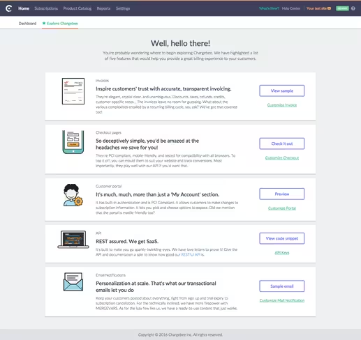
As a part of this, we created an “Explore Chargebee” tab within the app, which guided the users through the various actions they could perform in the app (yes, each of those actions specified there is a CCA).

- Chargebee’s target market is widespread and comprises multiple segments. So having a generalised common sandbox for all of them doesn’t make sense. Also, someone who doesn’t belong to the billing industry cannot easily get a grasp of all its terms and jargons in the very first encounter. A lot of our customer feedback were revolving around this issue and we realised that this was having an implicit effect on our conversion as well.
Our solution:
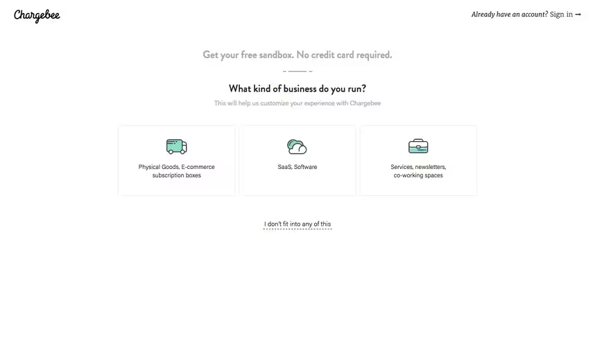
Get the user’s industry when they sign up and tailor the app’s demo data accordingly.

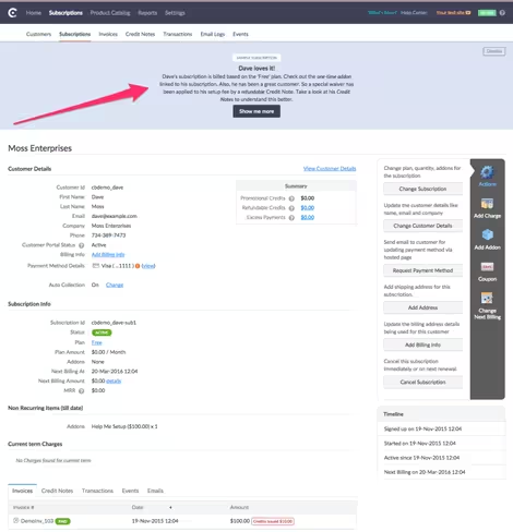
And add little help snippets on each page that hand-holds them through the workings of the tool.
 This way, the users find themselves in a familiar turf, are able to get a better grasp of how things worked, and can hence start getting their hands dirty as soon as possible.
Bonus nuggets of advice
- Include support enquiries to the top of the funnel (Free Sandbox Sign-ups + Support Enquiries = Top of the Funnel), by classifying your tickets into “Prospects” and “Customers”. This way, your sales team is brought into the loop, and whenever a prospect/sandbox user raises a ticket, the sales guys can pitch in and take it from there.
- Show the right features to the right customers (persona). E.g. if a member of the finance team signs up, prompt them to invite their developer comrade, who would better comprehend the API part of Chargebee.
- A product cannot and will not appeal to anyone and everyone. Hence, it doesn’t make sense to force everyone to understand and like your product. Just showcase your product, and let them take the call. Nobody likes it when ideas (or products) get shoved down their throats.
- Learn to say “No”, when you realise that your product isn’t what the prospect is looking for. By spending your time in making a wrong prospect happy, you’re losing out on reaching out to the right ones.
To sum it all up, data insights, process alignment, and supporting app modifications go hand-in-hand in streamlining your CCAs and in raising the conversion gauge to green.
Get the TNW newsletter
Get the most important tech news in your inbox each week.


