Blue is the most common favorite color in the world, which is why so many companies have used it for their logos and mobile app icons. However, by picking blue as a primary branding color, many smaller companies run the risk of literally blending in with their competition.
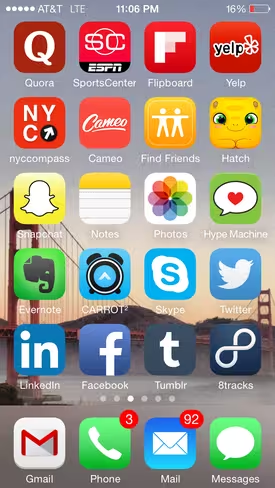
This became grossly apparent to me a few weeks ago when I struggled with where to place Facebook and LinkedIn on my phone screen. My applications are organized by color, and the overwhelming number of blue icons is apparent in the screenshot below:
This is just one screen, so it’s worth noting that out of the 60 apps on my phone that don’t live in a folder (and therefore have a prominent place on the screen), 16 have blue as their main color, and two more have blue fairly prominently.
That’s over ¼ of the icons, which makes organizing the shades of blue incredibly frustrating.
As evidenced above, brand color is particularly important for mobile apps, as their icons become the face of the product on the screens of their users’ devices. The logo iconography itself is important, but the color of the icon is a crucial decision that needs to be made thoughtfully.
Questions such as who is a product’s target user, what is the product personality, and where might this icon sit in the hierarchy of apps on a user’s device all need to be considered when determining what the final icon design will be.
Just as a company’s personality can be determined by the colors it uses in its branding, many established companies have influenced public perception of various colors. When you think of Whole Foods, British Petroleum, and Girl Scouts, green and the associations that come with it—growth, health, nature, fresh—are top of mind.
This acts in reverse as well: red brings to mind excitement, youthfulness, intensity – think CNN, Virgin, Coca-Cola, and RedBull. When determining which color align a product with, it is important to consider the personalities of the other brands that have picked that color as well.
So what is the best color a new mobile product can adopt for its icon? There is no one answer, but the logos of established companies such as Facebook, Apple, and Yahoo and the icons below, which were sourced by emerging companies through 99designs, can help guide the decision.
Red
TapStory is an iPad app that “that fosters open-ended creative play between children and their picture books.” The team chose red as their primary color because it is evokes excitement, energy, and youth – three core qualities associated with the product’s personality.
Many other companies have chosen shades of red for their apps, including Nike, ESPN SportsCenter, and Yelp. Because it’s such a bold color, it’s one of the most popular icon colors in the app store, easily rivaling blue.
Orange
Orange is a friendly and cheerful color that is just beginning to emerge as a popular icon color as more companies are choosing to stay away from the more common reds and blues.
Playground is an event discovery and management app for college campuses, and it chose orange because its playful and energetic nature does a good job of depicting the idea of passion and engagement that the company’s founders were looking to communicate to their users.
Yellow
Like orange, yellow is slowly emerging as a preferred icon color. Though various shades of yellow are less than desirable, a bright and cheery yellow can conjure a certain amount of warmth and optimism in the minds of potential users.
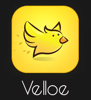
The color that has been so boldly adopted by DHL and Sprint was also chosen by small startup Velloe, a product that allows users to order services online from local service providers. The cheerfulness of the yellow is comforting to potential users, and the bright hue stands out among the wave of blue and red icons on a mobile screen.
Green
Most personal finance apps are green because, as everyone knows, green is the color most often associated with money. But other reasons to choose green include green’s peaceful and healthy personality, which are two sentiments that are more happily associated with finances than, say, red ones.
Long Weekend, LLC picked a green icon to represent its mobile product, which helps individual wealth “grow like a natural, organic thing.” If that doesn’t scream, “Pick green!” then I don’t know what does.
Blue
I’ve already stated that blue is the most popular color in the world, which is one of the reasons why it is so popular as a brand and icon color, especially for products that are intended to be used globally and need to transcend cultural interpretations.
Coinbolt is a wallet for the international currency Bitcoin, so blue was an intelligent choice. Chase, American Express, and IBM choose blue because the color suggests trust, strength, and dependability – all things a user is looking for in their banks, as well as their Bitcoin wallets.
Purple
Purple is one of the least prevalent icon colors, perhaps because it’s not as gender neutral as others. Startup Jolimi is a fashion app intended for use by urban females ages 17 to 25, and as such was looking for a color and icon that was fun, creative, and playful.
Purple was a wise choice that not only communicates the essence of its brand, but that will stand out from others on mobile screens. Although Yahoo may have taken over purple as its identity, others like HotelTonight and Luna have also made good use of the hue.
Think about the message you’re sending
Choosing a color for an app icon is one of the most important branding decisions a company can make when developing and launching a new product. Every product is different and the icon needs to communicate individuality so that it doesn’t get lost on the mobile screen.
As such, it’s important to keep intended audience, potential differences between cultures if you’re intending to be an international product, and the branding chosen by competitive products in mind when making a decision.
Rebranding and changing an icon color is not unheard of (see Urbanspoon’s recent efforts) but there is nothing more annoying than seeing a pop of yellow in the perfectly organized blue icons on my screen. Or perhaps that’s exactly the point.
What colors does your company icon use, and how do they convey your message?
Get the TNW newsletter
Get the most important tech news in your inbox each week.
