Mobile card payment company Square has just updated the career page on its site. In an attempt to create an appealing section where interested applicants can go to be recruited, the company has made it much more experiential than it was before. This is all in conjunction with CEO and co-founder Jack Dorsey’s intent to bring on board 1,000 new people by the end of 2013.
Just last week, Square announced that it would be relocating its corporate offices to the Mid-Market neighborhood of San Francisco by the middle of 2013. Now with 400 employees, the company has been making the news lately and now with Dorsey no longer managing operations at his other startup, Twitter, he will most likely dedicate more time focused on accelerating the growth of Square.
That being said, the goal is for 1,000 new employees over the next 14 months and one way to attract new talent is to show them that Square is the best place for you to work at.
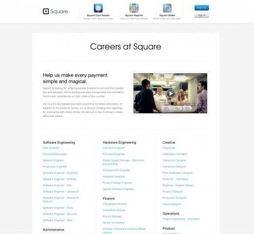
But first things first, let’s take a look at the old version of the company’s jobs section. It was a pretty simple site that followed suit of the well-recognized card readers. It displayed the available jobs and even had a “why should you work here?” video on the page. You got the information you needed and moved on.
When you go to Square’s jobs section now, you’re going to see much more than just the above. It’s about presenting an experience and Square wants to let engineers and designers know that you can make things happen at this company.
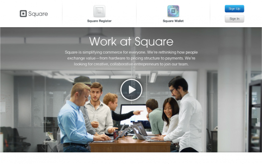
The first thing that you’ll see is the standard “work here” video, but this in-house produced video has been done to apparently show applicants that Square is a “change the world” company. After that, you can get the general idea of the three types of positions that the startup is looking for: creative, engineering, and business — each one will reveal specific information custom for those roles.
Of course you have to display the benefits of working at Square, right? So after you read into the company’s story and why it does what it does, you can go straight into finding out that the company gives three meals catered on site, apparently gives employees great health insurance, professional development, vacation, retirement, oh, and equity.
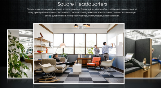
To top off Square’s career experience, the site includes some photos of the office so potential applicants will feel like they are almost there ready to “build a special company”.
Everything about Square is about presentation. From the way the card readers are designed to the way the office is arranged and even to the style of the career section, there’s a simple, yet elegant and technical design to it. While the previous version had a list of available positions, it looks like the company found a simpler way to tell potential applicants exactly what it’s looking for. But each section is completely different and tailored towards that profession.
What this means is that if you look at the creative positions at Square, you will see that the page was designed with great aesthetics so that creative folks will find it worth investigating. The same goes for developers and also those seeking business-related positions. It’s all about building the right experience to bring on the right people.
Square’s Vice-President of People, Jude Komuves says that the redesigned section was done with the careful consideration of the audience: “At Square, we put a tremendous amount of thought into everything we do, from our products and customer experience, to our people and culture. Our beautiful new careers page reflects who we are — innovative, collaborative, with an eye for details — and hopefully gives future team members real insight into what it’s like to work at Square.”
It’s apparent that in Silicon Valley, there’s definitely a huge need for specific types of talent, but a limited supply available to companies. In order to attract the best, companies are now pulling out all the stops when it comes to recruiting, and that usually starts with the company’s website. Let’s face it, there’s most likely a chance that a decision to apply is made simply by viewing a company’s website and if the job section isn’t compelling enough, companies risk losing out.
Photo credit: Square
Get the TNW newsletter
Get the most important tech news in your inbox each week.


