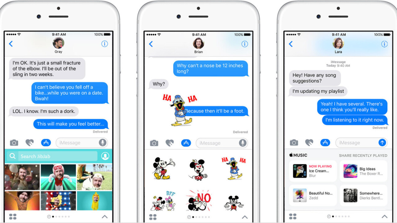
You might not realize it, but the iMessage App Store is pretty awful.
When announced, it was one of my favorite new features, and personally I still love it. Crazy sticker packs and lightweight apps aren’t life-changing, but when used in the right situation they breathe life into text message conversations.
Unfortunately, this breath probably isn’t enough to resuscitate the iMessage App Store itself.
Design
The problems are numerous, but we can start with design.
As a design-first company, Apple truly dropped the ball here. Using a bad example, but a good rule: Yahoo CEO Marissa Mayer once said no app should require more than three taps to get where you’re going — and one of those taps is opening the app itself.
It takes five taps just to open the iMessage App Store. Go ahead, count them.
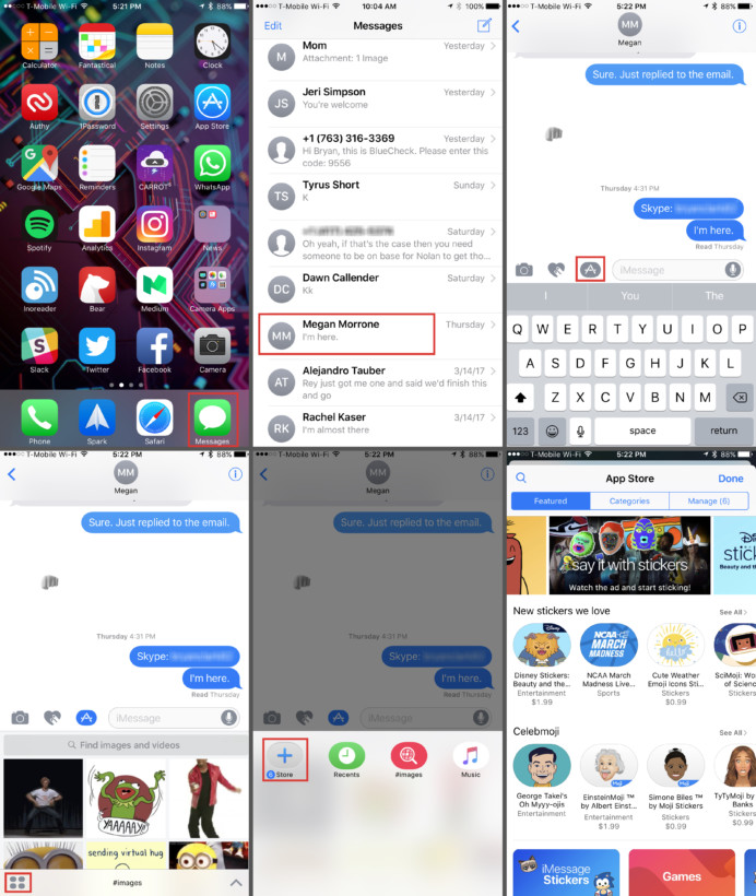
But look, we’re web savvy; finding features in convoluted design is right up our alley. What we typically forget, though, is that we’re not the norm. If it takes multi-step instructions on how to use something so simple, you have to consider it a UI failure. Just imagine your parents. You think they could navigate this thing without instruction?
In addition to being tricky to find, it’s not always apparent what happens to apps after you install them. Just look at this feedback from a few popular apps.
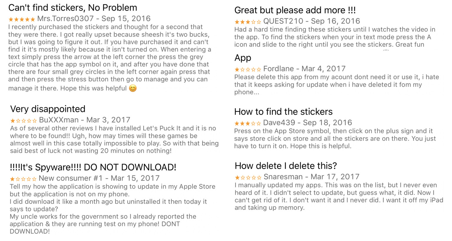
And those that were able to install it were later baffled as to how to remove it. I especially like the threat of calling his ‘uncle’ who works with the ‘government’ because it’s spyware — the reality here is, the guy probably looked through his normal apps and didn’t see it, so he assumed it was gone. Nope, not how it works, buddy.
Curation
I am baffled by the quality of apps Apple allows into this store. In fact, it gives me not-so-fond memories of being an early Android user. They’re not all bad, it’s just that you can only find good ones by accident or recommendation.
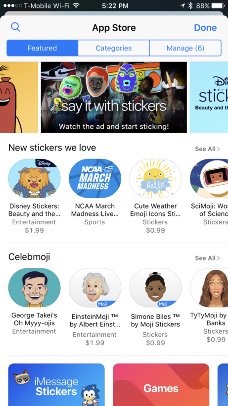
Of those that are worth using, you start to wonder why you’re using them in the first place. Yelp, for example, is excellent — as is Carrot Weather. Neither are apps I ever remember to use in iMessage. And why would I? When I’m checking the weather, it’s not normally in a text message.
Apple also seems to have an unhealthy obsession with Disney. Or, maybe the company has just given up entirely on the iMessage App Store. The constantly-updating nature of the standard App Store is nowhere to be found here. Instead, Beauty and the Beast, Mickey Mouse, Star Wars, and kitten sticker packs litter the home screen for days, weeks even.
I’m starting to believe Apple may have just given up on pointing out the useful and instead resigned to hopes that frustrated browsers will just download a Mickey Mouse sticker pack and go about their business — the digital equivalent of giving a kid a breadstick at Olive Garden to shut him up.
And if you’re looking for something useful? Well, just keep scrolling.
At the bottom of the page, or near it, you’ll find the top charts. These are the saving grace of the entire experience, and they’re buried under stickers of Chewbacca chewing off his own legs in frustration. So, it’s not that these features don’t exist, they just aren’t positioned in a way that gives most users any hope of, you know, actually finding them.
Seeing some of the options, though, I’m not sure that’s such a bad thing.
Get the TNW newsletter
Get the most important tech news in your inbox each week.
