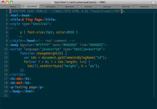

Solarized is color palette that’s been designed primarily for terminal and text editor applications, and its goal is to make these applications easier on the eyes so you can code more comfortably for longer.
You can download packages that will install Solarized color schemes in Vim, Mutt, Xresources, iTerm2, and the OS X Terminal, and the palettes can be downloaded for Photoshop, the Apple Color Picker and the GIMP Palette.
All of the information required to port the scheme to your preferred editor is available in the palettes and on the site if yours is missing from the list. (First person to port this to TextMate will get candy.)
Solarized doesn’t just claim to be easy to read based on the designer’s personal preferences, though. Ethan Schoonover, the designer responsible for the project, clearly explains the rationale behind the decisions he made on the project site. The most prominently visible is the use of selective contrast:
“On a sunny summer day I love to read a book outside. Not right in the sun; that’s too bright. I’ll hunt for a shady spot under a tree. The shaded paper contrasts with the crisp text nicely. If you were to actually measure the contrast between the two, you’d find it is much lower than black text on a white background (or white on black) on your display device of choice. Black text on white from a computer display is akin to reading a book in direct sunlight and tires the eye.Solarized reduces brightness contrast but, unlike many low contrast colorschemes, retains contrasting hues (based on colorwheel relations) for syntax highlighting readability.”
White-on-black themes, popular among developers who want to reduce eye strain, are an improvement over black-on-white themes, but the contrast is still far too great.
I doubt there are many, if any, terminal color schemes that have received the amount of thought and attention that Schoonover’s Solarized has. If you spend much time coding, you’ll definitely want to take a look.
Get the TNW newsletter
Get the most important tech news in your inbox each week.


