Snapchat’s teased redesign has today been unveiled, and its one big change is a simple-yet-welcome concession to modernity.
For something that was presented to me as the “new Snapchat,” its alterations are surprisingly simple ones. If you’ve stuck to using Snapchat’s basic social features up to now, rather than its original commercial content, you might not even notice much of a difference.
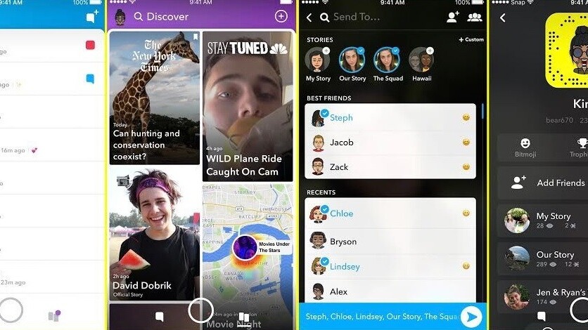
The primary change between the current version of Snapchat and its upcoming redesign is the separation of friend-based content and publisher content. Now, when you swipe left from the main camera screen, you’ll have access to your friends’ Stories, Bitmojis, and chats. The Discover content, which was previously tangled with the Stories, is now on a separate screen.
Snap CEO Evan Spiegel said in an statement published on Axios:
With the upcoming redesign of Snapchat, we are separating the social from the media, and taking an important step forward towards strengthening our relationships with our friends and our relationships with the media. This will provide a better way for publishers to distribute and monetize their Stories, and a more personal way for friends to communicate and find the content they want to watch.
Right now there’s no way to avoid seeing Snapchat’s branded content unless you just don’t look at Stories at all, due to them being in roughly the same place. So for users, this is a welcome separation of personal and professional content.
The redesign will be available to users starting in the next few weeks.
Get the TNW newsletter
Get the most important tech news in your inbox each week.
