
This post originally appeared on the Buffer blog.
Is SlideShare part of your content strategy? Truth be told, we have yet to fully integrate it into our content creation process here at Buffer. We’ve felt lots of great nudges, though.
We’ve heard tell of the amazing opportunity on SlideShare, how it’s a primed network of highly engaged influencers just itching to find and share your stuff. What might ultimately sell us, though, is the response we got from a single slide deck, created in a hurry, that garnered over 5,000 views in one weekend.
It would appear that SlideShare has the potential for big returns on a small investment.
I dove into some research on SlideShare content in order to see the best route to success and how to best invest your time. Here are the best Slideshare tips and resources I found.
Our SlideShare experiment: 5,000 views for 10 minutes of work
We’ve long been told that SlideShare is a great place to invest quality content creation time. The stats bear this out.
There are over 60 million unique visits to SlideShare every month.
Seven million SlideShare pages get viewed every single day.
SlideShare receives 500 percent more traffic from business owners than Facebook, Twitter, and LinkedIn.

SlideShare was one of our key suggestions for advanced content tips and ways to take content beyond the standard blog and social scenes. We just hadn’t quite fit it into our schedule yet.
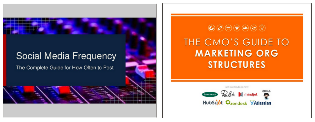
When the opportunity arose to practice what we preach and create a slide deck of an existing blog post, I jumped on it. I hopped into Google Presentations—one of the cloud services that come with Google Drive—and started building with a template.
I pulled headings and images from our social media frequency guide and uploaded them into the slides. I placed the featured image from the blog post as the background. I added some sources and a call to action. Voila!
When the slides were done, I saved as a Microsoft PowerPoint file and uploaded to SlideShare. All told, the presentation was 12 slides and included fewer than five words per slide.
Since I created the slide deck as part of a blog post that had yet to go live, we gave it zero promotion. And yet, when we happened upon our SlideShare page the following day, it had earned over 3,000 views. The presentation got picked up as a featured slideshare on SlideShare’s social media page. Our 10 minutes of quality time to build it resulted in over 5,000 views in one weekend.
What did we learn from this?
- SlideShare is worth our time.
- SlideShare users are eager for quality content.
- SlideShare has huge potential for businesses and brands looking for a new audience.
Of course, it all starts with the slides.
5 critical elements to creating a beautiful, viral slidedeck
The most important rule of SlideShare: If your presentations aren’t good enough, you won’t get anything from SlideShare.
Talk about pressure! This quote comes from blogger and presenter Mauro D’Andrea who put together a huge resource of SlideShare information for the KISSmetrics blog. D’Andrea’s biggest takeaway from the post: Design a great presentation.
I might amend that bit of advice just a tad. I’m not sure I was well equipped or capable of building a great presentation on my own, yet we still saw good results. So how about: Design a good-to-great presentation. It doesn’t have to be Picasso; it should be better than elementary.
A great place to start in understanding how to design beautiful, viral slidedecks is with this all-encompassing presentation from Slides That Rock.
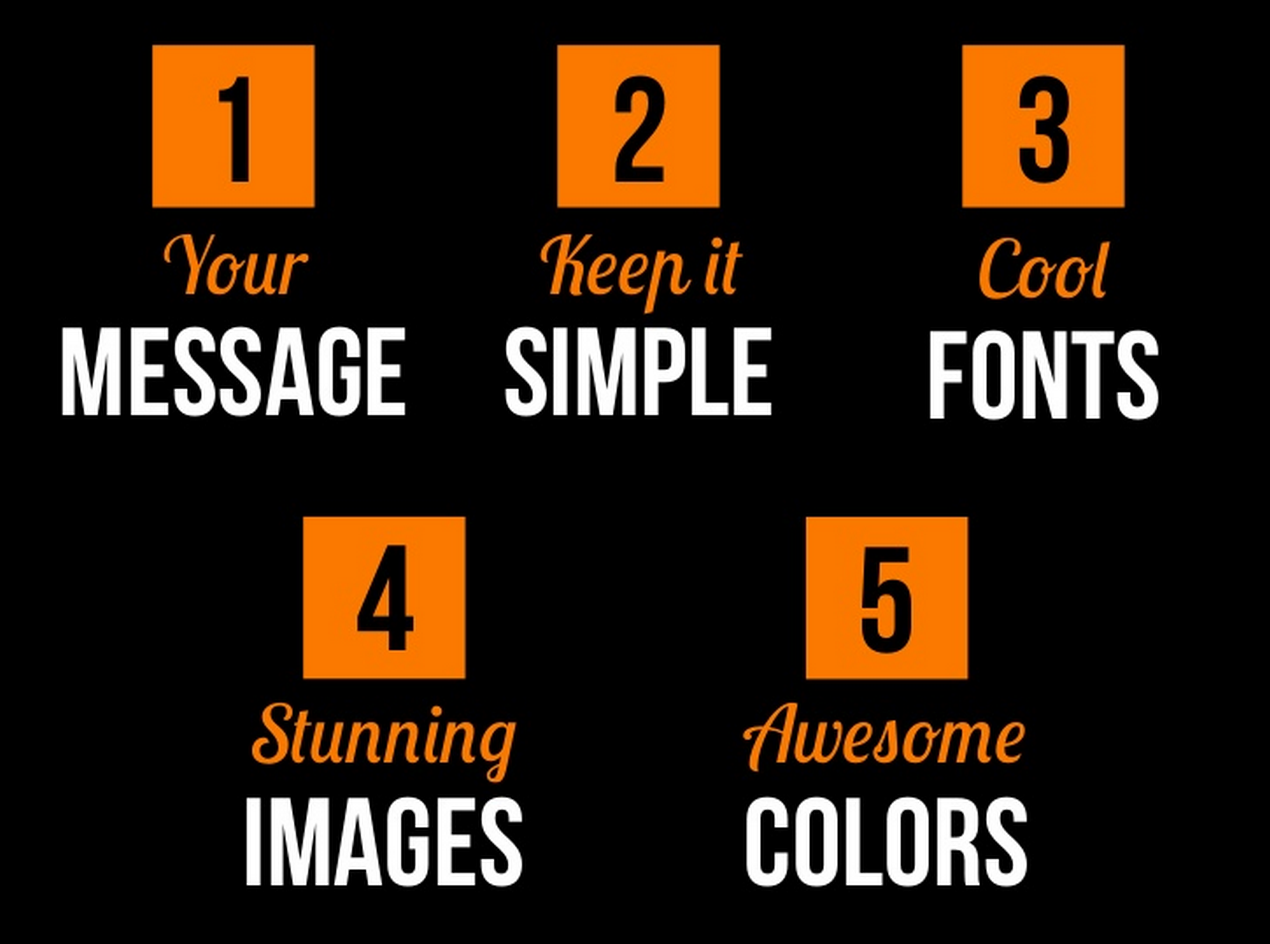
In summary, here are the five principles of good SlideShare design:
- Your message
- Keep it simple
- Cool fonts
- Stunning images
- Awesome colors
1. Your message: Focused and clear
A strong message is focused, clear, and concise. Know where you’re headed with your presentation before you begin. D’Andrea, the author of the KISSmetrics resource, has some further advice on what makes slide content stand out. If you’re aiming for a strong message, consider one of these elements:
- Show something shocking
- Explain useful information
- Evoke emotions
2. Keep it simple: The average SlideShare deck is 14 slides
A strong, focused message will help prevent your presentation from veering off into complex, superfluous territory. Simple works best on SlideShare. Keep in mind that the average SlideShare presentation is 14 slides and fewer than 25 words per slide.
New Rainmaker, a branch of CopyBlogger, has some of the simplest (and beautiful) slides out there. Here is an example from their first presentation.
3. Cool fonts: Look beyond the basics
Choose a font outside the norm. Here are some standard fonts alongside some alternatives.

Many graphic design/presentation programs allow for adding custom fonts to a design. If you can’t find a new font from the drop-down list of fonts in your tool of choice, you might see something you like at Font Squirrel, a free font resource.
4. Stunning images: See our guide of free sources
Emphasizing visual content is important not just on blogs and social media but also on SlideShare. The more stunning images you can include, the better. If you’re in need of a resource (or two, or 53) for free images, you can check out our complete roundup of free image sources. A couple of sources I use every day are compfight, Photo Pin, and Death to the Stock Photo.
The slides from Rand Fishkin‘s presentations are very image-focused. Here is a recent example from his presentation on content marketing.
5. Colors: Create a consistent palette
Not only is it great to include awesome colors but also consistent colors. Choose one or two colors to be consistent throughout your slides, and if you can make them awesome colors, all the better!
One fun tip is to pull colors from a main image or logo in your presentation. Pictaculous is a tool that lets you upload an image, and get a full color palette based on the image you uploaded.
Here’s a before-and-after of a Buffer presentation
We held our first webinar back in March, which also meant our first opportunity to put together a set of slides. They got the point across but were far from elegant. So we went to the presentation experts at Ethos3 for a slide makeover.
Here are some of the images—before and after—along with the advice behind the changes.

Ethos3′s advice: Add a stunning image and a complementary icon to the slide. Find a custom font that relates well to the theme of the presentation (in our case, a thin, modern font helped support the theme of “science”).
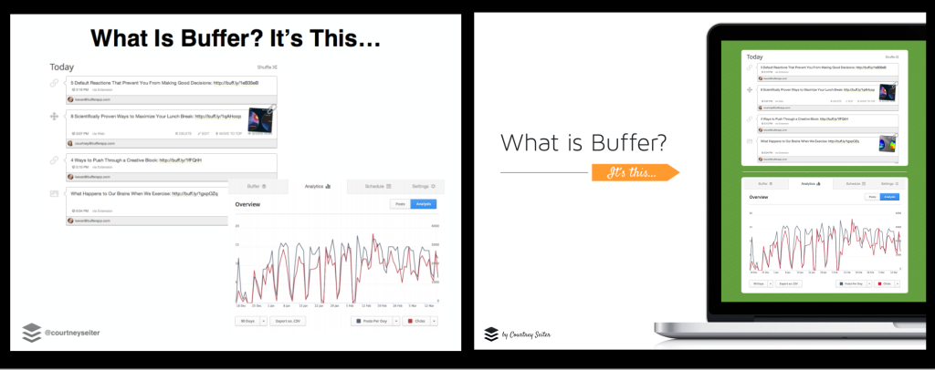
Ethos’ advice: Place floating screen captures into a picture of a laptop, giving the image a sense of purpose and place and helping the viewer get an easier sense of where the Buffer screen grabs belong.
The bright green should be the central color of the presentation; it’s carried over here from the opening slide.
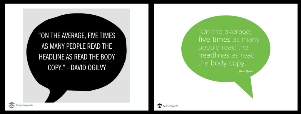
Ethos3′s advice: Instead of screen-capturing a quote from another site, create your own in your presentation builder. In the new example, Ethos3 used our new standard font and standard green color.
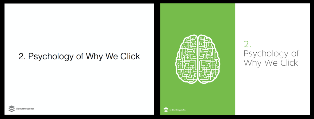
Ethos3′s advice: Title decks like these can be highlighted with some well-chosen iconography or imagery (plus the return of our green color and modern font).
In general, some quick wins for any amateur slide designer can be broken down into these points:
- Find a custom font and eye-catching color, and stick with them throughout the presentation.
- Use visual metaphor to supplement the text on a slide. Try iconography and images that support the message.
- Fill the slide with an image. Avoid placing an image in the center of the slide (with white border around it), if at all possible.
5 tips for working faster and smarter when creating slides
Once you know the basics, you can add a few new tips and tricks to your toolbox to really make the most of the slide deck time you have.
Tip #1: Pick a favorite presentation builder and get good at it
The better you know your design tool, the faster you can work. Some of the top presentation tools out there include:
- PowerPoint
- Google Presentations
- Haiku Deck
- Canva
I’ve mentioned before that my go-to tool for building visual content is Canva, which has a lot of customizable, premade templates to get you started on a design, and you can copy past presentations to modify for future slide decks.
(I used Google Presentations to build the slide deck that earned 5,000 views in one weekend. The templates and customization options are quite intuitive there as well.)
Tip #2: Create a template and use it forever
The single best bit of advice I can give for building SlideShare into your workflow is to create a template. It’s like paying in advance for a season pass. The upfront investment is big, but the template will pay for itself before you know.
My template solution might be a bit of a muddle. I simply copy a past presentation and use it as the basis for building a new one, deleting out all the old text and images and replacing them with new. (If you’ve got a more elegant solution, I’d love to hear about it in the comments!)
Tip #3: Build your slides to fit the full SlideShare screen
Notice a difference between these two presentations?
One is letterbox and one is full-screen. This comes down to the size of slides that you upload to SlideShare. When I built a presentation in Google Presentations, the default size was letterbox, and the resulting upload failed to fill the full size of the SlideShare viewer.
If you want to have a presentation that fits snugly, build slides that are 1024 pixels wide by 768 pixels tall, or a similar aspect ratio.
Tip #4: Include links, starting with your fourth slide
Clickable links are not allowed on the first three slides of a SlideShare presentation. If you happen to have one there, SlideShare will disable it.
Starting with the fourth slide, though, you can add links to your heart’s content. Hubspot has a helpful post about how this process works; essentially, you create hyperlinked text boxes in PowerPoint, export to an Adobe PDF, then upload to SlideShare.
At the very least, your slides can include the text of the URL so that viewers can type it in themselves. If you happen to be linking to a long URL on your call-to-action page, you might be interested to try bit.ly’s custom URL shortening for a snappier, easier, more memorable link to type.
Tip #5: Make the most of the upload process—optimize, optimize, optimize
Did you know that the information you enter when you upload your SlideShare file is the information indexed by Google? And did you know that 12 million visits every month come from Google traffic alone?
Here are some quick tips on the most important elements of a successful SlideShare upload (for more specific details, I’d recommend this SlideShare post by Ian Cleary of Razor Social).
Give your presentation a good title and description
Both the title and description you enter at upload will be the title and description Google uses in search results. Google will grab only the first 65 characters of a title and the first 155 characters of a description. Keep this in mind when you’re composing.
(It’s okay to go longer with your SlideShare description, so long as the first 155 characters represent a solid summary.)
Tag and categorize your content so it gets found on SlideShare
Users find presentations on SlideShare using these tags, so be sure to hit three or four of the most relevant ones for your upload. FYI: the six most-used tags on SlideShare are business, statistics, social media, market, trends, and research.
Allow others to share your slides, and then share your slides yourself
Double check that the share settings are enabled for your presentation, including the option for others to embed your slides on their site.
You can also promote your slides yourself. SlideShare presentations are easily shared on Twitter via built-in embedded media. Here’s an example.
You should be more like Jay-Z to become a better leader, says @piethis. Here’s why: http://t.co/UBTLjs17yD
— SlideShare (@SlideShare) May 27, 2014
What will you share on SlideShare?
Hopefully this post has made the idea of SlideShare an attractive option for your content strategy. We’re excited to dive in with more SlideShares ourselves and to continue to get better and faster at our creation process.
Have you used SlideShare before? What tips do you have for those just getting started? Is SlideShare something you might consider for your brand? What other questions can we answer to help you decide?
It’d be awesome to take this conversation to the comments.
Get the TNW newsletter
Get the most important tech news in your inbox each week.