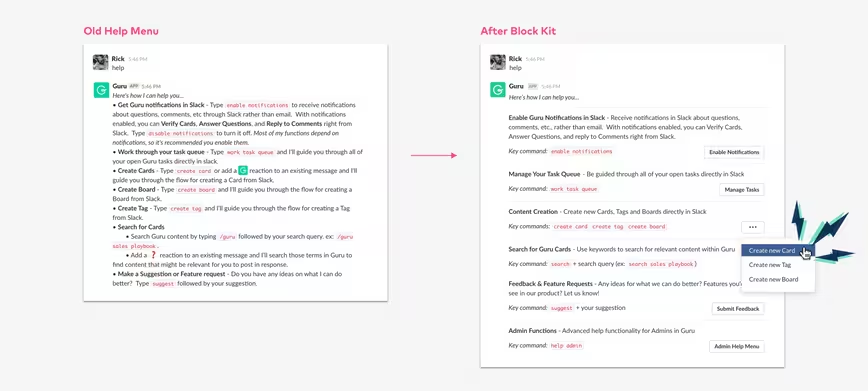
Slack isn’t just a messaging app. The main factor propelling the rise of this $7.1 billion platform is that it’s gradually become the nexus of how people work, thanks to integrations with Jira, Trello, and other popular workplace tools. To help increase the number of integrations available to its users, Slack today is introducing a new WYSIWYG UI tool called Block Kit Builder.
At the heart of this is a UI framework called — you guessed it — Block Kit, which sets a standard of how Slack apps should work. It compartmentalises Slack apps into stackable blocks, allowing developers to better visualize and order how information is presented to the user.
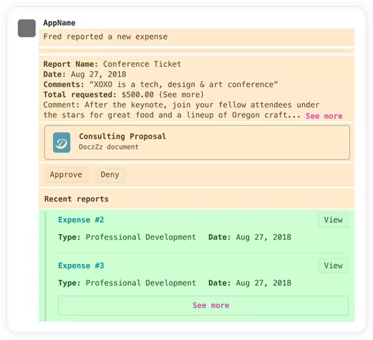
So, how does this look in practice? Take a glance at this example expense report app. At the top is the most important information. Below that, you’ve got the actions available to the user. Right at the bottom is contextual information — stuff that isn’t exactly pertinent to the task at hand, but helps put the primary information in a bigger picture.

With Slack now available across mobile, web, and desktop, Block Kit automatically handles the visual heavy-lifting, ensuring that apps look consistent across platforms. Slack developed the framework with its UI best practices involved, and Block Kit apps have a “write once, run anywhere” philosophy.
Bolstering this is a dead-simple developer platform. The Block Kit Builder itself is a WYSIWYG tool, allowing users to develop apps visually, without the need to write hundreds of lines of code. Speaking to TNW, Bear Douglas, Director of Developer Relations at Slack, explained that this would lower the barrier to entry for new developers, while also making existing Slack app developers vastly more productive.
“The great thing about the Block Kit Builder is you don’t need to have any context about what’s possible in the Slack message or Slack app,” she told me.
“Suppose I was working on an app for the Slack directory and I said to my designer to ‘you should go design my Slack interface.’ Without knowing anything about Slack, they would be able to drag and drop components to make the message so that it gets the end-user experience they’re going for,” Douglas added.
Slack, when framed against the broader workplace messaging market, isn’t especially remarkable. What makes it unique is the ease in which third-party companies can add integrations, allowing teams to be more productive and communicative. Block Kit dramatically lowers the entry for app developers to build for Slack. In our conversation, Douglas suggested it could even be used by non-technical people.
That said, building the back-end for a Slack app is still a complex affair. Piecing together the myriad of business logic continues to require a trained developer. However, on that note, there’s some good news. In August 2017, Slack acquired a firm called Missions. This no-code platform lets people build Slack apps visually.
Slack is in the process of integration Missions into the company, and further down the line users can expect to see an official way to create Slack app workflows without needing to write a single line of code. Sadly though, there’s no official launch date for this.
Get the TNW newsletter
Get the most important tech news in your inbox each week.


