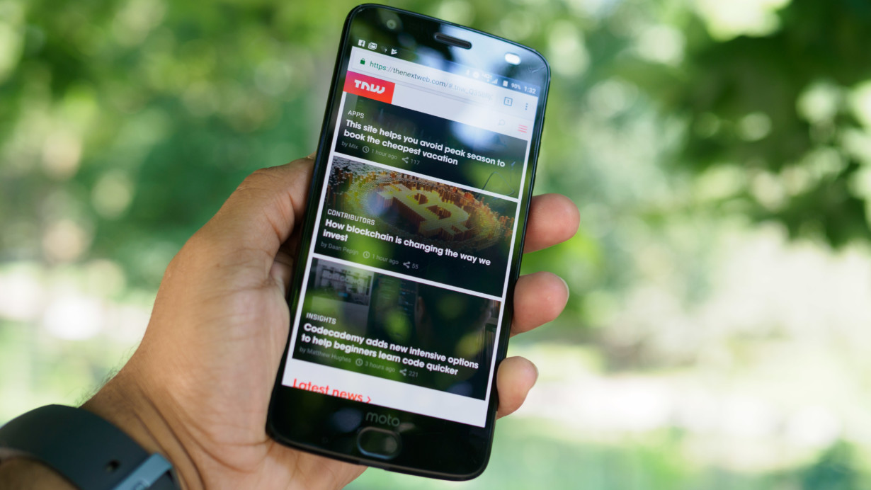
Motorola’s Z Force was one of our favorite phones last year, to the extent we picked it as the best phone for power users. Its snappy performance, long battery life, unbreakable screen, and modular flexibility made it a unique offering in an increasingly homogenous smartphone market.
The new Moto Z2 Force largely lives up to its predecessor, but it’s held back by some questionable design choices.
This time around, there are only two Moto Z models, the Force and Play. Motorola apparently decided to narrow its product portfolio by combining its two flagships into the Force – although I’m not sure why it didn’t just name it the Z2 for simplicity.
The specs are pretty much in line with the usual 2017 flagship, save for the shatterproof screen and Mods.
- Snapdragon 835
- 4GB RAM (US) / 6GB of RAM (Everywhere else)
- 5.5-inch QHD display
- ShatterShield screen (scratches easily, but is pretty much unbreakable)
- Moto Mods snap-on modules
- 2,730 mAh battery
- 64 GB / 128 GB (China) of storage
- MicroSD slot
- Dual rear 12MP cameras (color/monochrome)
- TurboPower Quick charging
- Black, gold, and grey colors
- Water-resistant coating on internal components
Design wise, the Z2 Force looks a lot like the original Moto Z. That’s no surprise, as Motorola needs to maintain the same overall shape to maintain compatibility with Mods. That said, there are some notable differences – some for better, and some for worse.
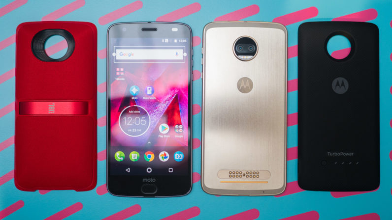
Instead of the original model’s subtle stripes, the Z2 Force uses a brushed metal pattern that both looks and feels premium. It comes in three colors – black, gold, and grey (T-Mobile exclusive) – though you can customize them using one of the many available Style Mods.
The phone feels impressively rigid given how thin it is, and the ShatterShield screen gives me a sense of security I simply don’t have with any other phone.
I’ve hit a previous ShatterShield screen with a baseball bat – twice – and the screen survived. I hate cases and screen protectors, so I can’t tell you how much of a relief it is to be able to carry a phone au naturel without any worry of breaking it.
That said, there’s an important caveat to consider: While these screens have always scratched more easily than your usual Gorilla Glass fare – they are basically layers of tough plastic – for some reason the Z2’s ShatterShield screen scratches even more easily this time around.
I noticed I was able to scratch the display with just my fingernail when I was trying to remove some gunk I’d gotten on the screen. This did not happen with the original Moto Z – I tried. The scratch is more of a really faint indentation, but it’s still pretty disheartening to see on an $800 device.
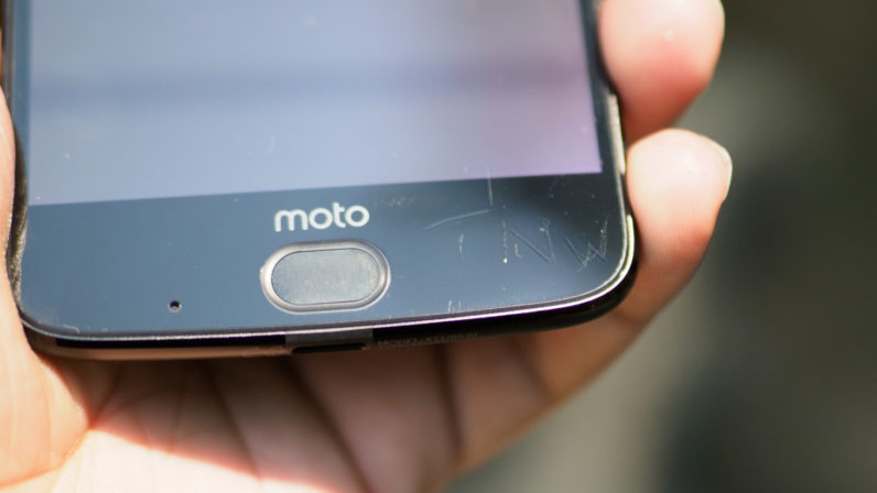
What’s more, the screen’s fit and finish just feels… sloppier. You couldn’t tell the screen was plastic on the previous model because of how well integrated it was with the body. This time, the screen is slightly raised from the edges and the fingerprint sensor, with a rougher transition between materials.
It basically feels like a well-applied screen protector. It didn’t ultimately mar my experience, but it made the phone feel less premium than it purports to be.
Oddly enough, Motorola seems to think the opposite. In a statement to Android Police, the company said it switched the screen to a “3D design” for it to be more competitive with flagships. I assume Motorola means the 2.5D curved edges on many flagships, but on the Z2 Force, I can only find rough edges.
Still, the company says that review units were some of the first production batch and it has “an improvement in the works that consumers will see shortly after launch.” But unlike previous generations, you won’t be able to send the phone to Motorola and get the top layer replaced.
Now for another questionable decision: the Z2 is too thin. That’s not a bad thing in and of itself, but it means the battery is 22 percent smaller than last years, at 2,730 mAh battery, instead of 3,500 mAh.
Let’s be clear, the Z2 Force actually has solid battery life. I regularly managed around 6 hours of screen-on time, on par with the Galaxy S8 and much better than the LG G6, both of which have bigger batteries.
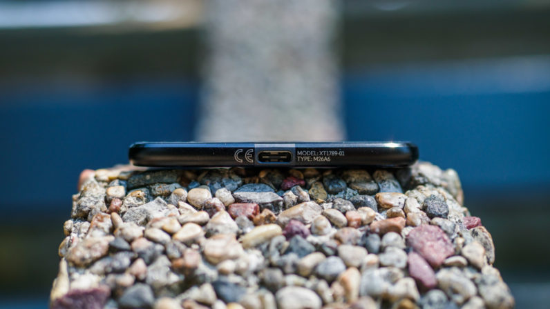
But the original Z Force was already only 7mm thick – as thin as an iPhone 7 – and didn’t need to be made any thinner. I kept thinking about how much better battery could have been if Motorola had just kept that extra millimeter. Not to mention it still doesn’t have a headphone jack.
The small battery is surely helped out by a near-stock version on Android. As usual Motorola has kept Google’s OS nearly untouched, save for a few genuinely useful additions.
Motorola’s gesture shortcuts for things like the camera (a double twist) and flashlight (a double chop) are among my favorites, and the company added gestures to the fingerprint sensor so you can hide the navbar and save some precious screen real estate.
That makes the giant bezels much more bearable, though it’s still hard to go back after using something like the the LG G6 or Samsung S8. Hopefully Motorola will fill in that empty space on the Z3.
The dual camera is probably the most notable update in this generation, and it largely delivers. Like Huawei – which pioneered the modern second camera depth sensing – the Moto Z use one monochrome and one RGB sensor.
The basic daylight shooting experience still isn’t as good as on the Pixel or S8, but it’s up there. The camera can struggle at handling scenes with tricky contrast, and in my experience auto HDR tended to prefer brightening shadows than recovering highlights, so it helps to expose on the low end.

Colors were vibrant and accurate though, and I appreciate how Motorola doesn’t oversharpen its photos.
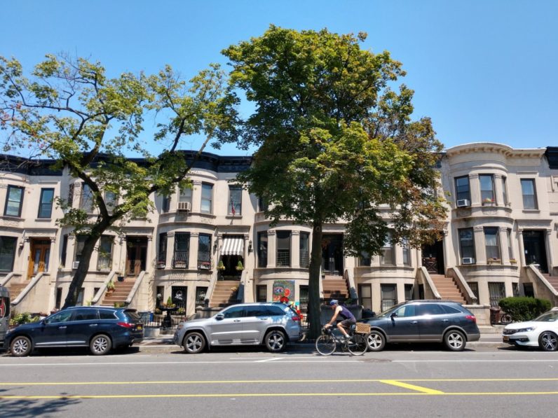
I was really impressed by night-time performance, where the camera managed to deliver surprisingly usable results. It seems to prefer retaining detail instead of using noise reduction to oblivion.
The camera has a dedicated monochrome mode I’m pretty ambivalent about. While the photos taken with the Monochrome photos are sharper than the color ones, I would’ve much rather had a wide-angle or telephoto lens instead.

All this adds up to a package that’s unusually difficult to compare to the competition. On traditional metrics, the Moto Z isn’t all that superior to its rivals. By some measures, it’s no better than its predecessor.
I’m left wishing Motorola had done more on its second go. With a bigger screen, beefier battery, and headphone jack, Motorola would’ve easily had one of the best phones on the market, even if it was a little thicker. It would be easy to recommend even without the mods.
Cut out the Force’s gimmicks and the phone feels a little outdated, a little boring. As it stands, there’s little reason to choose one if you’re not interested in its particular features.
In fact, for many, the Z2 Play is a better option. If you don’t care about dual cameras or the ShatterShield screen, the Play has longer battery life, does include a headphone jack (the audacity!), is much cheaper ($500 vs $800), and arguably looks better too. Despite the weaker processor, it feels nearly as zippy in everyday use.
On the other hand, outside of Motorola, there’s no other phone on the market that offers anything like the Moto Z2’s versatility. If the battery isn’t big enough, you can slap on a seamless battery mod. If you want a better camera, add the Hasselblad mod. Want a projector in your pocket? There’s one for that too.
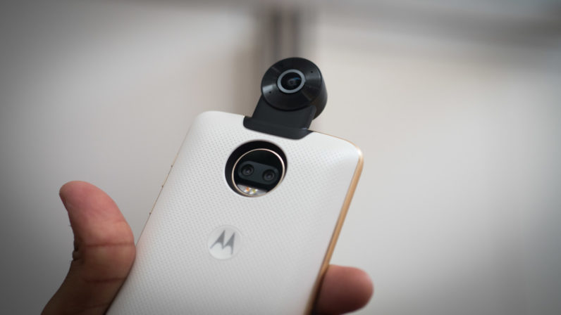
The Mods aren’t for everyone – they cost extra, after all – but some will find them invaluable, and I’m grateful there’s at least one major phone with a modular ecosystem. My girlfriend uses the original Z Force, and we use the Mods all the time – whether adding speakers for a day in the park, or just getting a quick battery boost after a long night out.
The same goes for the ShatterShield screen: I’ll gladly take some extra scratches for a screen I never have to worry about breaking. After all, I can always just pop on a screen protector.
Considering this is the first time you can easily get a Motorola flagship outside of Verizon, I expect the company to sell a lot more Moto Z2s, and rightly so. For all my qualms, Motorola is one of the few companies doing something radically different from the competition. I just hope the Z3 is a better at the smartphone basics, without the mods.
Get the TNW newsletter
Get the most important tech news in your inbox each week.

