If you live in the US or much of the West, you probably haven’t heard of Meizu. Though it’s occasionally made headlines for some interesting designs – see the rear display on the Meizu 7 Pro – it’s ‘only’ the world’s 11th largest smartphone maker, operating mainly in China and small pockets around the globe.
Still, when the company asked me to review its new M6 Note – a budget phone which does not actually have a stylus, despite the name – I thought I’d give it a shot to see what the other side of the world is up to. I’m glad I did.
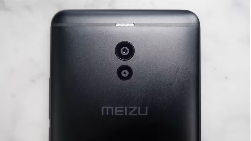
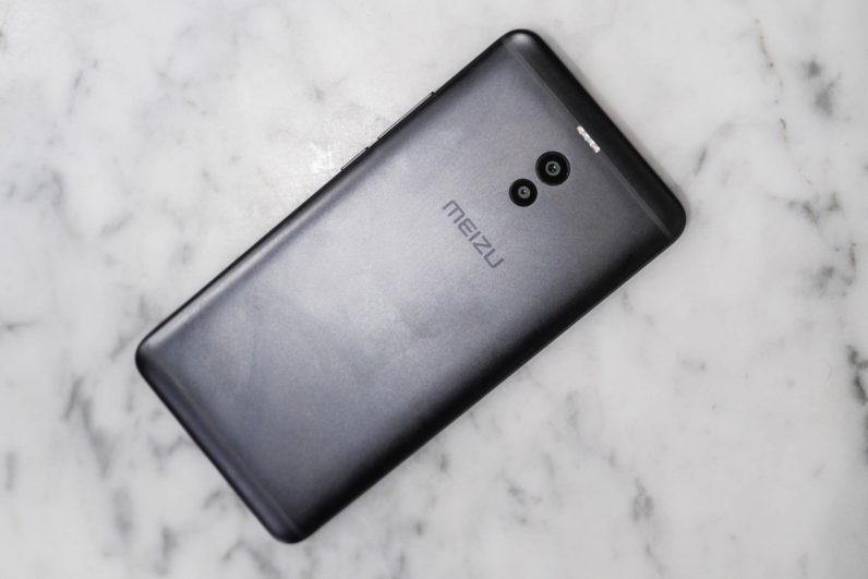
The device’s hardware feels very well-built for a device that retails starting around $160-70 dollars (CNY 1,099), if a little stoic. It’s a thick device, thanks to a chunky 4,000 mAh battery, but I appreciate the heft. My favorite design detail by far is how the company integrated the flash into the antenna band – it’s such a clever touch I can’t believe I haven’t seen it on another device. Less pleasant is the choice of a micro-USB, but at least it has a headphone jack.
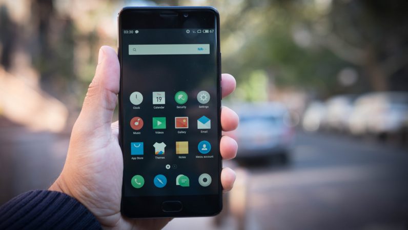
It’s 2017, so we need to talk bezels. The Pro6’s are average, which is to be expected from a mid-range phone. The display itself is decidedly average too – colors are a little too dull and cool out of the box. You can adjust the color temperature in the display setting, but the colors remain unexciting.
At least there’s a fingerprint sensor below the display, which pulls double duty as a home button and gesture pad. The fingerprint sensor is actually a button, so a full press goes home and a tap goes back. To access the recent menu, you swipe up from the bottom of the display on either side of the sensor. I would have preferred the traditional trio of capacitive buttons, but Meizu’s implementation is totally servicable and helps with one handed usability.
As this phone was meant to sell in China, it doesn’t come with the Google Play Store pre-installed, but it takes just a few minutes to download it from Meizu’s App Store. The device is running a heavily skinned version of Android called Flyme OS. The name that sounds a little too close to phlegm, but as far as heavy Android skins go, this is one of the better ones. I’m always appreciative of features like power-saving modes and theming engines as long as there’s no major performance hit.
Despite mid-range components – Snapdragon 625, 16/32/64 GB of storage, and 3 or 4 GB of storage – and heavy skin, the Note quite frankly was comparable to many flagships I’ve tried this year for everyday tasks. We’re simply at a point where optimization matters a great deal more than raw specs for typical performance.
Similarly, the Note has truly superb battery life – I generally comfortably got two days of use out of it, and never managed to kill the battery before a full day. If only more manufacturers would sacrifice a few millimeters for battery life.
The Note’s headline feature is its camera, something that’s generally the weakest point of mid-range devices. While it definitely has significant drawbacks and flawed and doesn’t outclass the best on the whole, it does excel in one area: Portrait mode.

Specifically, the portrait mode is beyond what you’d expect for the price. What I thought would be little more than a tendy cash grab actually turned out to be the camera’s best feature. Meizu, somehow, managed to create one of the most realistic portrait modes I’ve seen to date.
Meizu consistently does a good job of selecting around complicated edges – better than Samsung’s Note 8, OnePlus 5 or the Moto Z, in my experience. It’s not that it doesn’t screw up sometimes, it’s that it seems to be better at masking artifacts on the whole. Moreover, Meizu’s bokeh just looks more realistic than many others I’ve tried. It’s closer to something shot from a real camera than looking like someone just applied a Gaussian blur filter in Photoshop – at least compared to the competition.
To my eye, that’s largely because the Note tends to create smooth transitions between in-focus and out-of-focus areas – as opposed to making your subject look like a cardboard cutout. It also creates pretty realistic bokeh circles on highlight points, something other phones tend to miss.
I’d put it right up there with Google Pixel, Huawei Mate 9 and iPhone 8 among the best portrait modes I’ve used. I just wish there were a way to tone adjust the amount of blur; it can sometimes be too much.
The rest of the camera is more midrange-y. I like Meizu’s color rendition, and low light performance alright is when you turn HDR off (it’s much too grainy otherwise). It’s main shooter a uses an f/1.9 aperture on a Sony IMX362 – a solid sensor – but without OIS, the noise reduction algorithms could definitely use some work.
Side-note: The Note stamps a watermark on your photo by default. Why, Meizu? Thankfully it’s easy to turn off in settings.
The more frustrating issue is the lack of an auto-HDR mode, which seems baffling in 2017, even at this price point. Though the shutter is instant, it also takes a second or too to process HDR images, which feels slow for 2017. The HDR processing is pretty good though, so I just left it on all the time. Thankfully, Meizu says it’s working on implementing auto-HDR.

The Meizu M6 Note is available in a motley of countries around the globe. Though you probably won’t be able to get one easily in the US or much else of the world, the Note is surprisingly capable budget phone. If it were available more easily round these parts, it would be an solid recommendation in its price range.
Get the TNW newsletter
Get the most important tech news in your inbox each week.


