How do you redesign a site with 350 million monthly active users, 300 million comments a day, and a user base known to get a little rowdy when things go wrong? This is exactly the sort of challenge Reddit’s CTO and Co-Founder Chris Slowe has been tackling over the past year.
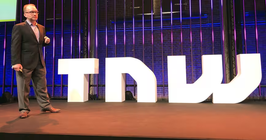
In a talk at TNW Conference, Slowe let loose a little about the recently redesigned “front page of the web,” aka Reddit. Perhaps the most interesting element — at least to me — was one that never made the cut.
The team knew after launching its first mobile app, in 2016, a redesign had to happen sooner, rather than later. The mobile apps for Android and iOS were polished, futuristic-looking versions of Reddit, while the web version looked a bit like an IRC channel that had overflown onto a domain.
The massive overhaul that the desktop site required would almost certainly ruffle more than a few users’ feathers. Slowe let us in on an internal discussion to appease the most demanding of those users. Reddit, he says, is primarily a platform for criticizing Reddit, after all.
In talking it over, the design team initially focused on the backlash it received during the last redesign, when it added a sky blue banner behind Snoo, Reddit’s alien mascot — a move that, as Slowe puts it, Reddit users almost universally hated. Now able to forecast exactly this sort of thing, the team had an idea that might allow users to warm up to the new design after it went live, rather than immediately discounting it.
The idea was to place intentionally ugly elements throughout the site. By giving users something intentionally ugly to focus on, it would, presumably, draw attention away from all the changes and instead provide a rallying point that brought the community together in their near-universal hatred of said thing… like the blue banner.
These elements could shift the focus of the conversation away from all that they hate about the new look, and instead toward an intentionally placed attention trap. It’s a way to avoid the “ruining the site” accusations Slowe is so used to hearing these days.
(Un)fortunately for Slowe’s team, at least, the plan never made it out of the idea phase.
Get the TNW newsletter
Get the most important tech news in your inbox each week.
