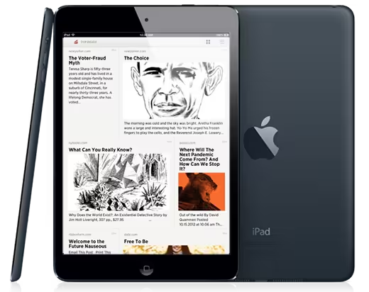
Reading is one of the most popular pastimes for owners of the iPad and popular ‘read it later’ service Readability has just made things a whole lot more convenient for owners of Apple tablets after it introduced a redesigned viewing option, Grid View.
The update, which is available only for iPad and iPad mini users thus far, lays out Readability’s Top Reads and Longform content — articles that it handpicks from the Web — in a more aesthetically pleasing manner that utilizes the larger screen space that both devices provide. That’s quite a big change from the more simplistic linear list of articles that displays on other devices.
“Grid View gives readers a more inviting, visual way to discover new content in Readability, and it’s the perfect complement to our redesigned Top Reads website,” the company said on its blog. “So now you have two great new ways to check out the latest snapshot of what the entire Web is reading.”
The company explains that the new layout takes its cue from its TweetMag app, which curates and serves up links from Twitter. TweetMag’s layout engine has been brought over and paired with the (considerable amount of) content that Readability includes these days.
There’s no word on whether the update will make it over to the iPhone or Android devices — though an appearance on tablets powered by the latter seems likely — but owners of iPads of all sizes can grab the updated app at the link below.
Related: Deep Dive into Readability, an efficient save it later reading service with curated content
Image via Shutterstock / Catalin Petolea
Get the TNW newsletter
Get the most important tech news in your inbox each week.


