 According to the New York Times, Google will start rolling out a major new design of its search results page, making it much more graphical in nature.
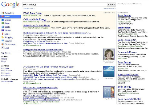
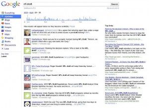
The majority of the changes will happen in the left hand column (which is currently defaulted as “Show options…” but seems to be from the screenshots to be always on) and will change depending on what type of content is searched for. So, for instance, if you search for the movie Avatar, Google might show you a Shopping icon or perhaps Discussion.
One of the great things about Google has always been its design sensibilities, and the results page has certainly been one place that has lagged behind for some time – it basically has stayed all-text – so this should be a welcome upgrade.
That said, Google has only updated this page a few times for a reason – the results page is what the company’s fortune has been built on, so even a slight change in how effective the page is for AdWords conversions can mean billions of dollars to Google. So we’ll have to see how this new design does from a usability and conversion perspective.
The new design also seems to refocus results onto Twitter, Facebook and other social media searches and, frankly, the whole redesign somewhat reminds us of Friendfeed.
Other features of the redesign will include a more prominent featuring of the previously released Wonder Wheel (a graphical representation of results) and a Something Different button that seems to kind of be like Google’s I’m Feeling Lucky button on the homepage.
Regardless, Google doesn’t make many changes to its search results very often, so this is really a pretty big deal. They’ll be rolling it out gradually over the course of the next 48 hours it seems, so please let us know when you start seeing it and what you think of it.
Here is what a search for “solar energy” might look like:
Images: The New York Times
Get the TNW newsletter
Get the most important tech news in your inbox each week.

