I spend a an inordinate portion of my day on Twitter, so any time a new client comes along, I’m always interested in checking it out. This goes all the more so for any client designed by Glasshouse Apps, the studio behind Early Edition 2, Barista and other lovely iOS apps.
I’ve had the opportunity to test out the result of their work, Quip, which is launching today on the iPad. It’s a beautifully crafted experience that turns the Twitter timeline on its head, delivering tweets, replies and conversations in readable, chronological order.
So much of what I do on twitter is based around the ever preset stream. I follow around a thousand people and my stream flows by at a fairly brisk pace. This is important for the work I do, but it definitely doesn’t lend itself to following conversations very well. It also doesn’t let me see all of the Instagram shots and twitpics that my friends post throughout the day.
This is where Quip excels. It’s a twitter client that is built for coherent display of conversations that may go by you so fast that you lose the thread, or that your normal client may leave bits out of. I’ve honestly never experienced Twitter like I have while using Quip.
It takes the frenetic pace of Twitter and calms it, letting you absorb and digest the things the people you follow have been conversing about.
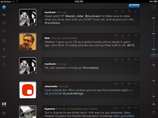
The timeline view you’re presented with allows you to scroll through your recent history, with a quick scroll on right letting you buzz through faster. That quick scroll can be locked away, but it serves the dual function of highlighting your new tweets in blue, so you can see where you left off.
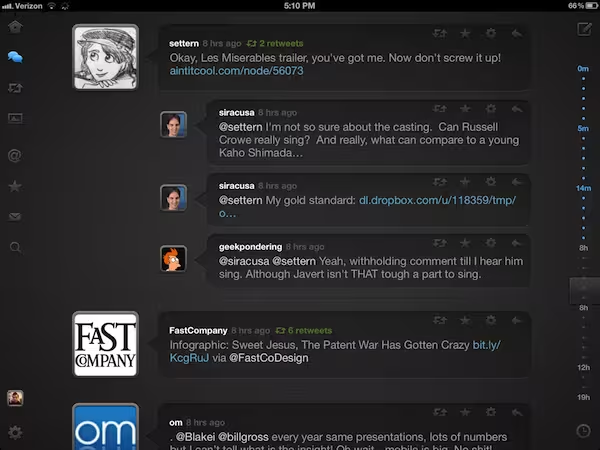
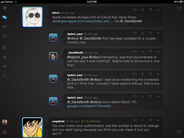
To view a conversation surrounding any tweet in your timeline, tap and hold on the large profile picture. Quip will go out and find all of the replies, then reshuffle the conversation to make sure you see the originating tweet first. Then you can tap anywhere below the tweet to expand that conversation and read it. It’s pretty fantastic really.

The next tab down lets you see only conversations, but the ‘find all bits of this’ shortcut still works to gather and sort them all. This is really the core section of Quip, as it lets you browse discussions around ideas, rather than a disjointed feed of tweets. It works so well because there is no switching to another modal view to view conversations, it’s all right there just a tap away. It’s a very relaxing experience.

Further on down you have access to a stream that just displays the images culled from your feed. This provides you with a pure pictographic tour of your timeline, isolated from all of the chatter. When viewing any images in full screen you do still get a nice popup overlay that gives you the tweet for context.
The direct message section is also one of the most extensive I’ve seen in any Twitter app, with a deep cache that keeps a ton of your conversations handy, represented by the same large profile thumbnails and message counts. I’ve taken to leaving it up as a sort of DM message board that I switch to to communicate with Twitter friends.
It’s worth noting that every place a tweet is visible in Quip it is also fully actionable. You can fave, RT, replay and such, without having to visit a detail view. A nice dark-on-dark theme keeps this from looking busy.

But what engenders the most love for me in Quip is that the details here are so sweet. It has — hands down — the coolest dialog boxes of all time. Try changing your Twitter account or performing a search, the prompt flies up out from the bottom on animated silver wings, I kid you not. It was one of the most delightful things I’d seen in an iPad app in a long time.
This detail extends to the Twitter profile boxes, which are detailed and artful, and the lovely icon. Tis is truly an app made with care, something that always shows the most when you look at the little cracks and corners that normally get overlooked.
I don’t think that Quip could ever be my primary Twitter client. I’m too much of an information addict and I’m tied to my stream throughout the day. But it has given me a different way to read Twitter, a more coherent way that gives it the ‘lean-back’ feel that no other client has.
Other apps make Twitter feel like business to me, Quip makes it feel like pleasure, and that’s very cool.
➤ Quip for iPad $1.29
Get the TNW newsletter
Get the most important tech news in your inbox each week.


