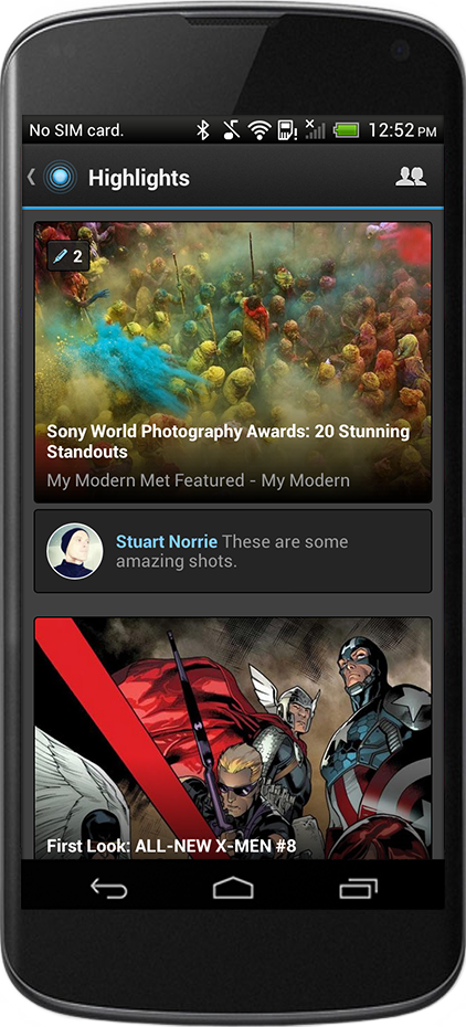
Pulse has rolled out a new feature today for its digital news aggregation app called Highlights, which pulls in a selective feed of news stories shared by your friends and family on Facebook.
Pulse, similar to Flipboard and Circa, is an Android, iOS and Web app that grabs your favorite news and media websites, bundles them together and then presents them in a clear, readable format.
As a news consumption service it works very well, but it’s always been a solitary affair relying mostly on Pulse’s own opinion of what’s worth reading. Earlier this month, however, the company added social integration with Instagram, Flickr, YouTube, Tumblr and Facebook accounts, reeling in uploaded content shared by friends or followers.
This content was formatted specifically for Pulse, with a redesigned article layout for photos and videos. The menus for setting this up were buried and long-winded though, and meant that it was all curated in a pre-defined category such as News, Technology or Men’s Lifestyle. Most of the time, it made little sense.
Highlights is an entirely new area, available by swiping to the right from the home screen, that shows stories shared only by your friends on Facebook. It strips away all of the status updates, check-ins and other additional information though, simply showing you the content and news stories based on how many times they’ve been read, shared or highlighted.

It’s also possible to add new articles to your friends’ accounts simply by tapping the blue Highlights icon at the bottom of a piece. This button can also be used to share articles through external social networks such as Facebook, Twitter and Google+, but the focus here is on building a curated feed for your closest friends.
Highlights has also given user profiles some added functionality, as it’s now possible to tap the ‘friends’ icon in the top right corner of the feed, select another user’s account and see all of their highlights in one clean view.
Pulse says it’s trying to focus on “timely curation, discovery and empowerment” of content in their apps, rather than simply offering another way of liking a story and moving on without a sidelong glance.
At the moment Highlights is restricted to showing full stories, but the team is working on being able to highlight a particular quote, image or passage. “It really becomes powerful to see what’s being highlights in a long form article,” Akshay Kothari, co-founder of Pulse said.
All of this follows the release of Pulse 3.0, a major redesign of the app that also introduced a bunch of new features including unlimited publications per page – rather than the original 12 – a sidebar for navigation and infinite scrolling.
The updated app with Highlights is available right now for Android users, although the iOS version is still awaiting approval in the App Store.
Disclosure: This article contains an affiliate link. While we only ever write about products we think deserve to be on the pages of our site, The Next Web may earn a small commission if you click through and buy the product in question. For more information, please see our Terms of Service.
Image Credit: PASCAL GUYOT/AFP/Getty Images
Get the TNW newsletter
Get the most important tech news in your inbox each week.


