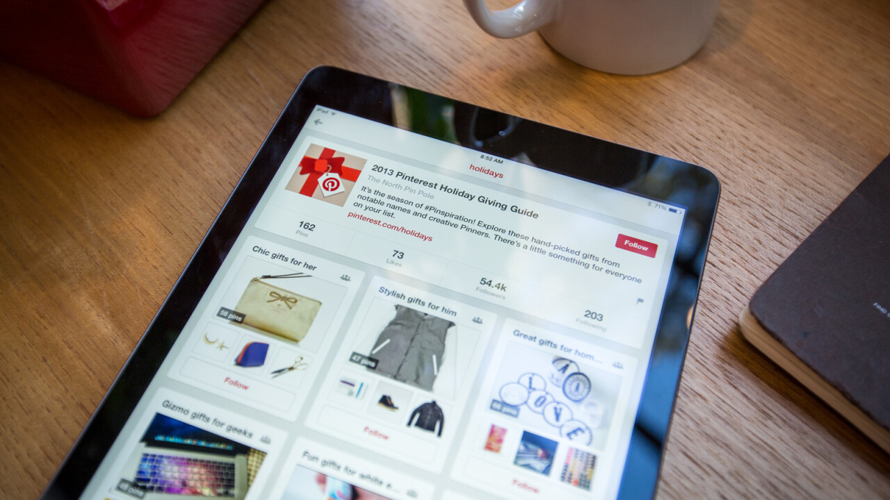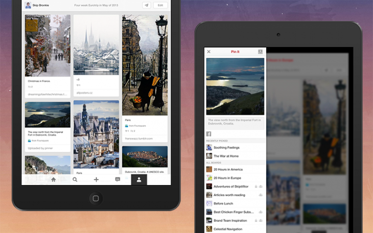
Pinterest fans will be pleased to hear that the firm’s iPad app has finally been given the iOS 7 treatment, revamping the design with a sparse, clean grid layout similar to its iPhone incarnation.
A slim, subtle menu has been added to the bottom of the screen this time around, making it easier for users to jump to their own profile, look at recent notifications and begin a new search query. When pinning something new, Pinterest will show recently viewed boards for faster sharing, and there are also three extra ‘secret boards’ for the run up to Christmas.
Last but not least, the updated iPad app now has a contextual long-press menu so that when users are browsing an interesting board, they can quickly share it with a friend or see boards with similar content too.
➤ Pinterest | iOS
Get the TNW newsletter
Get the most important tech news in your inbox each week.


