Following a trial in January, Pinterest has launched a new look for its content-sharing social network today, which it says should start rolling out to users via an invite “soon”.
The first noticeable change is to the close-up view of pins. Now, when a user looks at a webpage for a specific photo or web clipping, they’ll be able to see other pins from the same board on the right-hand side. It uses the exact same mosaic-esque layout used on the home screen and individual boards, further extending Pinterest’s design ethos across the website.
Just underneath, users will able to see other pins sourced from the same website. So if, for example, you’re looking at a pair of incredible shoes, some of the pins underneath should show other kicks available on their online store. Likewise, a stunning landscape shot might have other snaps uploaded by the photographer to this website.
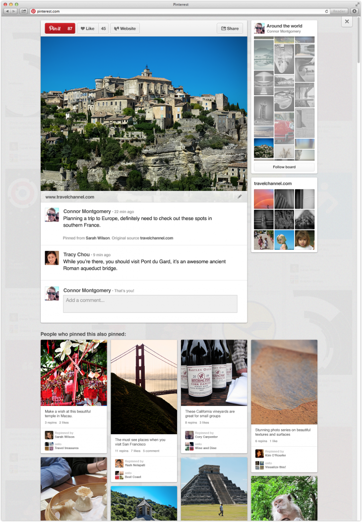
At the very bottom of the screen is arguably the most significant design change though. Pinterest now shows a board, covering the entire width of the webpage, that displays pins posted by other users who also pinned this content.
Follow? The idea is that if you’re interested or intrigued by a certain pin, the likelihood is that you’ll also enjoy other pins posted by that Pinterest user. The likelihood, however, is that more than one user has posted that image or link though – so the new feature offers a way to look at all of this related content collectively.
Pinterest says it will be updating its Android and iOS apps “soon” to include “People who pinned this also pinned” content.
The social network has been working hard elsewhere too. The end result is a simpler and cleaner experience marked by subtle changes such as slightly bigger pins.
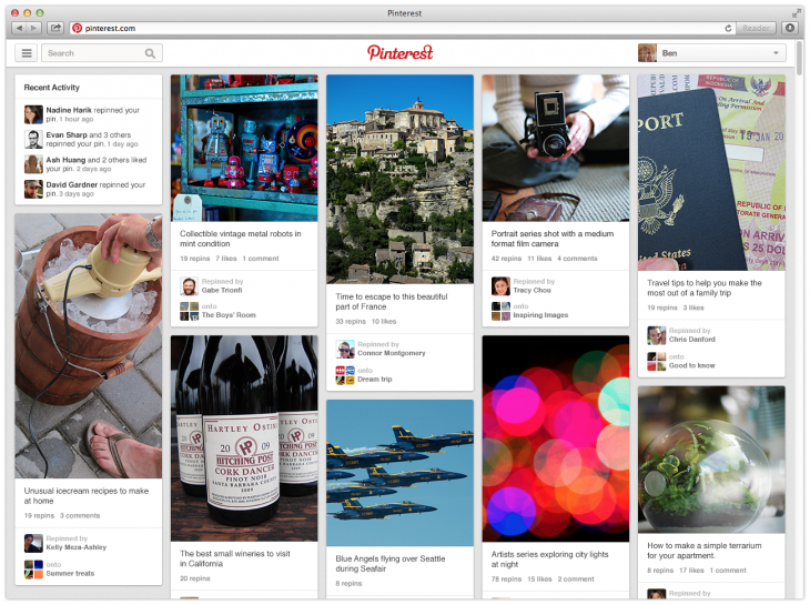
“We also responded to some feedback from pinners who told us they hated losing their place while browsing,” a blog post reads. “Now, when you scroll through pins and click on something that interests you, the back button lands you right back where you were no matter how far you’ve gone.”
These changes should keep users engaged in the site, not only because it’s a more enjoyable experience to navigate, but also because it’s easier to find new and relative content. That in turn increases the likelihood of a user being interested in a particular product, service or experience – improving Pinterest’s potential for monetization further down the road.
Today’s news follows the launch of a new analytics service earlier this week. Last month, Pinterest closed a $200 million funding round at a $2.5 billion dollar valuation, according to Kara Swisher at All Things D.
Get the TNW newsletter
Get the most important tech news in your inbox each week.

