Apple’s Photos organizer and editor, part of OS X 10.10.3, was released to the public today, and, as many expected, it is designed to facilitate a smooth transition for users of the old iPhoto.
Photos is a modern, streamlined app and will be hugely beneficial to those who also happen to be packing an iPhone with the analogous mobile Photos app installed. You will immediately spot the resemblance in terms of organization and interface of the two, and that is by design.
If you’re fond of the way Apple has organized your photo album on the iPhone and iPad, then you will be thrilled that the organization scheme on the desktop Photos is analogous. Most people are shooting, accessing and organizing photos on a mobile device, so aligning the two removes the disconnect.
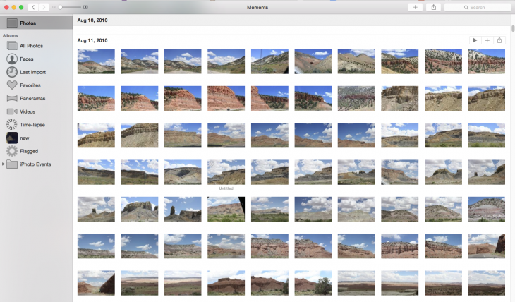
Interface
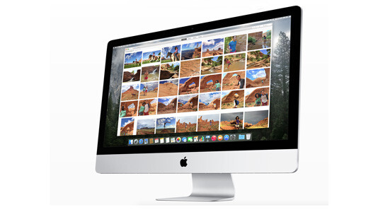
The desktop interface will be the biggest adjustment for users, but it’s a critical improvement over iPhoto under any circumstances. The main Photos view of Years, Collections, Moments and Albums has a dynamic, modern feel. Resize the sidebar and watch as the images dynamically grow or shrink.
Arrow-based navigation lets you easily move from one full frame photo to the next, but you can also pick and choose from the library.
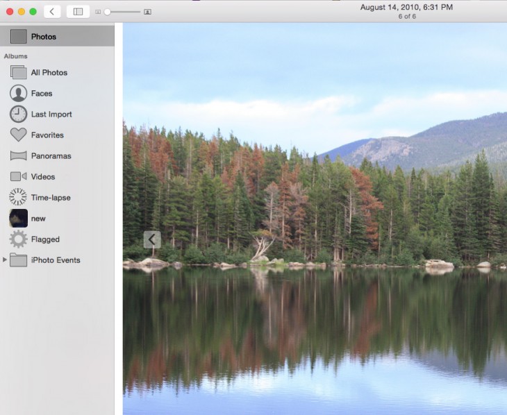
Working on a laptop gives you full control of your photo collection via familiar trackpad gestures. Apple has been pushing its gestures on its MacBooks for years and they have been implemented to positive effect in Photos.
More than anything, the new desktop Photos reminds me of late, great iPhoto for iOS: the new slider editing interface is light years ahead of iPhoto and a welcome update, though arguably that could have been implemented years ago, as Apple was already using the technology.
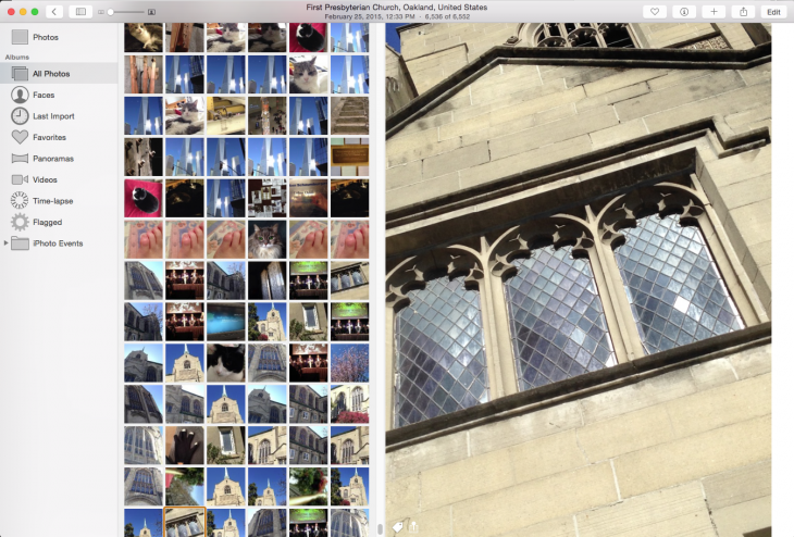
In Photos, events are now albums — just like on the mobile app — and located in a single folder, accessible under a dropdown menu. I’m not crazy about that particular innovation: With the old Events, you could combine the ones you wanted, but the new interface is less flexible in letting you merge events. You can move and switch places, but not combine. The new Photos also does not carry over the star rating system from its predecessor; star ratings are now key words.


Editing tools
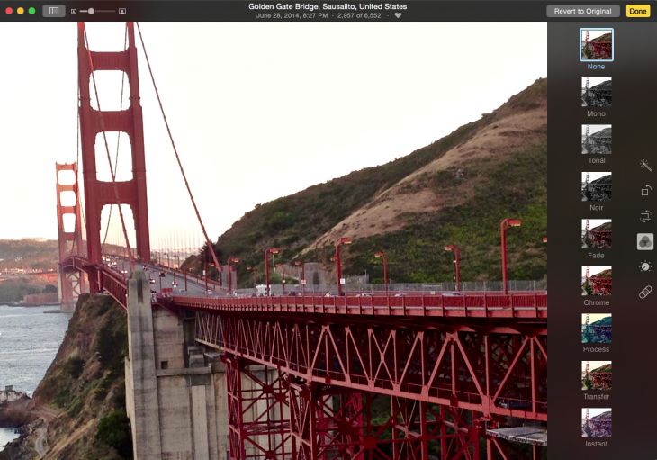
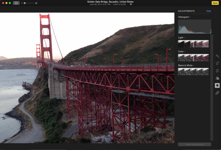
Apple has changed the editing toolbar for the better, replacing antiquated controls with more advanced tools that enthusiast photographers are now used to from myriad iOS apps.
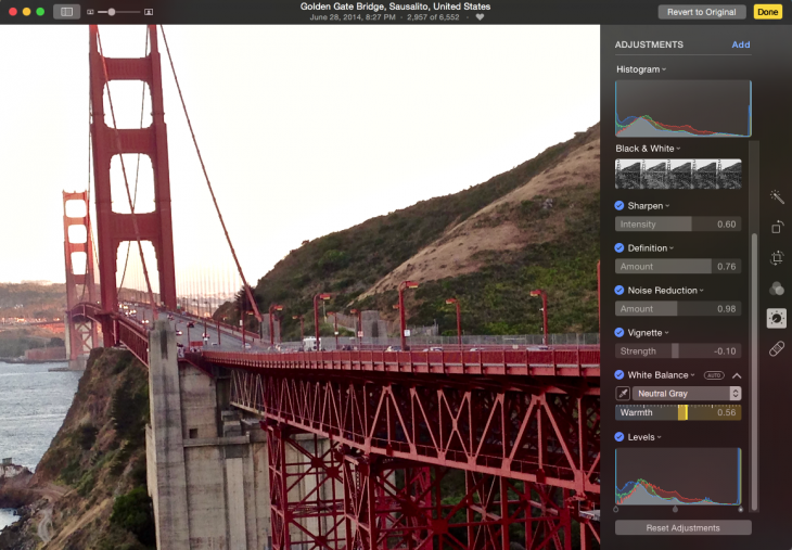
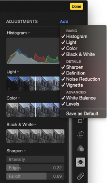
For example, you get by default, slider-adjusted Light, Color, and Black & White controls. But if you peek under the Add menu, you’ll see additional tools that you can set in the sidebar: Sharpen, Definition, Noise Reduction, Vignette, White Balance and Levels. Each slider is equipped with an Auto button.
Because these tools are dynamic and precision adjusted, they are very easy for amateurs who enjoy tweaking their photos to use and learn. In a tip of the hat to Aperture, the Levels tool lets you do adjustments within its own histogram.
 Apple has included the iOS filters on the desktop, and they look fine. It would have been nice to see a few more added, but the idea of keeping this feature analogous to the mobile version, and simple, is also compelling. There are plenty of places to go to find new filters.
The editing tools will likely suit the target audience, but they will not satisfy pro-level users. But there is a way to set up the more advanced editing tools to show up by default for all image edits. When you click the ones you like under the Add Menu, just click the Save as Default button and they’ll show up for every edit.
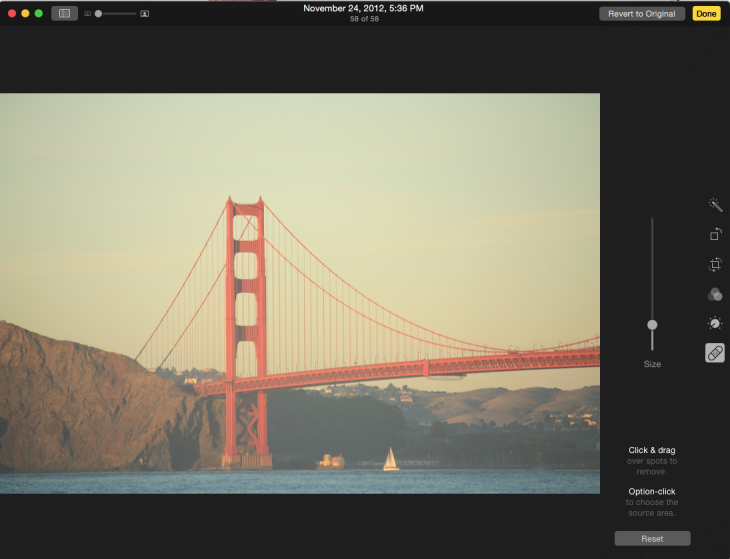
The improved Retouch tool combines a clone tool with a spot healing brush that should remove small flaws from an image. Like most such tools, it worked well on small items with smoother backgrounds, but would not smoothly remove a person, say, from a busy background.
iCloud Photo Library
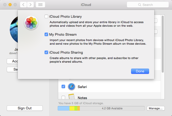
Not everyone wants to use iCloud, but if you do, the iCloud Photo Library will sync your high-resolution photos and videos between devices. This lets you keep full versions of your photos in the cloud, salvaging storage space on your space-restricted laptop. However most people will need to pay to upgrade their storage plan.
The iCloud Photo Library shares your photo edits between devices, too, so that you can see the better exposed shot that you fixed on your Mac on your iPhone, iPad, Apple TV or Apple Watch (eventually).
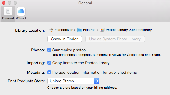
Note that the iCloud Photo Library applies only to the library you choose as the System Photo Library — if you have multiple libraries, Apple has a process for how to deal with them.

Wave goodbye to Aperture
When Apple merged the iPhoto and Aperture libraries years ago, some observers assumed (hoped) that at some point Aperture would simply replace iPhoto. That was not farfetched as, over the years, Apple had left iPhoto to either simply wither away without making confusing features easier to use. Photos has mostly remedied that without adding the advanced features that professional photographers seek.
Aperture, on the other hand, started life as a pro level app that people were trained to expect a learning curve. And once they got through that, Aperture had an amazing range of editing and management tools. Photos will not replace that functionality, but it has added some controls that are reminiscent.
Bottom Line
As a classic replacement to the traditional iPhoto, Photos is a long overdue and solid upgrade for the consumer and amateur market. If you’re looking for a pro level photo management tool and editor, I suggest looking into Adobe Photoshop Lightroom or Corel Aftershot Pro.
➤ Photos
Updated at 6:13 pm PST to clarify an image editing process.
Get the TNW newsletter
Get the most important tech news in your inbox each week.


