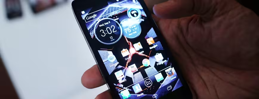
We love Android devices as much as the next person, but sometimes the vanilla Android experience leaves us wanting a little more. Thankfully, it’s possible to change the whole look and feel of your Android device with only the minimum of effort – and no need to root.
Android launchers, or home screen replacements as they are sometimes known, aren’t anything particularly new but in recent months the idea of completely changing how your phone looks has broken outside of Android geekery and into the mainstream, so we thought it high-time we found out which are the best.
There are obviously a lot more features than we have time to go into for each now, but what we’ve got is a good overview of some of our favorites. As always, tell us your favorites in the comments and we’ll take a look at them for potential inclusion.
If you’d like to view this post on one single page, you can do so here.
Aviate
Aviate is one of the newer Android launchers on the scene – in fact, it’s so new it’s still in invite-only beta mode, but maybe you were one of the lucky ones who grabbed a code from us a few months ago.
Rather than focusing on providing tools for creating icons, shortcuts and widgets in a whole range of wacky shapes and colors, Aviate takes a smart, mature approach to the custom Android home screen, with the key idea behind it being that it will provide contextually relevant information, no matter what you’re doing.
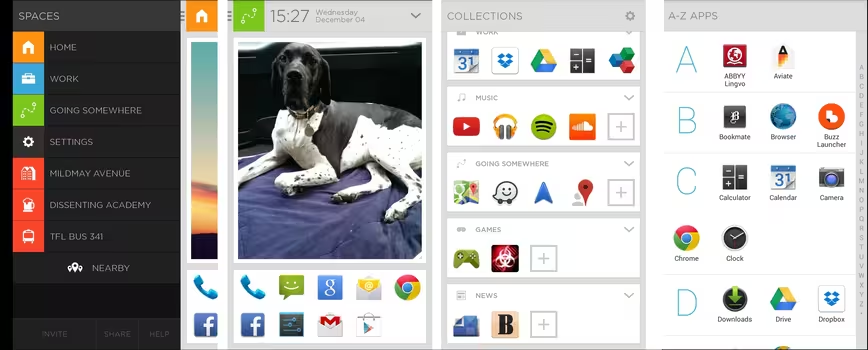
So, once you’ve installed the app and set it as your default home screen, the main screen that you’re met by is the second image above, the one with the dog. The first thing that you’ll notice is that your apps have been automatically arranged into Collections (image three above), like Work, Going Somewhere, Music, Games, News, etc. Naturally, you can edit the apps in these collections and create your own too. If you can’t seem to find what you’re looking for, the full list of installed apps can be found on the home screen (and in the image above) to the far-right.
Scrolling left from that first screen gives you quick access to some preset spaces – selecting any of them puts a slightly different set of apps and features at front and center. Aviate also automatically shows any other pertinent local information.
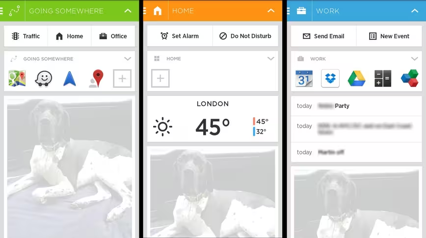
If you’re looking at the main home screen, scrolling that main image (which is customizable or removable) presents you with quick access to the apps and features associated with the ‘Space’ you’re in. Shown above are the three pre-defined spaces, with the company considering the possibility of adding new ones in due course. Apps relevant to each of these scenarios are placed at the top, and as shown in the Home Space, new apps can also be added (it’ll recommend some if you click the + icon) if you don’t have anything installed.
There’s also a settings Space too, which provides quick access to phone functions like switching WiFi or Bluetooth on and off, and things like that.
With a slick, clean UI and some smart, context relevant content, Aviate is one of our favorite launchers at the moment – and we’re hoping it can only continue to get better as it matures.
➤ Aviate
Buzz Launcher
Launching in beta back in March of this year, Buzz Launcher is another full homescreen replacement, with all the bells and whistles you’d expect.
Rather than focusing on a particular set of features or core experience – like the context relevance of Aviate for example, Buzz Launcher goes for all-out optimization.
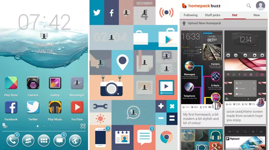
It does this in two ways: either by letting you loose and allowing you to create and customize your own widgets, backgrounds and other icons, or – if you’re a bit short on time – you can select from thousands of the pre-made options that the community have created. On the left, you have the ‘standard’ Buzz Launcher home screen and in the middle there’s one of the pre-made home screens that someone else uploaded. Applying entire home screens to your phone is as simple as hitting install, and then confirming once it has downloaded.
By providing this facility to download (or upload) different home screen packs with almost no effort at all it fosters the sense of community, and users have the option to favorite, comment on, download or recommend particularly good packs. With staff picks and a ‘hot’ packs section, it’s pretty easy to jump straight to some of the best. The right image above is the central store for all the uploaded themes.
With lots of personalization options, you’ll find some wildly varying ones too, and not just in the obvious ways. For example, with some layouts, you’ll find that the full app listing is provided in a semi-transparent overlay, meaning you can still see part of your home screen. Simple, but a nice effect. It’s worth noting, as everyone uploads these home screens themselves, some are more appropriate than others for high-resolution displays – currently the ‘homepack buzz’ store doesn’t provide any facilities for filtering by device resolution.
While downloading home screens is free, you’ll notice that the greyed out icons denote apps that aren’t yet installed – this can be anything such as a free one like Path, or a paid-for one, in which case if you want to use the home screen as designed, you’ll need to pay for the app. You also have the option of simply making the shortcut point at something else.
Themer
One more app that’s still in beta mode, Themer is another home screen launcher that takes the largely pre-made theme route, rather than allowing you to spend endless amounts of time creating your own custom widgets.
As with all the others, once downloaded, Themer appears any time you’d normally see your home screen – so when you unlock phone or hit the home button.
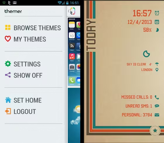
Below, just one of the many themes available to download for free on Themer.
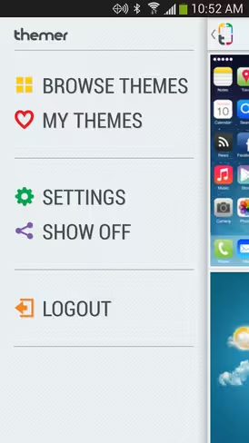
Adding new themes is easy enough, you simply navigate to the Themer settings menu, or hit the Themer icon in the app drawer. Long-pressing anywhere on any of the home screens also pops up a list of options, from which you can select to download new themes. Then all you have to do is actually pick one. They’re free and more are being added all the time. It’s worth noting that first time out you’ll be prompted to log in with Google or Facebook before you can download a theme – it requests basic access to your account information.
There’s a whole lot of pre-made themes to select from too. Other options, like changing the wallpaper, the number of home screens, quick access to apps and more are also accessible from this pop-up options list.
It strikes a balance somewhere between Aviate and Buzz Launcher, by providing you with options to change icons, wallpaper and other things you’d normally be able to customize with Android, but doesn’t do it in an overwhelming way.
Similarly, while there’s a similar pre-made theme element as with Buzz Launcher, there’s far less information on show about the number of downloads, favorites and other things that have led themes to end up in the ‘most popular’ or ‘trending’ categories.
If it all feels like it would be a little too different for you, there’s also the option of importing the apps from your previous home screen.
If Themer doesn’t know which app is your favorite for a task – playing music for example, it will ask you the first time – and from then on it will use it as the default without prompting. Naturally, you can change these default settings in the preferences area – and indeed, restore your original home screen if Themer’s becomes a bit too much.
➤ Themer
Nova Launcher
Nova Launcher is a bit more straightforward than some of the others here – providing you with a slightly tweaked version of a normal home screen – and tools to further fine-tune it to your liking.
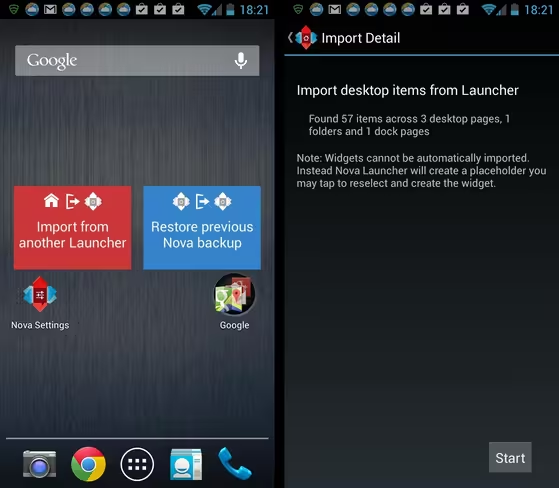
On first install it will ask you if you want to import a home screen from another custom launcher, or the stock Android setup.
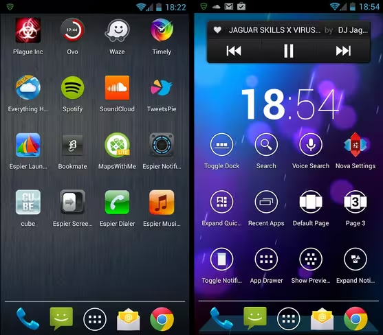
The biggest change to the normal home screen operation is that it’s based on a revolving 3D cube UI. So, when you scroll left or right to move through the home screens, it actually revolves – it’s a pretty nice, and importantly, fluid effect that doesn’t seem to slow things down, which can’t be said for other 3D UIs we’ve seen. Mostly though, things look a lot like normal by default, although there are features under the surface to make customizations.
What Nova is great for is taking a productive approach to your home screens. If you find yourself looking for certain device settings frequently, you might want to do what I’ve done (above right) and add all the Nova Actions to one home screen. I popped on a clock and a Sound Cloud widget too. Most of the pre-made Nova Actions widgets are used to quickly jump to frequently used settings and options.
Although not the most fully-featured, Nova Launcher certainly has some appeal, and there’s also a Nova Launcher Prime available for $4/£2.60, if you’d like more customization options.
Espier Launcher
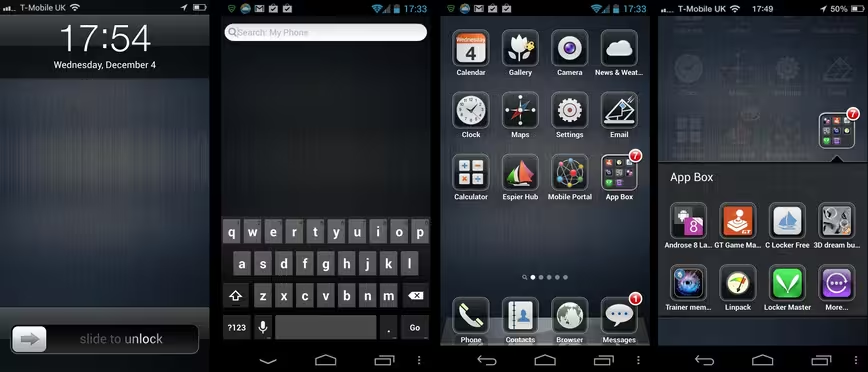
If what you’ve got is an Android phone, but what you really like the look of is iOS, then the Espier Launcher might be worth a quick look.
‘Inspired’, let’s say, by the look of Apple’s mobile OS, Espier has recently been updated to reflect some of the changes rung in by the arrival of iOS 7.
Combining the look of Apple with the features of Android might sound like a dream scenario for some, but the app is much more of a one-trick pony than some of the others in this list. While there are other themes available, if iOS is really what you’re after, then you’ll probably stick with the default.
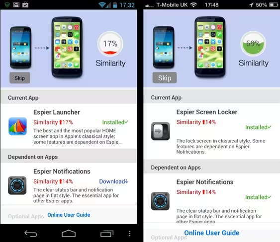
When you first fire it up, it shows you a screen showing how similar your current setup is to the look of iOS. It also recommends apps you can install to increase the similarity percentage between the two. As you can see in the image above, some of those changes include tweaking the look of things like the notification bar, which more closely resembles iOS in the right-hand image.
However, as these change core functionality, they each require individually downloading from the app store – the same goes for themes and other plugins too. Ultimately, it works, but the system doesn’t feel as integrated as if it used a central portal for downloading them all.
While a lot of the basic features and functions are free (it also has no ads), there are still some extra options you’ll have to pay to get access to if you want them. For example, if you want to Choose your favorite search engine, you’ll need to pay 600 Espier Coins to get the extra license. Removing the AppHub folder will cost 1,000 Espier Coins and if you want to save images from the Online Gallery you’ll need to subscribe to this option, which costs 500 coins every 30 days. In real terms, 1,000 Espier Coins is the equivalent of $5. Whether or not this seems like good value is for you to decide.
Dodol Launcher
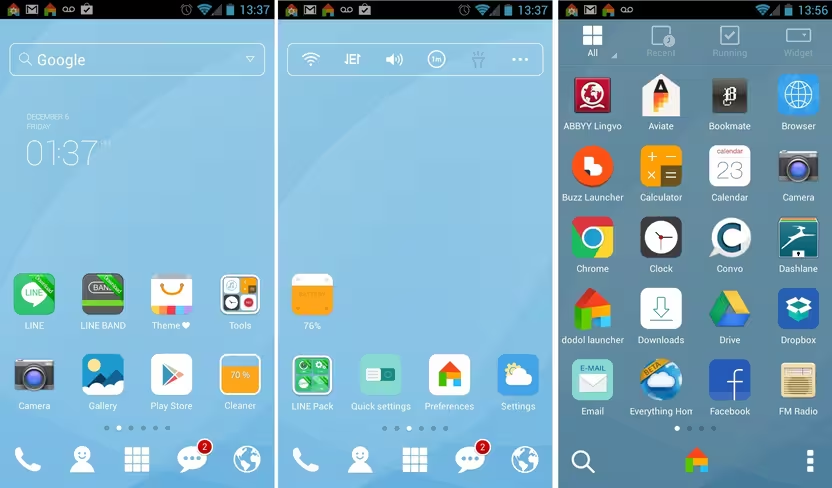
The Dodol Android launcher is one of the simplest in this list, and it’s for that reason that it made the cut.
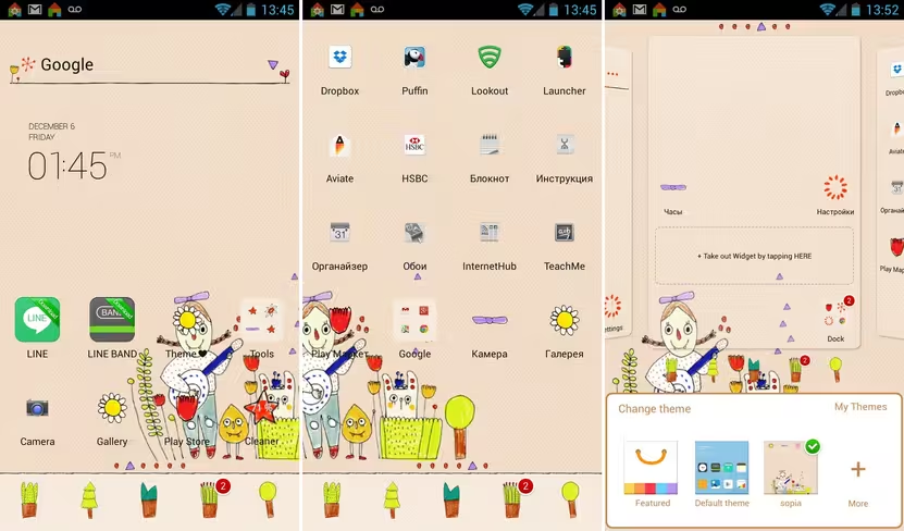
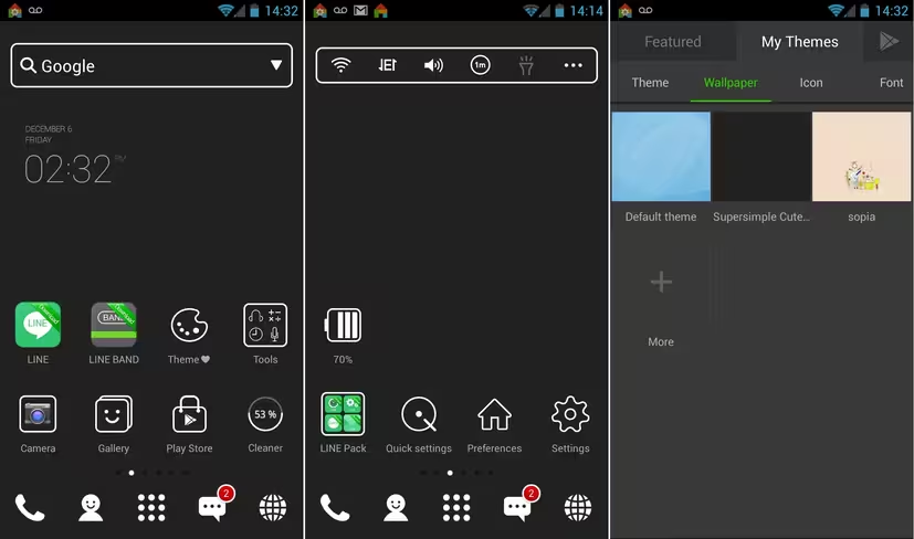
Once installed, and much like some of the others, new themes can be easily applied that will quickly change the look of your home screen in just a few clicks. If you don’t like the default one shown below, there are plenty more that can be accessed and downloaded via the Dodol Theme store, they seem to be mostly free too.
The only slight hiccup in the process is that it’s not quite fully integrated – each theme has to be downloaded via the Google Play store. Clicking the link on the Dodol themes page launches you straight into it though. As we said, just a few clicks and your phone can look quite different…
I particularly like the infinite scrolling home screen and the independently scrolling dock at the bottom. Scrolling the dock left or reveals a + sign where you can add shortcuts for up to five more apps. Changing all the icons, as well as backgrounds, widgets, and app drawer appearance when you select a new theme is also a nice touch.
As well as just changing the appearance, Dodol also, by default, places a few useful tools – like a memory cleaner to free up cache and options to change the ringtone and system fonts – right on the home screen. The cleaner icon (although it looks very different in each) can be seen in both sets of screenshots above. It doesn’t offer anywhere near the level of personalization in terms of creating themes or widgets as some of the others, but for some people that might well be a good thing.
Everything Home
The Everything Home launcher is another in this list that still comes with a beta tag attached, but it’s one of my favorites.
Instead of focusing on customizable everything, Everything Home has got a job to do: making your phone use more efficient.
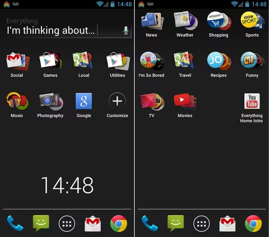
It does this by basing all pretty much all actions around search and context. So that box in the image above that says “I’m thinking about…” is central to getting what you want out of Everything Home.
So, for example, simply typing what’s on your mind will bring up a list of relevant Web matches and apps (installed or not). You’ll notice in the image below that once you start searching for something, the background changes accordingly too. For all that’s going on here, it actually works surprisingly quickly and often throws up options wouldn’t necessarily have occurred to me. A dynamic list of frequently used apps appears where the clock is in the image above with more use.
The general idea is based around the idea of smart folders, so if you don’t want to search, you can just click on a smart folder to view the contents. Two examples of the pre-made smart folders are shown below, but you can create your own as you see fit. As before, it returns results from installed apps, as well as from across the Web.
So, while Everything Home doesn’t perhaps approach personalization in the same way as some others, that’s a good thing in this case – its dynamic home screen approach might add more value than innumerable widgets.
Smart Launcher
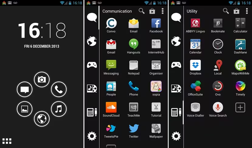
Smart Launcher is one this list for its overall slick presentation. From the minute you install it your phone looks different, and the home screen has been rearranged into different categories.
Tapping the icon in the lower left corner of the image above takes you to your list of apps organized into categories vertically down the left side of the display. Tapping a different category takes you to a different list of apps. The categorization isn’t always perfect, but it’s pretty accurate and you can fine tune it to your heart’s content.
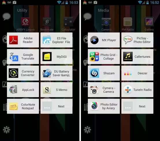
Tapping the + icon brings up a list of apps relevant to that category that aren’t currently installed, as shown below.
Rather than use ads or pushy upgrades to tempt users to pay for the launcher, Smart Launcher reserves some of its more advanced features for paying users only. For example, if you want to use widgets on your home screen or use the more advance single and double finger gesture controls, you’ll need to shell out the $3.99/£2.49.
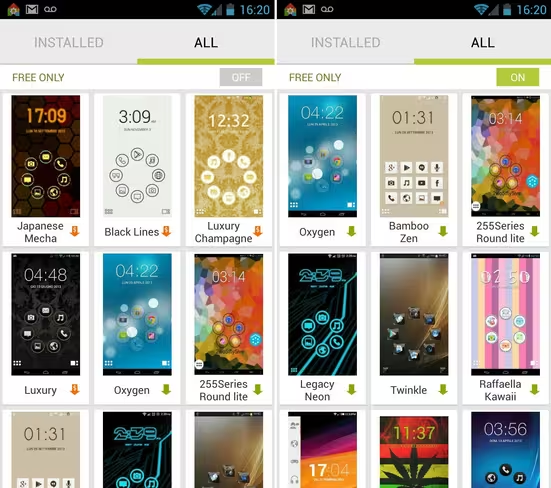
You can change the theme (paid and free are available), but like some others, each one requires installation manually from Google Play. Handily, you can also import icon sets from other launchers too, including the Nova Launcher listed in this roundup, among others.
For its minimalist good looks and simple categorization alone, Smart Launcher might be worth giving a test spin.
GO Launcher EX
GO Launcher EX is one of the best known launchers in this list, and can boast more than 100,000,000 downloads to date.
Along with millions of downloads come thousands of different personalization options, and a thriving ecosystem of other content. It provides apps, games, themes, wallpapers and options to manage all your installed apps in one place.
While I wouldn’t call it slick or minimalistic, it makes up for it in features. With more than 10,000 free and premium themes to choose from, you should be able to find one that you like.
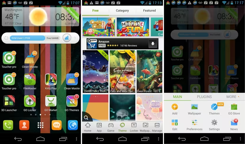
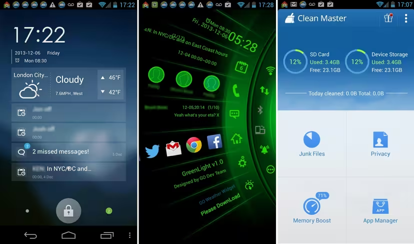
If you love knowing what’s going on with your phone, from the minute you install GO Launcher EX you’ll see plenty of options to download a load of different utilities via Google Play. One of my favorite options, a virtual must if you use this launcher is the GO Locker (shown below left), which let’s you jazz up your lock screen. Like the themes and wallpapers, there are hundreds to browse and download.
Another is Toucher Pro (above center), which has a whole load of themes of its own that can be downloaded and used. Toucher Pro puts a little button (at the place of your choosing) on the screen. Tapping it brings up a list of different recent information, such as notifications. There’s also a handy app called Clean Master, which can be downloaded for free directly from the default home screen (above right).
Little touches like offering to auto arrange the full list of apps are also particularly handy if you have hundreds installed, which, by the time you’ve used GO Launcher for a while you might well have.
However, these free tools and customization options come at the price of adverts, or you could pay to download the Go Launcher Prime version which costs $5.99/£3.66. As well as removing ads, purchasing the pro version adds a few other features, like app lock and gesture support options.
It’s not the prettiest, and it’s not the fastest, but if you like options – check out GO Launcher EX.
ADWLauncher
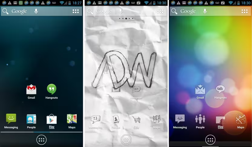
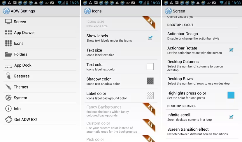
ADWLauncher is a lot like GO Launcher EX and offers a similar set of all-encompassing tools to modify the look and operation of your home screen, including: quick deletion of apps, customizable gesture controls, Appwidget Picker (Android 4.1+) to quickly add widgets to the desktop and even options to resize your screen margins, should you so wish. Like most of the others in this list, it also offers a list of alternate themes accessible via the options menu, or downloadable directly by searching Google Play.
Allows you to organize groups of applications, or individual ones however you want and in a variety of different styles – however, some of the more exciting options are reserved for ADWLauncher EX users, which costs $3/£2.26.
It also allows you to tweak the animation effects between home screens, but like with some of the other options, the more extravagant options will require the premium app.
Somehow, it manages to provide more customization options than you’ll find in most other launcher apps, but in a way that isn’t quite as overbearing as Go Launcher EX can sometimes feel. There’s a useful guide to the launcher’s functions on first install too, which is handy for new users.
Action Launcher
Action Launcher is one of the newer launchers on this list and is well worth a look if you like a no-nonsense and slick approach to your desktop and apps.
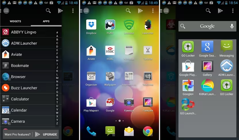
Primarily it takes the navigation of your phone to the edges of your screen with its Quickdrawer and Quickpage options docked on each side. Accessing the Quickdrawer (an alphabetical list of apps and widgets, shown on the left below) is achieved by pressing the icon in the top left corner of the home screen in the center image below. Or you can just swipe from the left-hand edge of the display.
Accessing the Quickpage pop-up can be done by swiping from the right-hand side of the screen. A beta feature that provides access to Quickdrawer and Quickpage while in any app and not just the home screen is available to Action Launcher Pro ($1.99/£1.09) users
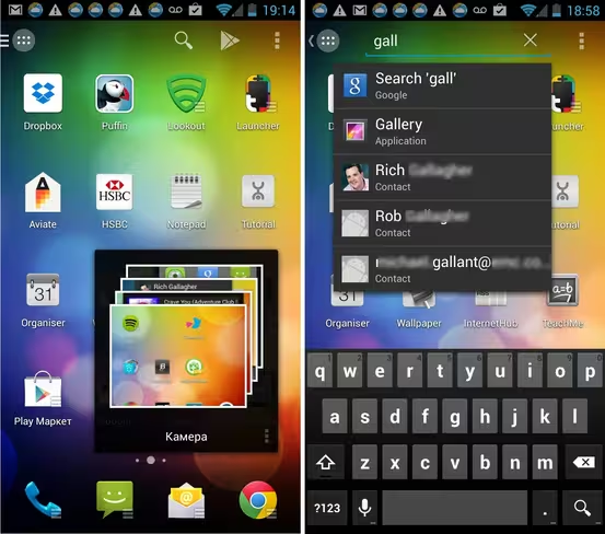
Another feature of Action Launcher that makes it stand out is the ability for it to create pop-up widgets on the fly for any of the apps you have installed that have widgets. The company calls this feature Shutters, and you do it by swiping down quickly on any of the apps that have the ‘shutter’ icon. For example, the camera icon on the home screen in the image above (middle) is widget-enabled, swiping down on it pops up a temporary widget displaying the photos stored on the device (below left). It’s particularly useful if you just want to have a quick peek at Twitter or check a bus timetable.
The image above-right shows of the integrated universal search that’s included in the Action Launcher, which will sort through all your content, like apps, contacts, music and more.
Aside of enabling one swipe access to features, the premium version also allows for further tweaking of the look the launcher, with support for things like icon packs, changing the icon scale and individual icons, the ability to use Shutters within a folder and options to change the Quickpage and Quickdrawer backgrounds.
Featured Image Credit – Spencer Platt/Getty Images
Get the TNW newsletter
Get the most important tech news in your inbox each week.
