Content and file curation and sharing platform Pearltrees has been updated today with new features that include ‘Meaning’, a new organization system.
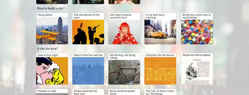
‘Meaning’ is based on a traditional grid and allows users to drag and drop content into collections that can be shared with others and collaborated on with real-time synchronization.
Pearltrees tells us that it hopes the new layout will encourage more collaboration between users. The company may have a point – a conventional grid could well take less time for new users to adapt to than Pearltrees’ old ‘tree of pearls‘ look that it moved away from earlier this year, even if it’s not quite as unique to look at.
The France-based company’s video below shows Meaning in action:
Meanwhile, Pearltrees’ mobile apps on iOS and Android have been updated with new features including a ‘tunable interest feed’ that delivers personalized content recommendations to your account. Beyond that, storage on Professional accouns has been boosted from 100GB to 1TB for the same price of $9.99, with size boosts for lower tiers, too.
This article has been updated to clarify that Pearltrees first moved away from its old interface earlier this year.
Get the TNW newsletter
Get the most important tech news in your inbox each week.


