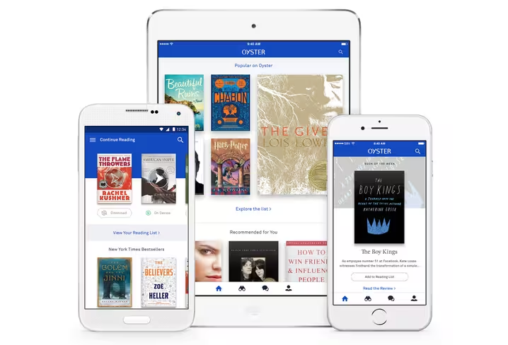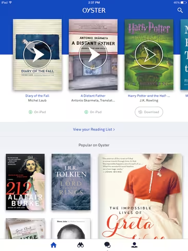
Netflix-for-books app Oyster today got a visual refresh to bring its library of more than 1 million titles closer to users’ purviews. The redesign focuses primarily on the app’s Home tab, adding larger mosaics of book covers to highlight recommended titles based on what the user has been reading and when they’re accessing the app.
In the new Home, in place of the “Spotlight” carousel, users will now see covers of books they’re currently reading, followed by recommended reading lists, such as Popular, New Releases and New York Times Bestsellers. These recommended books will adapt depending on what the user and their friends are currently reading to provide more title variety.
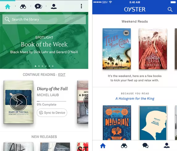
Recommendations will also change depending on time of day. For example, if the user opens on the app on a Friday afternoon, they may get recommendations for relaxing weekend reads, curated by the Oyster editorial team.
With today’s popular streaming services such as Netflix and Spotify, users are used to seeing carousels of recommendations tailored to their consumption habits, Oyster co-founder and chief product officer Willem Van Lancker told The Next Web. In this redesign, he says the team hopes to go further by making images more prominent, giving the users visual cues to see which books are more highly recommended, and always offering them new content overtime.
Left: The original Oyster app home screen, Right: New Oyster with updated recommendation lists
Today’s redesign also adds access to The Oyster Review, the app’s previously browser-only magazine that offers reviews and feature stories on popular books and authors. Some Oyster Review articles are also embedded with book recommendations throughout, so users can add titles to their reading lists directly.
For example, in the Kurt Vonnegut piece below, Oyster staff listed their favorite Vonnegut titles, along with links to the particular e-books.
“We found that our Oyster Review recommendations resonate well with Oyster users, so we wanted to make it easier for them to access these articles straight from the app,” Van Lancker says.
In our test with Oyster’s alpha version of the iOS app, the overall look and feel is less clunky and contains an improved information hierarchy. Although the previous iteration of the app was beautifully-designed, this update does exactly what Oyster intended by presenting popular titles more clearly without making the user scroll through recommendations to find interesting books.
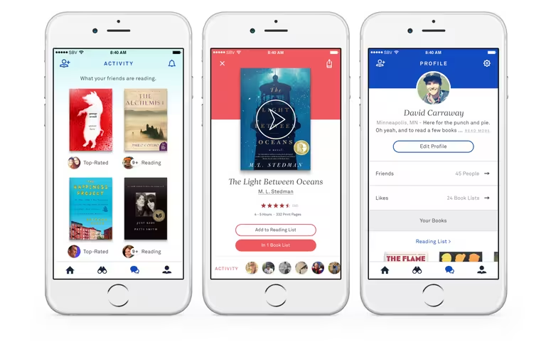
Other small visual refreshes include a hint of color on the user’s profile page and new app icons. While these changes are minor, they offer a touch of personalization, just as the app did when it added reader themes alongside its addition of the ‘Harry Potter’ series this month. Color palettes don’t make or break a book-reading experience, but the flexibility is quite nice to have.
The Oyster app update arrives today on the free iOS and Android app, with the service running at $9.95 a month.
Get the TNW newsletter
Get the most important tech news in your inbox each week.


