Jordan Roland is a staff designer and illustrator for the Shutterstock blog. This post was originally published on the Shutterstock blog and has been reprinted with permission.
With days to go before the 87th Annual Academy Awards, it’s time for what’s become an annual tradition. Each year, the challenge for our designers is to create Pop Art-inspired posters for the Best Picture nominees, and each year poses a wonderful set of problems to solve.
This seems to be the year of the individual, with personal stories of triumph, heartbreak and determination holding strong throughout the list of nominated films — from the story of America’s most prolific sniper to the struggles of one of the most important men in civil rights history.
They, along with the complex characters from all the other Best Picture nominees, are hard enough to distill in a few images, but trying to add some light and levity to the topics was a challenge our team was glad to tackle. Check out the results below, along with insight on each poster’s Pop Art inspiration, and tell us what you think in the comments!
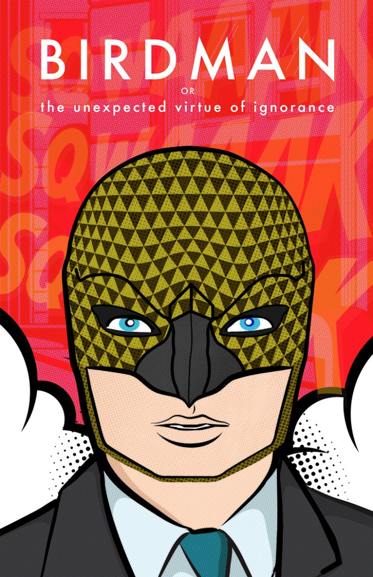
Birdman
Poster by Odes Roberts
“Roy Lichtenstein was widely known for taking the colorful pop aesthetic of comic art and using it to parody real life and serious subjects. The way Birdman dissects Hollywood’s obsession with the superhero movie, and how Broadway views mainstream actors trying to use theater to beef up their serious acting “cred” were perfect for his pop parody style. I chose to take the Birdman alter ego of Michael Keaton’s Riggan Thomson and make him front and center, adding in a business suit vs. the full superhero persona to highlight the serious side that Thomson so desperately wants to achieve.”
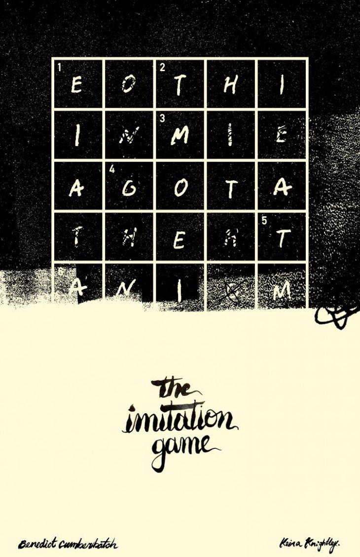
The Imitation Game
Poster by Bryant Nichols
“Andy Warhol’s experimentation with mass production and its place in the world of art has always been fascinating to me. The concept of adding a human touch to something as mechanical as a soup can mirrors The Imitation Game‘s analysis of the battle between man and machine. It took a human hand to transform a soup can into art, just as it took a human brain to solve a puzzle created by a machine. This dissonance is seen in my poster through the use of precise grids, made possible by a computer, and typography created with the flawed, yet beautiful human hand.”
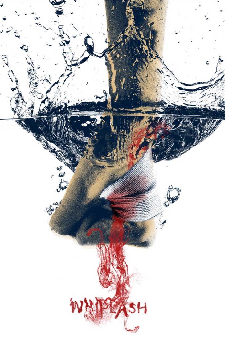
Whiplash
Poster by Jordan Roland
“Whiplash is all about how hard you will push yourself to be perfect at your craft. I wanted to capture the aggression and violent nature of stopping at nothing to achieve that perfection, so I chose to highlight one specific moment, where lead character Andrew is willing to practice on his drum set until the point where his hands start to bleed. For my artist inspiration, I chose Polish Pop Artist Lucjan Mianowski. I found his limited color palettes and use of duotone colored images provided a great way to visually convey the stark harshness of this moment in the film.”
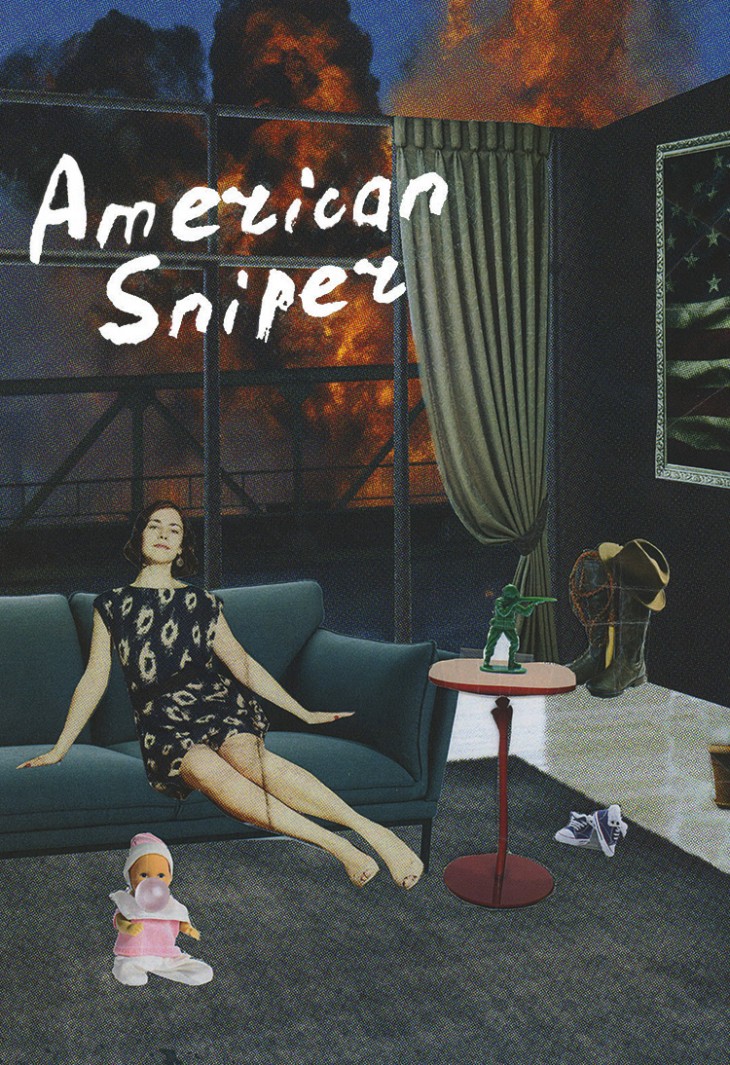
American Sniper
Poster by Kathy Cho
“I was inspired by artist Richard Hamilton‘s collage style, especially his 1956 work Just What Is It That Makes Today’s Homes So Different, So Appealing? This poster nods to Hamilton’s ambition to be “multi-allusive,” using magazine cutouts and prints in collage style. I wanted to sum up the main character Chris Kyle’s life — the reality that war began getting more attention than home in his mind. I thought Hamilton’s collage style felt like the perfect way to pull the details for all the visual components together.”
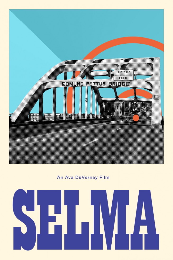
Selma
Poster by Nichole Garcia
“I chose artist Gerald Laing as inspiration because of the strong opposition he felt toward the Iraq war or using violence in general as a means to a political end, just as MLK felt. He incorporated his anger into his War Paintings series, which I thought related a lot to the Selma marches. Laing uses a lot of trichromatic schemes, as well as radiating rings in his work. I wanted to make the bridge the focal point because it was such an important landmark within the marches; I decided to put a target over it, since the goal of the marches was to cross the bridge into Montgomery to speak with the governor and raise awareness about violations of the protestors’ voting rights. It took three marches until the bill was passed, so the two rings signify the two marches and the dot represents the final march that led them to success.”
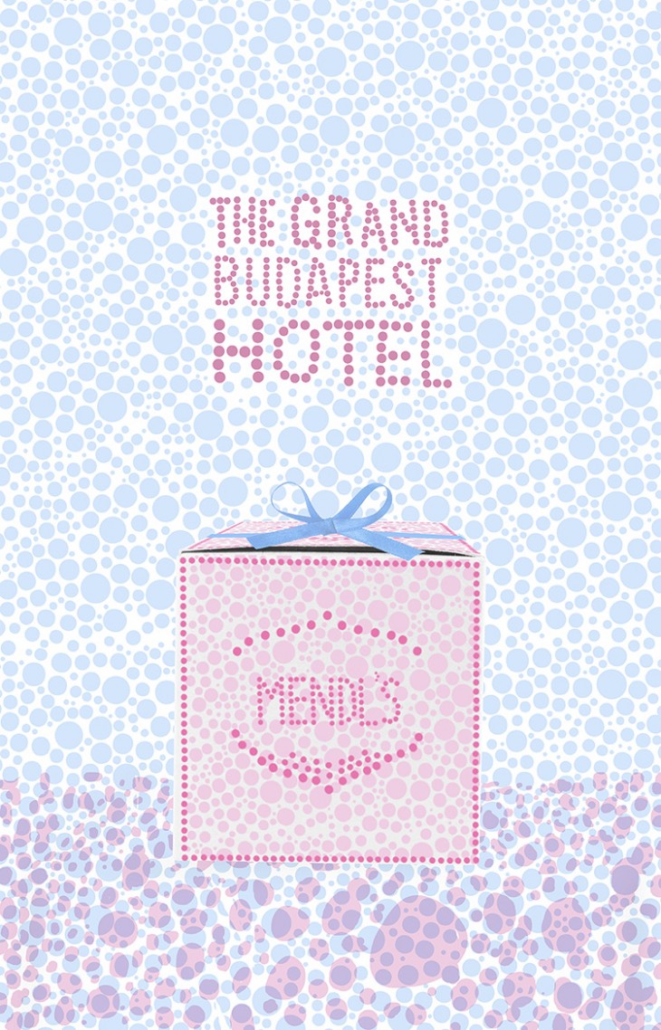
The Grand Budapest Hotel
Poster by Carisa Tong
“I reimagined the poster for The Grand Budapest Hotel by drawing inspiration from the work of Yayoi Kusama. Kusama influenced many of the famous Pop artists with her usage of bright colors and identifiable dot texture. Her live installations often include real-life objects taking on textured backgrounds, becoming both seen and camouflaged at the same time. In this poster, the Mendl’s cake box is portrayed in the same way, representing the dessert’s important, yet subdued role in the movie.”
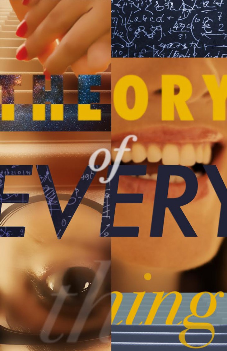
The Theory of Everything
Poster by Deanna Paquette
“I was interested in artist James Rosenquist‘s fragmented yet cohesive juxtapositions and how they aligned with story and style of The Theory of Everything. In many ways, the film is a work of juxtapositions itself, pacing through the evolution of an extraordinary love story. Color and camera angles are used throughout to present different perspectives, which played into the style of Rosenquist quite nicely.”
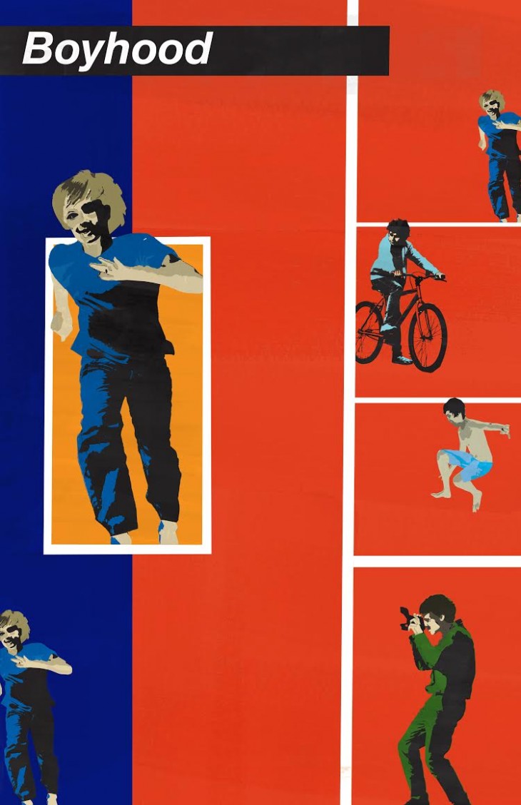
Boyhood
Poster by Cristin Burton
“Rosalyn Drexler’s technique of combining collage with paint and her use of color are certainly synonymous with her Pop Art counterparts, but the particular works that had potential to inspire a Boyhood poster were the pieces that featured scattered vignettes containing various figures centered around a theme. The figures were sometimes repeated in the pieces, sometimes in action or mid-drama, but sometimes just standing. Boyhood is almost exactly that — a series of scattered vignettes centered around one life, sometimes containing repeating patterns, sometimes drama, sometimes the ordinary.”
Get the TNW newsletter
Get the most important tech news in your inbox each week.
