Even if you’re not familiar with designer Susan Kare, you’ve been benefitting from her work for the past 30 years just about every time you use a computer. As part of the original Mac team, she created some of the first digital fonts, the UI for MacPaint and some of the most persistent icons in computing like the trash can, the save disk and the ever-cheerful Mac greeting.
 We chatted with Kare about what it was like to design for one of the earliest graphical user interfaces and why her creations have persisted over the past few decades.
TNW: How did you approach the “personal” element of computing when designing for the first Mac?
Susan: It was explained to me that the Mac’s intended audience was non-technical, and that the interface should look so friendly and be so easy to use that “your mom could do it”. Obviously, making the Mac easy to use was a team effort and graphics were just a part of that. Another prevailing idea was that it would be ideal if a user could just figure things out without a manual, as in an arcade game.
I interpreted “personal” and non-technical to mean that it would be good if symbols were based on everyday objects, when possible. For example, it seemed to me that more people had experience with a wristwatch than an hourglass.
TNW: What was your design process like back then? Where did you get your inspiration? Did Steve Jobs have an influence over your work during the project?
Susan: There were lots of releases, and from the start we were able to try out different graphics in various builds. This enabled a lot of iteration, for instance on title bars as well as icons.
I still think this is great — to see graphics in the software they’re destined for as early as possible as opposed to “on paper” or in art files. Have to thank Andy Hertzfeld for championing this.
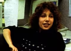 I got inspiration from all over: books, signage, toys, fine art, folk art — the same as I do now. Steve regularly dropped by the Mac software group at the end of his workday, plus often on Sunday mornings, and he liked to look over the options and make suggestions.
TNW: What expectations did the team have about the impact the Mac would have on the world? Did any of you imagine this is how the world would look in 30 years?
Susan: It was a great project — intense teamwork, a shared interest in making something new that was good, and a charismatic leader. But I would say for me, the focus was on solving the problem of the day, not thinking about years down the road. In fact, one consideration was that in the original software, there were numbers to assign to 256 fonts – that seemed like a really big number then, since we just had a handful.
TNW: How do you feel about your icons and fonts looking back on them now? Which is your favorite?
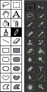
Susan: I feel grateful that many of the tools I designed for MacPaint have been continuously in use, along with the command key.
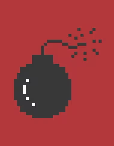
My favorite icon is the smiling Mac; it was designed to give a friendly first onscreen image. I also like the bomb, which is irreverent because I was told it would almost never be seen.
TNW: What’s your view of Apple’s current design ethos, as evidenced in iOS 7?
Susan: In general, I’m a believer in symbols that are easy to recognize, and limit excessive detail. It’s more about conveying meaning at a glance than any particular style.
Check out the rest of our Macintosh 30th Anniversary coverage.
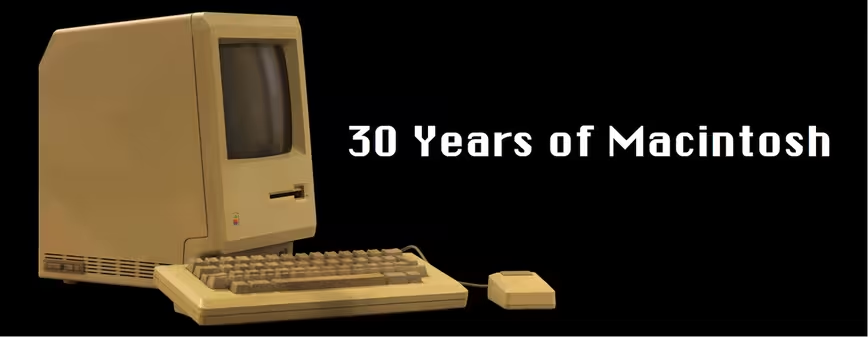
Photo credits: Ann Rhoney, Folklore.org, Kareprints.com, MATEUS_27:24&25 / Flickr
Get the TNW newsletter
Get the most important tech news in your inbox each week.
