
Brian Honigman is a marketing consultant, speaker and freelance writer. For more insights on how to be a better marketer, sign up for Brian Honigman’s weekly newsletter. This post originally appeared on the Skyword blog.
When it comes to content marketing, creating engaging content always comes first. However, great content alone does not make a similarly great blog. Another key element to creating an engaging blog is focusing on great design and user experience.
This doesn’t mean your blog needs to have groundbreaking aesthetics or world-class graphics. In a lot of ways blog design has more to do with establishing visual clarity and organizing information in a logical, consistent, and appealing way.
The following best practices lay out some guidelines for implementing strong design fundamentals into your blog and can help you to ensure that your content puts its best foot forward and engages your readers.
Break posts up to make them visually interesting
There may be nothing worse than staring at a wall of text. Long, unbroken paragraphs and a lack of visual variety can make even the most straightforward piece of content appear incredibly intimidating. Only Malcolm Gladwell, the renowned Canadian journalist, can get away with something like this:
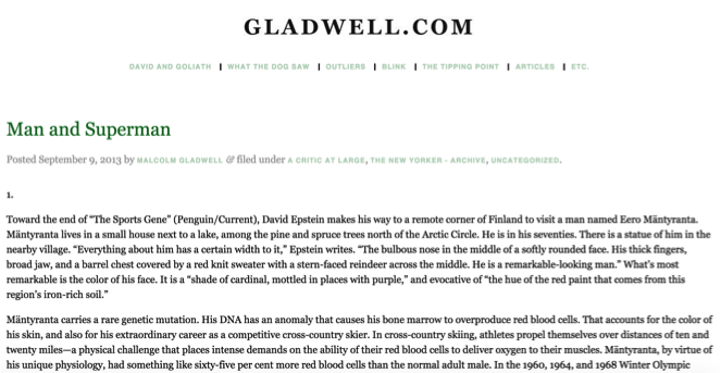 Photo Source: Malcolm Gladwell
Luckily, there are multiple methods for introducing visual interest into your blog posts. The first, and most obvious, piece of advice is to use images to break up your text.
Always strive to use high-quality visuals. Sure, any image will break up a page, but an unappealing image may also turn readers away. In addition, only insert images where appropriate for the content. If your image is not helping your message, it’s distracting readers from your point and will likely disengage them.
Another method for introducing visual interest into your posts is to break them up using subheads. Finding relevant, quality images can be difficult, but dividing posts into digestible chunks tends to be a lot easier and achieves a similar effect.
This example from KISSmetrics doesn’t use many images, and the blog still creates visual interest by only including paragraphs with a few sentences.
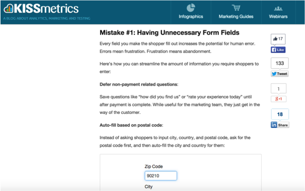 Photo Source: KISSmetrics
Write smaller paragraphs. Traditional schooling has trained many writers to embrace long paragraphs, but this strategy is ill-suited for online consumption. Attention spans are much shorter, and following a crowded paragraph on screen is difficult for many readers.
When creating digital content, try to keep paragraphs to a two- or three-sentence maximum to ensure that your content is easy to read and digest. This will also introduce even more visual interest into your posts while increasing the likelihood that your content actually gets read.
Display additional content promimently
Once readers are engaged with individual pieces of content, the next step is to convince them to explore your entire blog. A reader might click on a headline that appeals to them, but forget which blog it was a part of the next day.
A crucial step toward building a loyal, engaged following for your blog is to convince one-time readers that you are a destination they can return to for consistently good content. Many blogs rely on spammy pop-ups or sign-up forms to try to rope readers in, but there is a much better way.
Prominently displaying other content in multiple areas encourages a user to further explore your site. Although there is a chance that most readers won’t explore, there’s no harm in giving them the option of convenient site navigation.
In this example, Simply Measured uses a clean unobtrusive display to call attention to their other content.
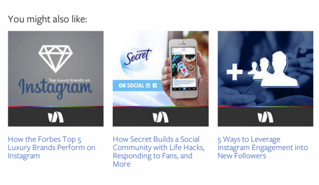 Photo Source: Simply Measured
An additional, and often overlooked, benefit to this tactic is that even if a reader doesn’t click on any of the links you display, simply seeing that they are there can signal that this blog might be worth visiting again.
Even better, if they do return to explore your site, having multiple, well-designed avenues to discover related content will increase the chances that they find something they like, and want to come back for more.
Make sharing really easy
Given how easy sharing is, it’s shocking people don’t do it more often. All it takes is a single click; newer toolbars even follow you as you read so you don’t have to move your mouse. So, what makes sharing so rare?
Technically sharing may be easy, but it’s a risk. We risk sharing something that doesn’t resonate or that’s already been said a million times. Understanding this barrier to entry can help you design compelling incentives to share.
The auto-share feature that most blogs use can result in something very impersonal and canned. When we see something shared like this, it’s often safe to assume that the person sharing didn’t even read the article.
One blog that understands this thought process—and that has designed a brilliant work around—is Mention. Instead of relying on the generic “Tweet” button, Mention intersperses content with insightful quotes and gives the option to tweet that insight directly.
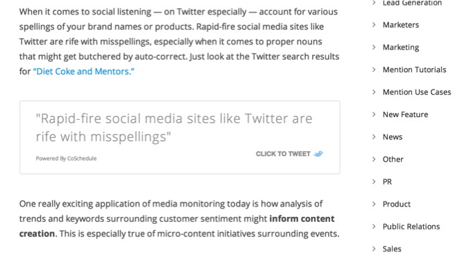 Photo Source: Mention
Not only does this serve to break up their content and add visual interest, it also removes the barrier to sharing. Instead of just sharing a headline, Mention offers readers an easy way to share specific segments of an article. Additionally, you can optimize for Twitter sharing on your own blog with services like Click to Tweet.
The common denominator of all of these best practices is that they don’t concern visuals directly. Oftentimes, using design to optimize your blog requires that you understand the way your users interact with your content in order to best cater to their needs and expectations.
While following these guidelines will certainly help your blog’s engagement, the real trick will be to shift your methodology completely.
What are the best blog design elements you’ve seen to date? Share your favorite blog designs in the comments below!
Read next: How to craft a compelling storyline for your company
Get the TNW newsletter
Get the most important tech news in your inbox each week.