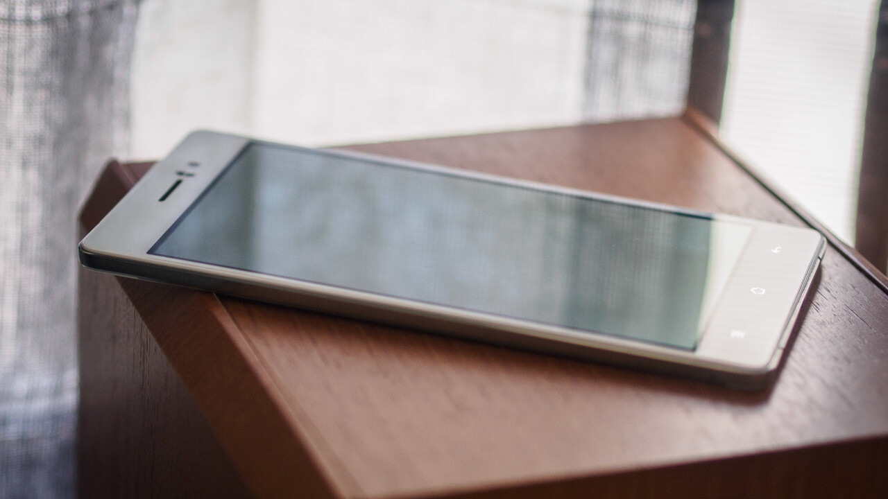
Before the fight for the biggest screen size, prior to the battle for the best specs or camera, there was the one great, very volatile feature phone manufacturers warred over: thinness. The R5 is Oppo’s 4.85mm stab at making the world’s skinniest phone – so thin they couldn’t fit a headphone jack.
Although that title was quickly claimed by the also-chinese Vivo X5 Max (which beat it by an entire 0.1mm), there’s no denying the R5 is impressively engineered. Unfortunately, and unlike Oppo’s wonderfully crazy N3, those design feats leave you with a phone with too many compromises.
Design
Let’s get my biases out of the way: I’ve never been one to care much about any of my devices being super thin and light, but I’m particularly perplexed by their enduring popularity in the smartphone wars.
That said, I can generally the appreciate the aesthetic appeal and how-did-they-fit-that-in-there reaction one has to such devices.
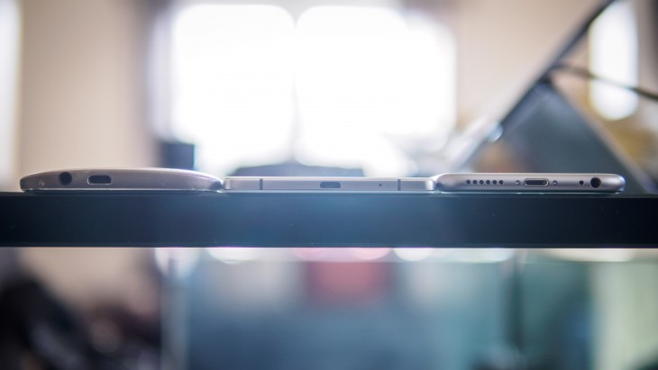
The R5 elicits that reaction more than any phone I’ve ever held. You really have to see it in person to appreciate it – it makes an iPhone 6 look fat. You might also worry a device less than half a centimeter thick would come off as flimsy or fragile, but the opposite is true: the R5 seems so dense as to give the impression it was carved out of a solid piece of metal and glass rather than a myriad of tiny components. Heck, you can apparently even use it as a blunt knife:
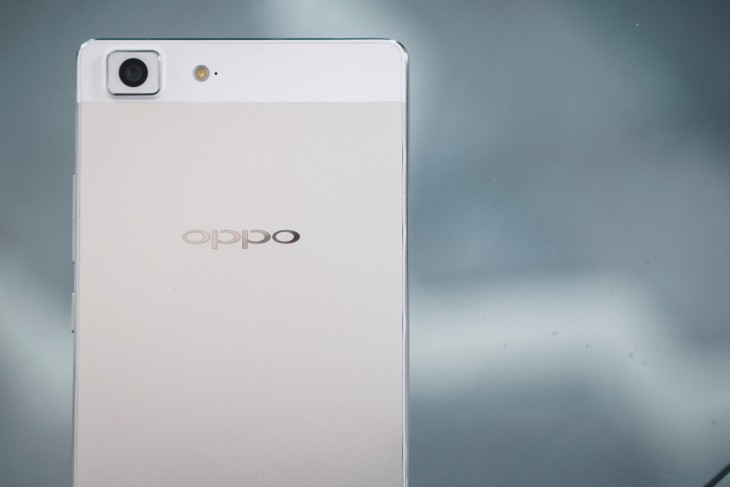
The phone comes only in white at the moment, and features a matte (thankfully non-slippery) metal back with a tastefully engraved Oppo logo. The one place the phone’s thinness wavers is with the camera; like on the new iPhones, it juts out a millimeter or two from the back of the device.
The front is similarly minimal, with the just the earpiece, light sensors, and camera up top, and three metallic capacitive buttons on the bottom. Those buttons don’t light up at night by the way, but that becomes a non-issue as their location gets quickly recorded in muscle memory.
The only physical controls are the power button and volume rocker, all of which exhibit a perfect amount of clickiness. There’s a chamfered metal frame, because you can’t have a metal phone without chamfers.
The micro-USB port is located on the bottom; the headphone port is non existent. For that you need to use the bundled floppy little adapter 80 percent of users are sure to lose within the first few months* of their phone’s probable two-year life-span. It also means you’ll be annoyed if you want to listen to music when your phone needs charging unless you have a Bluetooth headset. I don’t have a Bluetooth headset. I was annoyed.

Oppo is making a Bluetooth ‘O-Music’ accessory to remedy this, but unlike the N3 and its O-Click remote, this one isn’t included in the box. Even then, it would still be an easy-to-misplace accessory that you’ll probably have to charge. All of this is particularly unfortunate once you consider the aforementioned, even thinner, Vivo X5 Max manages to fit a headphone jack in its tiny frame.
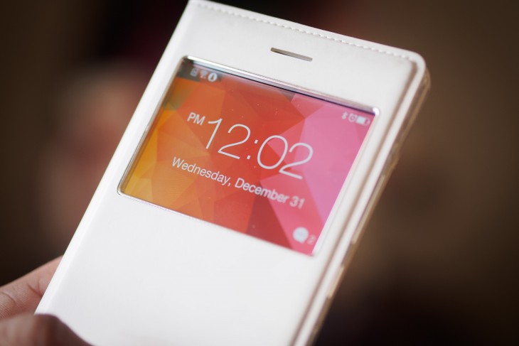
The phone comes with a clamshell pleather case. There’s a window on it to let you check the time. Since the R5 has an AMOLED display, it conserves battery by only lighting up part of the screen. I’m a bit baffled by the case’s inclusion though, nice as it is: what’s the point of making the world’s thinnest phone if you give everyone a case that makes it look as thick as any other device?
Some odd choices aside, the R5 is an all around impressive looking-and feeling device. Whether or not you actually like the phone’s minimalist approach, you can’t help but be impressed by it.
Display
The 5.2-inch display is another strong point on the R5. Unlike the N3’s screen, which I found too cool and under-saturated, the AMOLED panel on there R5 renders some of the best colors I’ve seen. Whites are actually white (perhaps a teensy bit cool). Viewing angles are spectacular for an AMOLED, showing minimal color shifting. And of course given the display technology, blacks are as black can be.
The panel features a 1920×1080 resolution, which, at 423 PPI, should qualify as ‘good enough’ for most people. That said, it isn’t the sharpest display around . See, AMOLED displays generally feature a sub-pixel array known as PenTile, which through some mathematical trickery yields similar resolution numbers to regular RGB layouts.
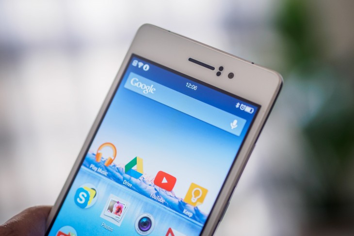
In practice, these screens tend to be slightly less sharp than others with identical resolution numbers, particularly around text and other high-contrast edges; text looks sharper on the N3, despite its lower pixel density, and compared to the PenTile-but-QuadHD display on the Droid Turbo (the closest thing I’ve seen to print on a phone display), there’s no contest.
Nevertheless, not going with a QuadHD display is understandable given the battery constraints, and I’ll take a 1080p display with great colors over a sharper display on a poor, battery hog of a screen. Also note that I’m nitpicking; I do a lot of photo-editing on my phones, so I’m more particular about display sharpness than most (and though there certainly are diminishing returns, Apple’s claims that your eyes can’t see a difference past 300 PPI, even at past a normal 6-inch viewing distance, are nonsense).
The R5 bests both the N3 and Turbo for color reproduction and visibility in bright sunlight. Sharpness aside, it’s up there with the Galaxy Note 4 for the best smartphone display’s I’ve laid eyes on.
Sound and Call Quality
The N3’s speaker performed impressively well for a single driver at the bottom of the phone. The R5 is a bit worse. Presumably because the phone is so thin, there’s no room for a dedicated loudspeaker, so sound just emanates from the earpiece. It’s a tinny, not very good affair, but at least it gets reasonably loud.
Audio quality through the Micro USB adapter was thankfully great – seemingly just as good as on the N3. You won’t find the MaxxAudio equalizer on this model, however. The same excellently balanced and engaging headphones that come with the N3 are included here too.
Call quality was solid. Nothing spectacular, given the speaker, but nothing to complain about either. Reception was good throughout my trial period.
Software
The R5 is running Oppo’s custom Color OS 2.0 Android skin, but it’s slightly different than the version on the N3. Aesthetically, the R5’s skin is like a ‘dark mode’ version of the N3’s (dark colors use less power than bright ones on AMOLED displays).
As on the N3, I’m not a fan of the Color OS launcher, which doesn’t feature an app drawer and forces you to organize your apps manually. There are sensible touches here and there over stock Android, like useful additions to the quick settings drawer including ‘end all’ and flashlight functions. Of course, Oppo has its proprietary apps in tow.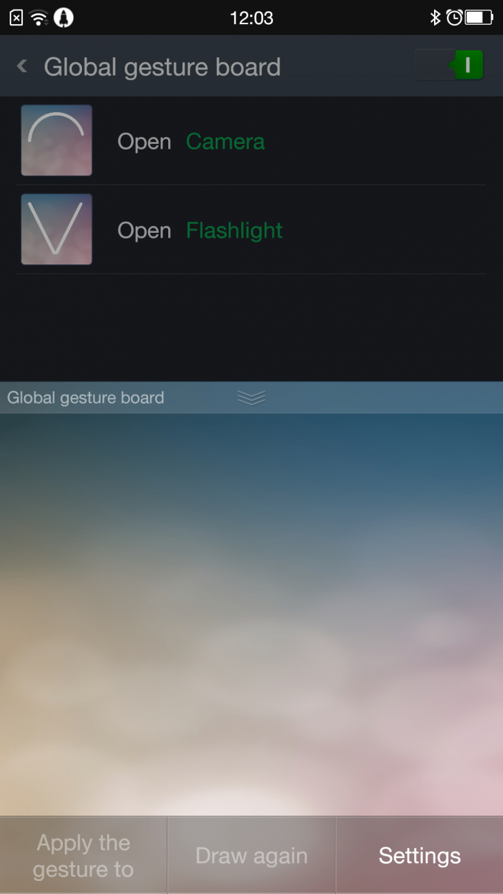
Otherwise there are a few minor differences here and there. As mentioned before, there’s no MaxxAudio for sound enhancements. Conversely, there’s a new ‘gesture board’ you can activate by swiping up from the bottom of the display to in order to launch apps or perform actions I ended up deactivating it because I found it too often interfered with the keyboard.
I found the R5’s build to be a bit buggy though. For instance, I was unable to switch out of the default keyboard to any other at all – the phone would crash and reboot anytime I tried to change the input method. Even more puzzling: I couldn’t install any of the OTA updates that became available during my trial period without the phone crashing. I’ll blame these on pre-release bugs, but still mildly disconcerting.
Performance and Battery Life
The R5 comes specced up with a octal-core Snapdragon 615 processor as well as 2GB of RAM, which is supposed to perform comparably to the HTC One M8 or Samsung Galaxy S5’s quad-core Snapdragon 801. Unfortunately, it feels markedly less snappy than either of those phones.
Whereas I thought Color OS didn’t slow down the N3 much, the R5 feels very sluggish by comparison. Not always; sometimes it seems to run just fine, but just as often I will see slowdowns when browsing the internet or even just pulling down the notification bar. Perhaps Oppo is throttling the R5’s CPU too harshly to conserve battery, or perhaps it’s just poor software optimization, but the device doesn’t feel as smooth to use as I’d expect from something of its caliber.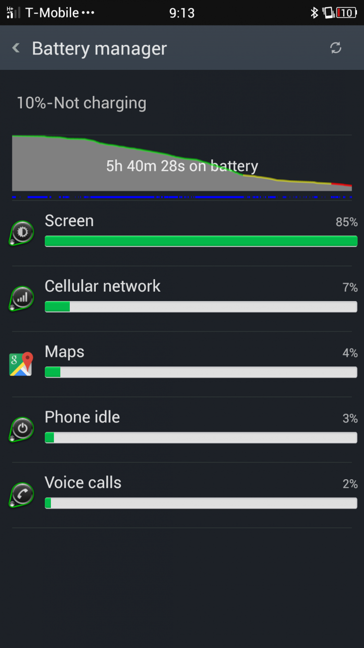
The device only comes with 16GB of storage, 12 or so which are available to the user.
The phone’s Achilles heel is the most obvious given its girth: battery life. A 2000 mAh battery simply doesn’t cut it for a phone with a 5.2inch display and a powerful processor. You will struggle to get more than 2.5 hours of screen on time with average use.
The unfortunately shared USB/headphone jack also causes a serious predicament in practice. Oftentimes, if I’m watching videos or listening to music while reading on my phone – two power-hungry scenarios – I’ll plug in my device to keep my battery topped up. You can’t do that with the R3. The VOOC charger remedies this a bit by letting you recharge quickly, but it still seems like an unnecessary sacrifice.
There wasn’t a single day I went out with the R5 for any significant amount of time without worrying whether it would last me until I got back home to recharge it, or needing to baby it to do so (even using the included power saver modes). One day I even depleted the phone, charged it up to about 70%, then depleted it again before the night was through. I would trade a few millimeters for some extra peace of mind.
Camera
Oppo chose to sacrifice having a completely flush, thin device in order to beef up the camera a bit. As such the camera on the R5 is an all around solid affair, even if it can’t match its brother the N3 or some of the other competitors in the category.
It’s a 13MP shooter with a Sony sensor, using Oppo’s custom processing engine which generally renders images with a tasteful amount of sharpening and saturation. The sensor itself seems to have only average dynamic range (the ability to capture a contrasty scene without blowing out the highlights or crushing the shadows).
Low light performance, however, is only average. In very low light, oppo uses very aggressiv noise reduction that will often kill any details.

My favorite feature of R5’s camera, like on the N3, is the customizable app. In particular, the ability to shoot in RAW gives power-users access to better image quality than what the camera’s processing can do on its own, and other add-ons – the GIF maker comes to mind – are plain fun to use.
That said, there’s something strange going on with the HDR mode. All semblance of contrast is gone, leaving the images looking like a really bad pastel painting. And white balance, though normally a strong point, will sometimes leave your images looking a bit too cold.

Some more photos for you to check out:
Wrap up

The R5 is, in a way, antithetical to Oppo’s N3. Whereas the N3 sacrificed some consistency in its design for newfangled (but useful) features, the R5 puts design first and foremost. It captivates you with its lovely build and radiant screen, but is lacking some of the basics the N3 got right.
The fact is, battery life, performance, storage and practicality all suffer as a direct consequences to the phone’s thinness. Give me this same hardware, thick enough so that the camera is flush with the body, and you could have so much more.
These worries are slightly mitigated by its price: it should cost $499 unlocked upon release, which is cheaper than many competitors. Still, there are better options. Oppo may have shown serious design chops with the R5, but unless you use your phone extremely lightly, it’s hard not to suggest something in the price range that will both perform better and get you through your day more easily, like a 2014 Moto X or Nexus 5.
Get the TNW newsletter
Get the most important tech news in your inbox each week.


