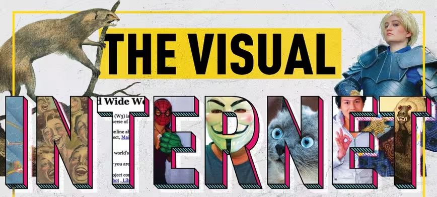
Less than 30 years ago, when the Internet first launched, everything was black, white, and plain text. It wasn’t until Flash hit the scene in 1996 that the web began to resemble what it looks like today. By the time YouTube rolled out in 2005, the mainstream Internet was an adolescent 14-years-old. Already, it was moving away from chat rooms and animated text toward rich online visuals, videos, search engines, and social media.
Today, the Internet is a thoroughly visual medium. And it’s not all good news …
The challenge of being “seen” (and heard)
According to a much-publicized Microsoft study, since the year 2000 human’s attention spans have decreased from 12 seconds to 8 seconds, leaving us with a “shorter attention span than a goldfish.” While that comparison isn’t one for one, it is true that attention is the online world’s most valuable and rare commodity.
In business especially, this presents a unique online-visuals challenge. And breaking through the deluge demands two ingredients.
The first is leveraging how people naturally process information.
Advances in neuroscience over the last decade has revealed much on this front. Not surprisingly, humans are wired to process visual cues far more rapidly than auditory ones. What’s more, our brains categorize pictures differently than words, absorbing visual stimuli in 13 milliseconds as well as retaining it much longer.
Of course, the internet has both shaped and been shaped by these online-visual realities. A mere snapshot (pun intended) of the data reveals:
- In 2015, news organizations shared 3.25 billion photos on social media sites
- In 2016, Snapchat users alone shared 760 million photos
- In 2017, people will take 1.2 trillion photos, the majority of which will end up online
- And by the close of 2017, we will have watched 5 billion videos on YouTube, every single day
Another adaptation of the Internet is how we process text. Most often people read in an F pattern, scanning headlines and then sliding down the right-hand side of a page to the next header. According to one recent study on the subject:
When writers and designers have not taken any steps to direct the user to the most relevant, interesting, or helpful information, users will then find their own path. In the absence of any signals to guide the eye, they will choose the path of minimum effort and will spend most of their fixations close to where they start reading (which is usually the top left most word on a page of text).
In other words, unless creators design online content with the F-pattern in mind — or intentionally break that pattern in startling ways — most content, both written and visual, ends up suffering an age-old fate: “If content posts on the Internet and nobody bothers to look at it … does it make a sound?”
Unfortunately, no.
What does this mean for your online Visuals?
All this online visual overload leads to the second key ingredient for captivating attention, a 20/20 understanding of the past, present, and future of online visuals. What follows is a detailed — and data-driven — look at exactly that.
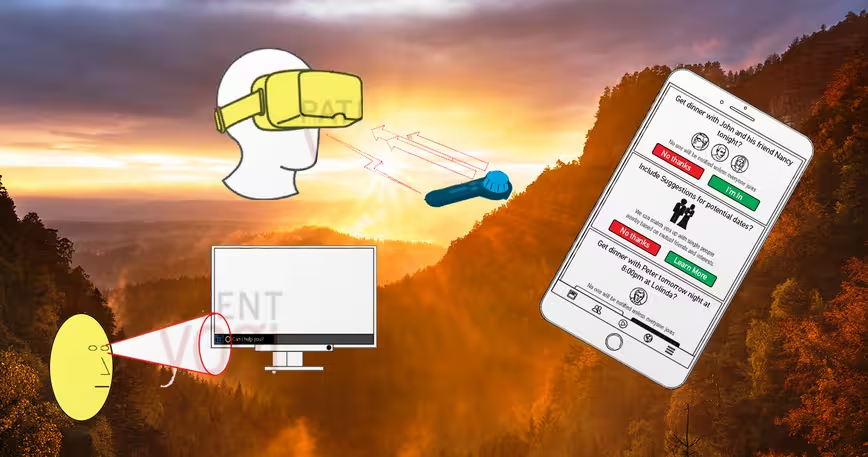
However, this infographic is more than just another pretty face. In addition to a historical look of the internet’s visual evolution, it also included practical tips on how to design web pages for the F pattern, how to use subheads, bullet points, and highlights in written content, how to harness the power of native videos, and a peek into the future.
Get the TNW newsletter
Get the most important tech news in your inbox each week.


