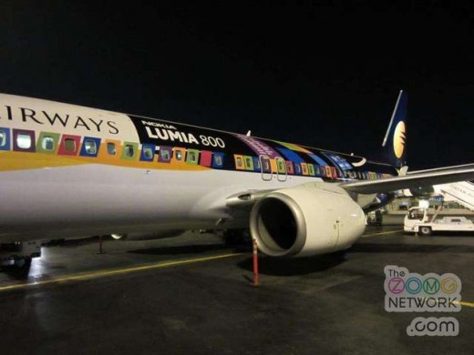
Ugly is as ugly does, and Nokia seems to have run face first into it in India. Despite putting out a well liked smartphone that receives plaudits for design and form, the company has managed to create something rather ugly: the Lumia 800 plane.
Sound like a bad idea? It’s the sort of thing that could go either way. In-your-face advertising of this sort can be quite hit or miss. In this case, Nokia couldn’t find the target. Here, feast your eyes on this:

Now I want to point out that I am not against this sort of thing in general. The Starcraft 2 plane in South Korea was excellent. But in that case the art was interesting, and the execution stronger:

Here’s the rub: If you are going to go the gaudy route, you have to completely own it. The Lumia 800 plane does not. Look at the windows, are they live tiles? If so, why do some slant? How about that no-fade box around the blocked “LUMIA 800” text? It’s hideous. Any first year design student could have seen this. Even more, the Lumia 800 has to share space with the name of the airline in question. Perhaps this lowers costs.
Snark aside, we’re days away from learning Nokia’s strategy to reclaim the US market. Keep awake for that at CES, you won’t want to miss it.
Get the TNW newsletter
Get the most important tech news in your inbox each week.


