Nokia is known for producing some of the most reliable and durable low-end mobile phones on the market. Its numerous Asha handsets have pushed the ageing Series 40 platform to its absolute limit, combining a fairly accessible user interface with sensible hardware aesthetics and an attractive price tag.
The Finnish smartphone maker’s throne is now under attack from a number of younger, fresher and arguably more powerful platforms. Android handsets continue to drop in price and BlackBerry is desperate to push its new BB10 platform through the Q5 in emerging markets. The first commercial Firefox OS handsets recently launched in Spain, Poland and Latin America, while Jolla’s Sailfish OS waits in the wings.
Series 40 is on the brink of antiquity, but Nokia has decided to extend its life-cycle once more with a new, revamped interface for its next wave of Asha handsets. The Asha 501, announced in May, is the first device to come stocked with the new UI and stands as a litmus test both for the platform itself and Nokia’s ongoing presence in the low-end smartphone market.
Design
The Asha 501 is positively dinky (99.2 x 58 x 12.1 mm) compared to most modern smartphones. The 3-inch form factor means that it’s compact and easy to use with one hand, although at times it can feel more like a children’s toy than a cutting edge piece of consumer electronics.
The device consists of two core parts, a seamless and removable rear plastic monobody coupled with a single display assembly on the front, which houses all of the internal hardware including the battery, microSD card slot and one or two micro-SIM cards.
It’s not the thinnest or lightest smartphone on the market, but there’s a simplicity and consistency in the hardware design that makes it pretty gorgeous to look at and hold. Users can pry the case off at any time by pressing the colored plastic nub on the back of the device, enabling quick switching with friends and family.
The process isn’t as effortless as you might imagine – I found myself grappling with the back cover on a number of occasions – but it’s playful and adds to Nokia’s vibrant and simplistic approach to hardware. The Asha 501 is available in yellow, red, blue, green, white or black and they all look pretty pleasing on the eye; this is a smartphone that will certainly draw attention on the street or at your local bar, despite its tiny $99 price tag.
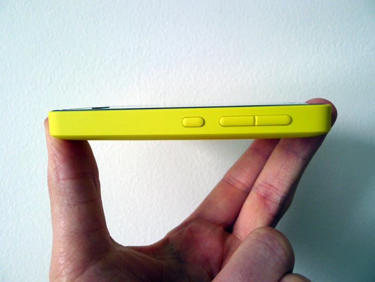
The power button and conventional volume rocker reside on the right edge of the cover, while the headphone jack, micro-USB port and charger socket are distributed neatly along the top.
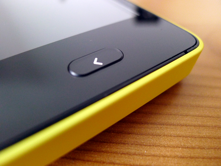
Aside from a single physical key below the display, the hardware is a strikingly minimalistic affair. The Nokia logo is splashed across the back and surrounded by a small, oblong indent next to the camera – it’s a little jarring, but doesn’t ruin what is otherwise a cohesive design.
Hardware
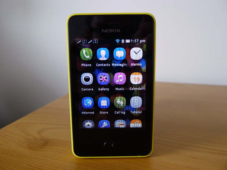
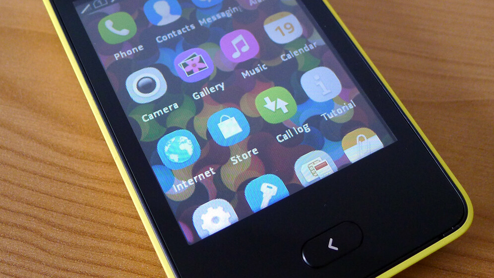
The Asha 501 is priced incredibly low, so expectations as to its power and display need to be tempered accordingly. The handset sports a 3-inch touchscreen display with a resolution of 240 x 320 pixels, or 133 ppi (pixels per inch). That’s certainly on the low side – especially compared to budget Android handsets – and it really shows in day-to-day use. Icons and on-screen text look noticeably rough around the edges and individual pixels are easily identifiable.
Brightness isn’t an issue though and viewing angles are respectable for a TFT display of this size. Under the hood, Nokia has opted for a 1GHz processor with just 64MB of internal storage, although it’s backed up with the aforementioned microSD slot for an additional 32GB. A 4GB card is also packed in with the retail model, which is a nice touch for anyone looking to immediately download some apps, take some photos and store multimedia content.
Given its price-point and target market, the Asha 501 isn’t going to break any speed tests or blow away any mid-range smartphones when it comes to performance. But that’s okay. This is a handset that bridges the gap between feature phones and smartphones and for the most part, the internal specs are enough for it to get by unnoticed.
Series 40, reworked
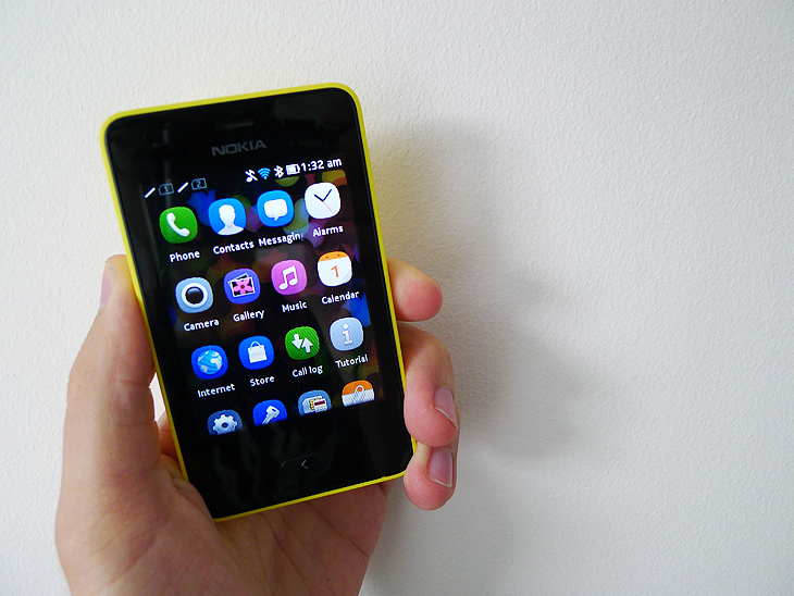
The revamped Asha platform imitates the home screen layout of iOS and Android with a simple grid of circular icons. Swiping up and down reveals everything in the user’s arsenal, with a single tap to launch the app itself.
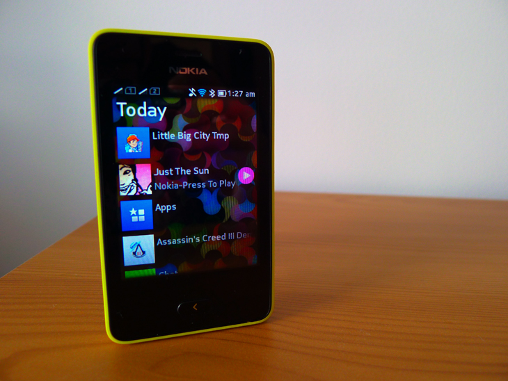
Series 40 doesn’t support multitasking, but Nokia has tried to sidestep this problem with a secondary screen it calls Fastlane. It’s triggered with a horizontal swipe while on the home screen and shows the user’s most recent activity in chronological order. Most of these actions are referenced as dull app icons, but it’s also possible to jump into a text message or start playing some music simply by finding it in the list and giving it a quick tap.
There’s even a simple entry box here for sharing a quick status update to Facebook or Twitter, which is handy given that it sidesteps the often laborious process of finding and loading up the required app from scratch.
When the user is in an app, they can return to the home screen with another horizontal swipe from the edge of the display. While the current app moves off to the side a nice transitionary animation is triggered, fading the home screen forward as if it was rising from below. It’s hardly groundbreaking, but helps give the Series 40 platform a much-needed sense of flow.
The lack of multitasking can be painful at times, but Nokia has eased this somewhat by making Fastlane and the home screen so accessible and easy to navigate. The physical back button is rarely needed, aside from cancelling the odd mistimed tap or retreating through various in-app sub-menus.
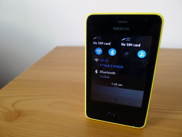
A notification center of sorts is available by pulling down from the top of the display. There’s a handful of toggles for Wi-Fi, Bluetooth and other connectivity options, as well as the time and the status of both SIM cards. It’s clean and intuitive, if a little basic.
Similarly while perusing an app, a trio of white lines occasionally jumps up from the bottom of the screen, notifying the user of additional options. These vary between apps, but often enable a single action for multiple files or sharing through social networks.
The revamped Asha platform feel modern, slick and refreshingly simple. There isn’t much to grasp and the functionality is limited, but it ensures that the smartphone is rarely disorienting or frustrating to use.
Camera
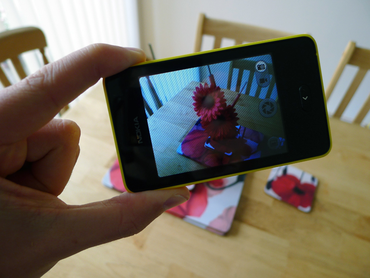
The 3.15-megapixel rear-facing camera is a far cry from the megapixel monsters carried in mid and high-end Android smartphones. The Asha 501 captures images at a resolution of up to 2048 x 1536 and unfortunately, they just aren’t all that useful.
The images in optimal lighting conditions are serviceable, but nothing that users will want to share on Facebook, Twitter or any other social network. They’re often too soft and lack detail where it matters most, resulting in mushy, inaccurate portrayals of a particular moment and scene.
Color reproduction is solid for the most part and the various toggles for adjusting the white balance, timer and filter effects are welcome. With our test unit, we also stumbled across a number of problems when transferring the final images with a USB cable. The issue is presumably fixed in the retail version, but left us feeling all the more disheartened.
Video is a similar affair. The handset spits out QVGA files at a resolution of 240 x 320 and 14 frames per second. It’s borderline useless and the footage produced is downright embarrassing for sharing online. Best avoided in pretty much all circumstances.
Software
Nokia has kitted out the Asha 501 with a bundle of apps designed to cover basic functionality such as voice calls, text messages and diary appointments. Given that this new and improved Asha platform is still in its infancy, most users will be relying on these tools to take them through the day while Nokia targets arguably more capable third-party developers.
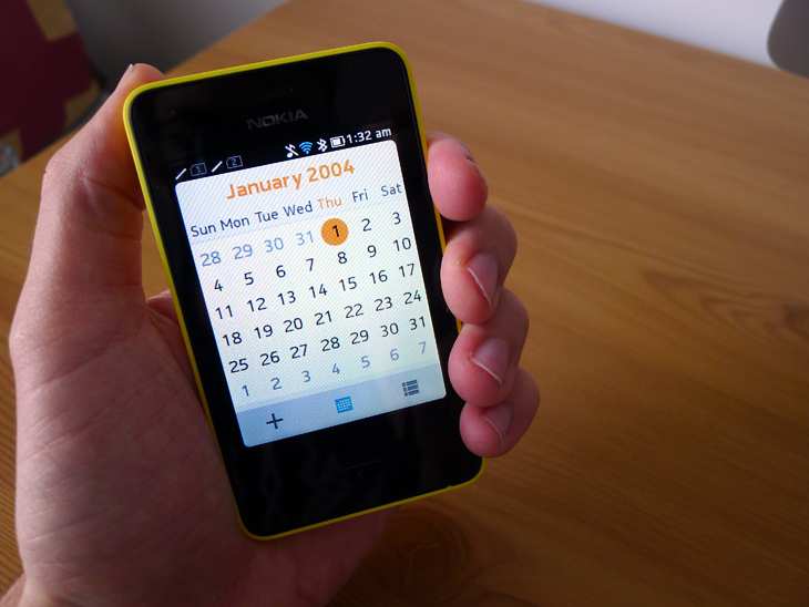
The software isn’t industry-leading by any means, but in almost all instances it works without a hitch. The on-screen keyboard feels pretty cramped, but every app is sensible and uncluttered, if a little light on features. The calendar is particularly impressive with a bright design and one-tap shortcut for adding new entries. The FM radio and email apps are also perfectly capable.
The Asha 501 supports Wi-Fi but not 3G connectivity, which often hampers the device when refreshing various sites and feeds on the move. The Nokia Xpress browser helps to reduce data consumption through some novel server-side compression, but it’s not an ideal Web experience. It’s no doubt advantageous for anyone with a low monthly data cap or patchy network coverage, but for everyone else it’s pretty underwhelming.
Wrap up
It’s difficult to ignore that $99 price tag. For all of its shortcomings, camera and Web browsing included, the Nokia Asha 501 is an impressive package for anyone on a budget. The interface feels modern and trendy, but also accessible enough that even my parents could use it without being overwhelmed.
The app ecosystem isn’t great, but some of the early adopters include LinkedIn and Foursquare. It’ll never match Android or iOS for depth and ingenuity, but for those yearning for only the most basic social links – updating Facebook or Twitter on the odd occasion – it works a treat. The Asha 501 is an attractive, pocketable handset with a battery that actually lasts; a feature that many high-end devices fail to produce.
Nokia might say otherwise, but I would struggle to call this a smartphone. The faux multitasking and limited functionality puts the revamped Asha platform more than a good half step below iOS and Android. It’s certainly more than the average feature phone though and can be recommended for consumers in emerging markets, as well as anyone looking for a back-up device when travelling abroad, or heading to their nearest nightclub or music festival.
It’s hard to see the Asha platform lasting more than a few years longer, given that the price of devices running Windows Phone, Android and maybe even iOS will only continue to drop in the coming years. For now though, Nokia has done just enough to keep the Asha 501 relevant.
Get the TNW newsletter
Get the most important tech news in your inbox each week.
