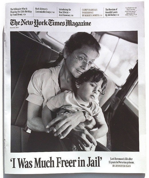
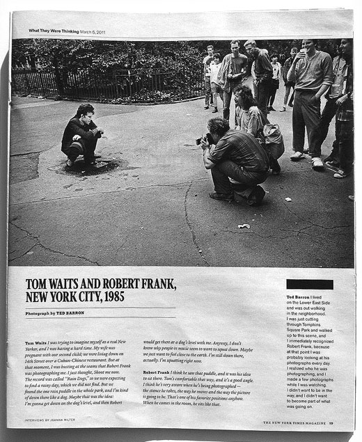
The New York Times unveiled its Sunday magazine’s new look this weekend with a redesign coordinated by magazine art director Arem Duplessis.
Duplessis tells the Society of Publication Designers how he ended up giving the magazine a vintage look that is reminiscent of mid-20th century publication design:
“When Hugo Lindgren was announced as the editor of the magazine we knew he’d want change. This excited me because I felt like the design had moved too far away from the brand of the newspaper and this was the chance to get it right. Gail Bichler (Art Director of the magazine) and I divided the duties, she stayed on the weekly and lead the ship while I went upstairs to work on the redesign with Matt Willey, Caleb Bennett and Sara Cwynar. We used the newspaper and vintage magazine issues from the 50’s, 60’s and 70’s as inspiration.”
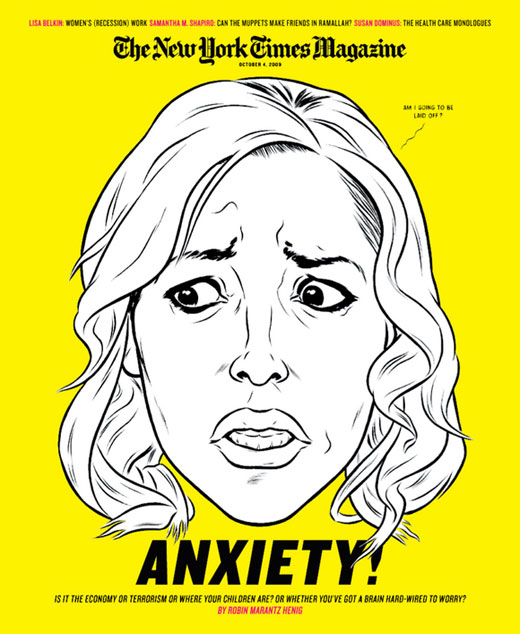
It’s a big change from the previous layout, which doesn’t share the new design’s subdued character:
Will the New York Times magazine’s redesign be the start of a vintage trend in print design? Only time will tell. We do know that the New York Times started making similar typography choices for its web edition in 2009, starting with the Times Skimmer.
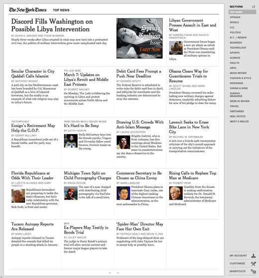
What do you think about this return to the Times’ older design values? Good? Bad? Are we likely to see others follow suit? Tell us in the comments.
Get the TNW newsletter
Get the most important tech news in your inbox each week.


