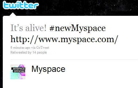
The new MySpace design is now live on the site. The main MySpace Twitter account just tweeted this, and sure enough, it’s live:
Here’s what the new homepage looks like:
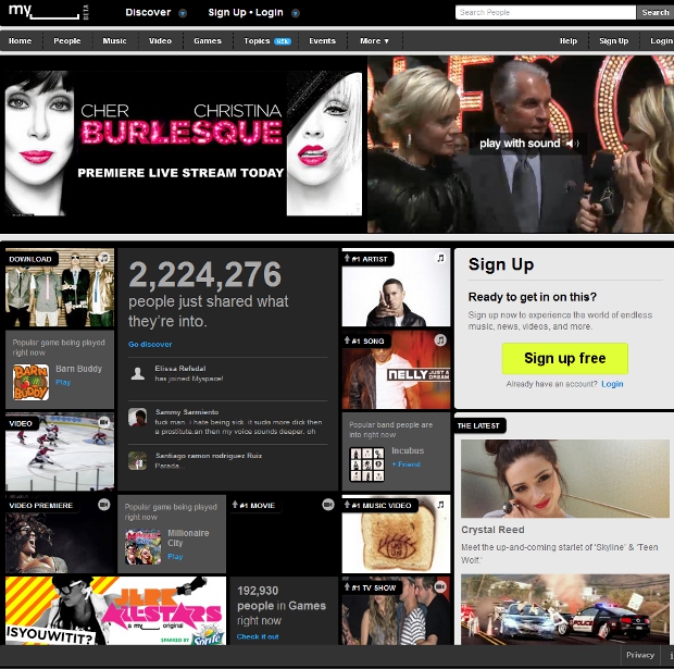
We’ve previously reported on the design change, including when the new MySpace logo was introduced last month, but now it would seem the entire new site is live.
Obviously, MySpace needed a major overhaul and the new design – from a looks of it – certainly goes a long way to that goal. However, cosmetics aren’t the only thing that MySpace needs to concentrate on: innovative ways to connect users to each other and for bands/brands/whatever to connect with users is also very important, and whether this new design includes that, we’re not sure.
What do you think about these changes? Is this enough for you to give MySpace a second (third?) shot? What would you like to see MySpace add in terms of functionality or is it all about the social graph to you (i.e. if you’re social graph is on Facebook, can anything MySpace does bring you back?). Please let us know in the comments, but regardless, this is certainly a milestone for a site that at one point nearly ruled the social web, and is tried to if not regain its throne, at least gain back some of what it has lost.
Get the TNW newsletter
Get the most important tech news in your inbox each week.
