 I hate browser toolbars. You hate browser toolbars. They are a running joke among the technologically capable. If you see a computer running Internet Explorer that has one, two, or heaven forbid, three toolbars, you know that the daily user of that machine is a Luddite.
And so when I caught word of Microsoft’s new toolbar for IE 7, 8, and 9 called ‘Bing Bar 7,’ I set off to test it with a very skeptical mind. What good could ever come from a browser toolbar, I asked myself. But I fired up Internet Explorer 9 and executed the installation with a somewhat open mind, at least as open as I could manage.
To my surprise, Bing Bar 7 is not only not terrible, but in fact would be something that I can imagine myself using if Internet Explorer 9 was my daily browser.
Why? Because it offers quick access to a number of services and pools of information that I use and need every day, potentially saving me minutes per hour, and it has an amazingly quick Bing search box that has the fastest auto-suggest feature that I have ever seen. This is the toolbar in action:
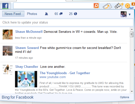
When you select any button, it brings down a square pane where the content for that feature is presented. This is what the Facebook function looks like when linked to your account (mine, in this case):
If I was a heavy Facebook user I could scan my news feed, check my messages, see updates, and so forth.
Think of each of the toolbar’s buttons as a miniature app: one for news, one for stocks, one for email (which does work with Gmail), another for mapping, one for weather, for Facebook, for movies in theaters near you, and one for games. Once you figure out what each button does, some being a bit design ambiguous, the total feature set feels full.
Now, there are better full apps in existence for each of those functions. The Facebook.com Facebook app is the best in existence, so the Facebook app in Bing Bar 7 is not as good. However, Bing Bar 7 does a very good job bringing many quick and dirty applications right to your fingertips, allowing you to stay on the page you are, and still access information quickly.
Do you need it? You probably don’t use IE, so no. But if you do, it is well worth at least looking into. I can see it being especially useful to the slightly less computer literate, a simple jumping off point into the internet if they are slow at regular browsing.
Microsoft did have toolbars in the past that were beyond forgettable. They didn’t support email outside of Hotmail, they didn’t have search integration as well thought out, and their total capabilities were a short list of things that were slow and hard to use. The new Bing Bar 7 has fixed nearly all the sins of its forefathers.
What is bad about Bing Bar 7? The name. It’s plain awful. I know that Microsoft is in love with the number 7, but this is too far. Please stop referring in press missives as Bing Bar 7. On most online Microsoft copy it is referred to as plain ‘Bing Bar,’ but even one round of Bing Bar 7 is too much. And please call Windows Phone 7 just ;Windows Phone.’ And so forth.
If you have any version of IE, you can download the toolbar here if you want to give it a test.
Get the TNW newsletter
Get the most important tech news in your inbox each week.

