Two brothers decided that they wanted to take on the challenge of rebuilding one of the most popular sites of the past decade. Why? Because, although others tried and failed, it was something they felt they could bring back. With the help of a celebrity named Justin Timberlake, they set out to find a way to revitalize the image of Myspace and restore it to its former glory. To that end, the roll-out of the new site begins today, and with it, the hope of a struggling network.
Originally started in 2003 by Tom Anderson and Chris Dewolfe, Myspace was the place to be if you wanted to connect with your friends or share things with the larger community. You might remember it being famous for being that site where anyone could tweak the design of their profile page simply by modifying the CSS code or using a third-party service to help you customize it — you know what I’m talking about, making your profile have a black background with really bright and hard-on-the-eyes font color or the incessant animated GIFs.
The trouble with Myspace
That all changed when Facebook rolled into town and took over the market, with its simple design and numerous features that seemed to trump anything that Myspace had to offer. And then…the social network tried to copy the brainchild of Mark Zuckerberg and that seemed to cause it to flounder.
When News Corp bought the company in 2005 for $530 million, it cut jobs and then-CEO Mike Jones announced five years later that the service had conceded the social network race to Zuckerberg.
Trouble clearly was brewing for Myspace, and it needed to find a way to do something to stop the hemorrhaging of users who were going to Facebook — at last count, it was over 50 million users who have left…all while Facebook has seen its users grow to over 1 billion.
Was there anything that Myspace could have done to save itself? Zuckerberg said publicly that there was a chance for it to succeed if it didn’t feel so threatened by his company. So for over six years, Myspace has sat in relative oblivion being the butt of everyone’s jokes. Now new owners have emerged to step up and find a way to bring Myspace’s sexy back.
Can Myspace really be brought back?
Beginning today, the service has undergone a major change, something it says required rebuilding it from scratch. When Jones conceded the social network space to Facebook, it shifted its focus to entertainment and music. Now, the platform has fundamentally changed and users will be able to gradually see it in the days and weeks ahead.
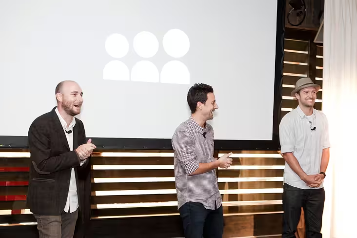
Before we move any further, a disclosure: yesterday, Myspace held a press event in Beverly Hills to promote the redesign of the service. The company paid for my travel, food, and lodging to and from Los Angeles. However, we were never instructed on what we had to write. These words are my own.
Last year, Myspace was purchased by Tim and Chris Vanderhook, and Justin Timberlake in 2011 for $35 million, way less than the $530 million News Corp. originally paid for it, but they believed its former glory could be revived. And there’s a great deal of incentive to do so — it still receives quite a bit of traffic to the site — 35 million unique visitors each month, says Tim Vanderhook, and it also has a catalog of 53 million songs with 13,000 more uploaded daily.
Learning about the new Myspace
Impressions (perceptions, not site traffic) can be everything, and it was amazing being able to check out the new Myspace early to see what all the hype was about since Timberlake teased it in a video last month. One of the first things that we noticed at the event was Myspace’s logo…in flames. That’s probably not the one thing you should be showing people who are interested in your optimism for rebuilding the company.
But aside from that, it was all business for the owners as they regaled us with tales about Myspace and their vision. The Vanderhooks said that people shouldn’t view this as Myspace 3.0, but rather that it’s something completely new and that it’s not just another social network that you need to maintain. It understands that people still think it’s destined to fail so it’s working hard to try and earn the respect from what it calls a skeptical community.
The detailed review
The new Myspace is a reimagined service that it says was created for, by, and about artists. The site is focused on delivering three things: design (delivering something stunning), discovery (enabling users to easily find their favorite artists and new ones), and inside look at the star community (creating tools and the features to help artists promote themselves).
So the answer to everyone’s question, would the new Myspace be worth checking out? Based on what we saw, yes, it would be.
Myspace says it set out to create a product with focus — it wasn’t about creating something that was “everything to everyone, but has value.” Now it’s all about being experiential while maintaining simplicity, something it admits was one of the hardest things to achieve.
If you still have a Myspace account prior to the new release, the company tells us that you will need to rebuild your profile and maybe even sign up for a new account. In sticking with their beliefs, this isn’t a redesign of the site so in the foreseeable future, both the old and the new versions of Myspace will be running simultaneously.
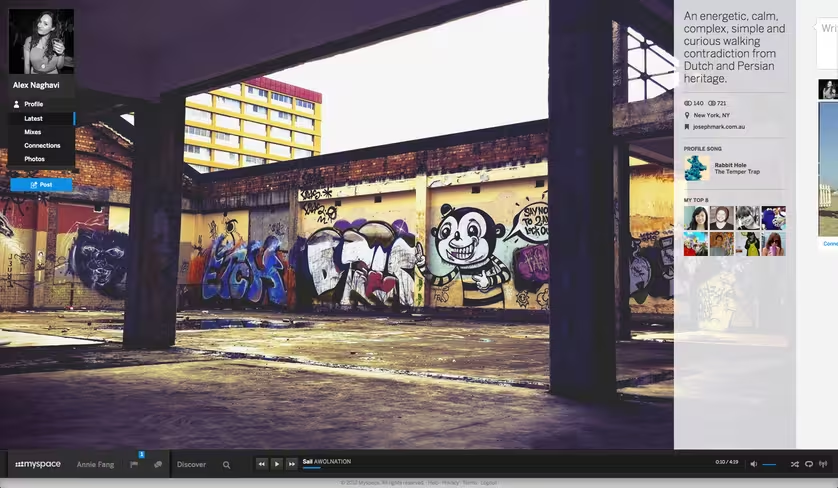
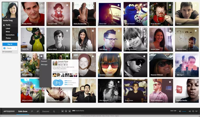
Users will find that in the new version, it’s about the open canvas, enabling people to express who they are and what they want to be. It’s still about relationships, but simplifying the process. Myspace now has a feature to help you figure out who you’re connected with and who reciprocates.
Long gone also are the days where users can abuse their profile pages with CSS-neglect — although there is enough functionality on the site in order to still make it your own.
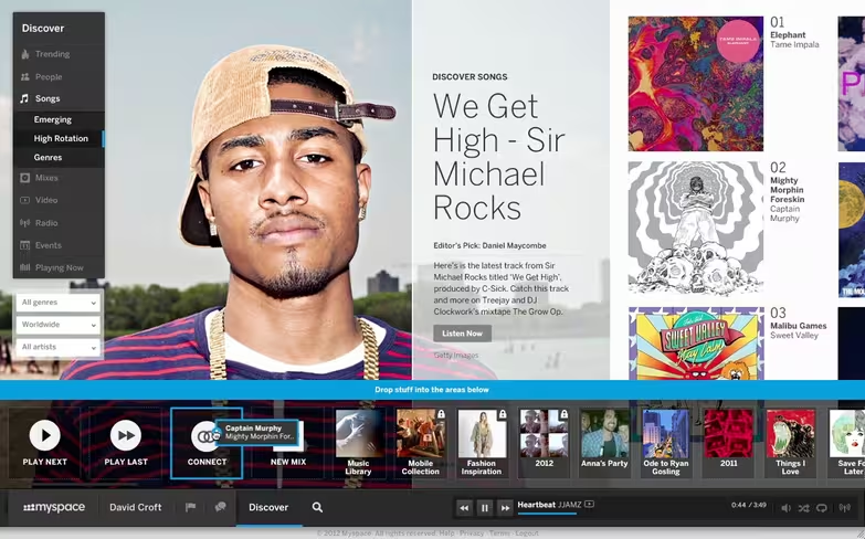
Some cool features that we found when using the site include being able to connect with people and objects — users can now connect to photos, music, people, or anything that defines who you are. While predominantly a music-centric social network, Myspace allows for discovery of things like celebrities, music, movies, and interests.
Other things re-imagined with this release includes updated search, which looks quite similar to Designspiration, the addition of contextual navigation on the left hand side of the screen that changes based on what screen you’re on. A feature that it calls the “social light rail” is included that enables users to be social by commenting, favoriting, etc for any object or post that they’re viewing and wish to provide feedback on.
The design of each page is visually stunning and doesn’t fit the persona of a social network. Sure, the “news feed” section of everyone’s profile is very similar to Pinterest and can be a bit disorganized if you have a lot going on, but when you consider how it looks on the browser and eventually on tablets and other mobile devices, it could be great.
Users who find music shared by both big music labels and also the myriad of independent artists on the site, can listen to it by simply dragging the song into the lower navigation pane. Myspace is allowing people to create their own playlist(s), but is enforcing DMCA standards and looks at the digital footprint of every song to prevent any illegal versions being shared. And no, users cannot create a playlist and download it onto a separate device to listen while on the go, although Myspace has said that feature might come with the release of its mobile app…eventually.
Two features that are being kept form the old Myspace are the top 8 friends and the profile songs. It probably makes sense to keep those as they were probably quite popular back in the hey-day.
Another fun thing on the site involves being able to create mixes. These are multimedia collections of whatever you want — photos, audio, videos, etc. The idea is that you can have tailored mixes for different things, doesn’t matter if you’re a photographer, blogger, musician, etc.
In order to help you better connect with people, Myspace has a new feature call affinity, which helps to measure your relationship to things while enabling users to discover similarities they have with others and even objects like a video, photos, etc. Right now, affinity looks at music connections and activity on the site and the company says it will eventually sort by relevancy.
There’s quite a bit more to the new site, but the new Myspace may have finally found a way to reinvigorate itself and become useful to people again. And it’s not as if it wasn’t — after all, this was the network where Katy Perry, Drake, Janelle Monae, and others first received attention from the fans and now Timberlake is hoping that with his connections to musicians, artists, celebrities, and movie studios, this can be a much bigger service than ever before.
Why aren’t there any banners?
You might have noticed that in the screenshots that are in the post, there weren’t any banner advertisements. So what’s the deal with that? Just how will the company make money off of what it hopes to be a heavily-trafficked site?
The Vanderhooks tells us that an ad-supported model will be implemented soon, but right now they want to focus on making the site better for users. Any advertising will also be done in a way that integrates with the site instead of standing out like sore thumb. Timberlake says that it’s more about making the ad part of the site and that brands will need to rethink their own image when advertising on Myspace — it claims to be a unique opportunity and they’ll need to come in with “open eyes and ears to think about the heritage of their brands and to think about how it works in their world.”
The judgement
We all know that Myspace seems to be on its last leg of being relevant to the masses, but after seeing what the company has in store for its users, it just might have found a way to bounce back and become a social powerhouse, just like the good ole’ days.
But admittedly so, we’ve all heard this same speech before when News Corp took over and basically burned the site to the ground (okay, not literally), but with the new owners and a firm focus on entertainment, music, and the arts, it might be time to check it out.
Myspace is now rolling out the new site to a small group of people. More users will gain access over time and it looks like artists are getting the first invitations.
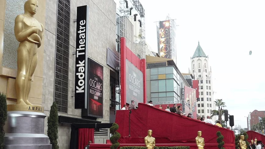
Photo credit: Bart Everson/Flickr
Get the TNW newsletter
Get the most important tech news in your inbox each week.
