Editor’s Note: We approached Alexey after spotting his wonderful redesign of iOS 7 and offered the opportunity to share it on The Next Web. We think it’s an incredible piece of work and undeniably a unique take on what iOS 7 could have been.
We’ve all read a great deal about the upcoming release of iOS 7 from Apple. Some of us have already tried it out and come to our own conclusions on the new interface.
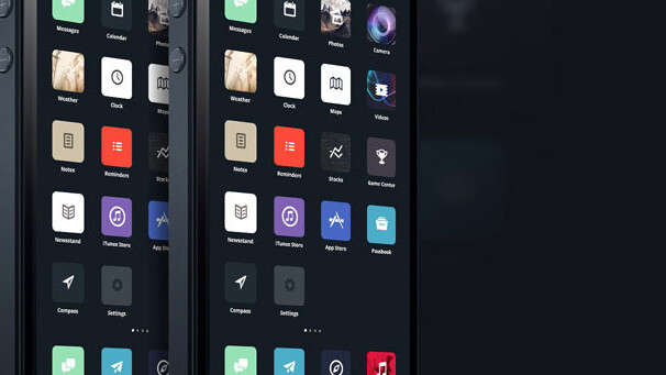
In this little personal project I wanted to show you a potential new direction for iOS 7 and its UI/UX.
Let me be clear: I feel Jony Ive and his team have created something special. Overall, the the minimalistic and simplified approach brings a great sense of content – the primary goal of any user experience. No more fake textures or unnecessary glossiness, gradients, bevels and stitches.
In my concept I’ve tried to reinvent this direction and go beyond. With more solid grid and typography, great spacing and clever balance it gives an iOS 7 absolutely new look. Let’s dive in. Feel free to follow me on Behance for more of the same.

Get the TNW newsletter
Get the most important tech news in your inbox each week.
This post is brought to you by Shutterstock – over 30 million stock photos, illustrations, vectors, and videos.


