This post is sponsored by MoWid.
Video search is broken.
Watching videos is a very different experience from reading web pages, however user interfaces for video applications have been stuck with the page model for a really long time.
Let’s take YouTube as an example, it is by far the largest collection of videos online. The choice of available videos is so overwhelming it becomes inhuman, on average 24 hours of video are uploaded to YouTube every minute. How can users make sense of a nearly infinite collection? Is there any rational way to decide which video to watch? Why should you watch one video over another? Where do you start ?
The UI strategies employed by YouTube to overcome the issue are search and recommendation. Both have their merits, but I am going to concentrate on their failings and offer a third way.
The Search Tunnel and the Recommendation Funnel: The Recho effect
One problem I find with search engines is they only present users with what they were already looking for, but fail to propose related content unknown to them which could inform their choices and lead them into exploring new directions.
When searching for a given expression on Google users rarely venture beyond the first page of results, and the more they pick Google’s top results the more value they gain in the eyes of the algorithm. This is why googlebombing is possible. Among other things, the results depend on measuring how many people click on a given link for a given query.
Recommendation algorithms rely on similar tactics, for example Amazon’s “people who liked this product also liked …” uses a similar principle. The more you buy a certain type of product, the more it is proposed to you. If I am a fan of Graphic Novels and I start buying them on Amazon, the recommendation system proposes me more and more graphic novels, in a never-ending spiral. It may well recommend graphic novels I haven’t heard of which I would certainly love to purchase, but rather than inspiring me to venture into new grounds and discover other genres, it locks me inside a self-referential frame. This is what I call “RECHO”, the Recommendation Echo Chamber.
And as a final example let’s take Digg, where a tiny group of influential users end up directing other user’s behaviour. Popular content gets exponentially popular, and buried content becomes invisible very quickly. Digg’s front page works as an amplifier: articles getting more votes are featured on the front page, which in turn prompts even more votes, creating yet another feedback loop.
Recommendation mechanisms’ results are thus highly dependent on user’s collective behaviour, indirectly they create herds of users who influence each other inside a limited network of self-reference. So it becomes quite hard to come across something truly unexpected, these recommendation systems do offer something but it’s always within very specific boundaries. They end up limiting rather than expanding a user’s awareness of what is available. Mathematically, everyone’s taste begins slowly trending towards an average middle point, funneling people’s perception rather than opening paths into new directions.
So how do you go about re-introducing the element of surprise, is it possible to create serendipity by design?
The Garden of Forking Paths: MoWid
The plot thickens with video search: results are not nearly as precise as they would on a text Google search. How could they be? If an image is worth a 1000 words, a 1 min video clip is worth 30 fps x 60 s x 1000 = 180 000 words. This figure isn’t necessarily exact but it gives us a pretty good indication of how hard it can be to describe the content of a short video clip using words. The meaning of images is more fluid and open to interpretation.
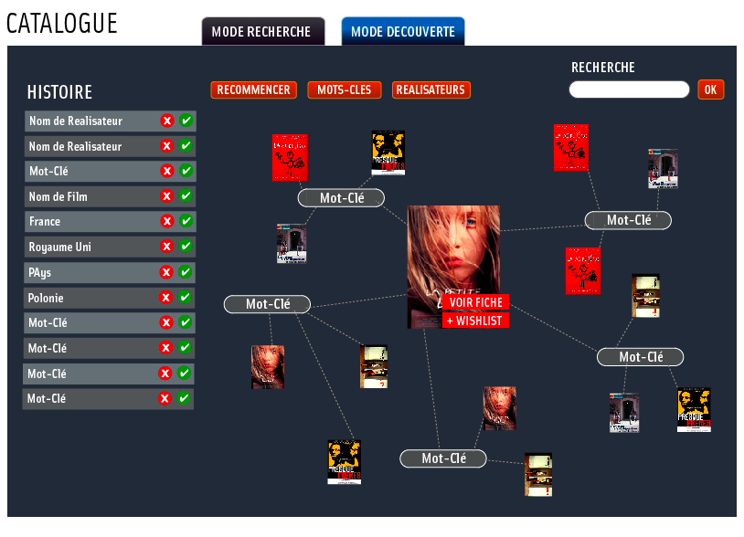
A couple of years ago I was working on the user experience design of an online VOD catalogue for Independent Cinema. The unifying characteristic of art house movies is they don’t easily fit into neat categories such as “Action”, “Comedy” or “Drama”. So I devised a system which relied on an open categorisation, tags, and a visual interface showing relations between tags and films.
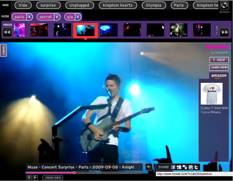
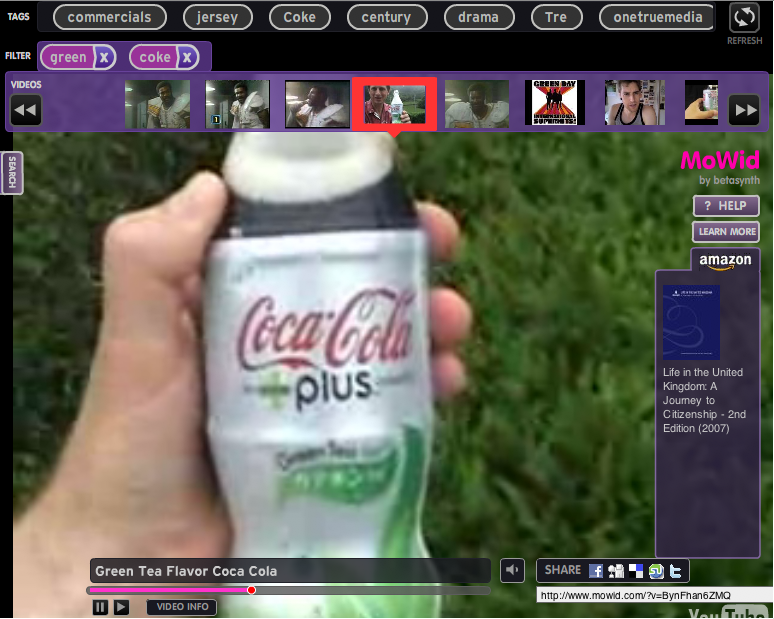
The idea wasn’t put into practice straight away but it stayed on the back of my mind, until eventually I built a prototype to test it. After many iterations of prototyping and user testing, armed with the inspiration and advice given by Priya Prakash and Alexander Grunsteidl, I arrived at a video search application which lets users conduct oblique searches by letting them combine their queries with random and contextual word suggestions.
This offers them the opportunity to go down unexpected search paths, rather than linear ones. (Hence the title of this article, inspired by Jorge Luis Borges’ book. Users become immersed in a game of relations between the keywords and videos, each referencing the other in more or less direct ways. Sounds complicated but in practice it’s dead easy, and fun!

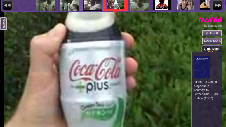
Try it for yourself, here is the web version of MoWid, a video discovery engine
And you can download the desktop version here.
In short, Mowid is a video search engine / browser where you combine tags together to find new videos, it’s serendipity by association of ideas.
Please note this is a beta version so hiccups are natural and to be expected. We welcome any feedback you might have. MoWid is not limited to operating with YouTube and can be customised to fit any video catalogue and used as a video playing application on your web site.
Tell us what you think!
Pedro Fernandes is an interaction designer with a long experience designing and conceiving rich media sites and apps. You can find his work at http://www.betasynth.com
Get the TNW newsletter
Get the most important tech news in your inbox each week.


