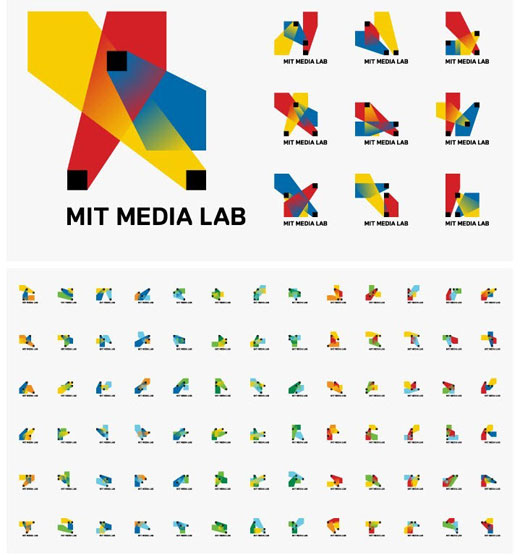
MIT Media Labs has a new logo, designed by Richard The, with a whopping 40,000 possible variations.
On his website, The explains that an algorithm is used to produce the logos based on just three shapes and 12 different colors. The algorithm produces a logo for each staff member at the Labs, combining personal branding with organizational branding. Despite the unique nature of each logo, they are clearly related. According to the designer, the logo’s varying nature represents what MIT Media Labs does:
Each of the three shapes stands for one individual’s contribution, the resulting shape represents the outcome of this process: A constant redefinition of what media and technology means today.
Below, you can see just a few of the 40,000 variations.

These dynamic identities are becoming more commonplace, and many are wondering how effective a mark that changes is for brand development. I asked Duane Kinsey of Logobird, a design studio that specializes in logo design and brand development, whether he thought MIT Media Labs’ new brand would suffer due to its changing nature.
I think the same basic rules apply across all identities — it doesn’t matter whether it is static or dynamic. Behind every successful identity design you need a well conceived concept. Without one, it will most likely be doomed for failure. So yes, a dynamic identity can hinder an organisations ability to build a brand, but the same can be applied to static identities.
In the case of the MIT Media Labs logo, I think it’s very unique — perhaps redefining what is possible with regards to adaptability for a brandmark. The fact that an algorithm can produce 40,000 variations of the logo in 12 different colours is very novel. The ability for employees to lay claim to their own personal piece of the identity via a custom web interface — now that is what I call innovation.
Overall, it appears to be a very cohesive and well excecuted dynamic identity system. However, only time will tell if it will be a success.
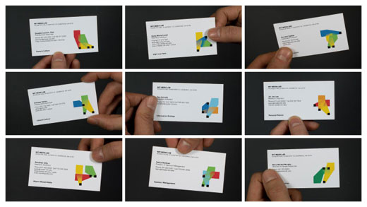
I’ve got to agree with Duane. Here you can see a bunch of business cards bearing their owners’ unique marks. While they’re all distinctly different, there’s no confusing the source.

Get the TNW newsletter
Get the most important tech news in your inbox each week.


