HT Media, the owner of the national daily Hindustan Times in India, runs a separate publication by the name of Mint, in partnership with The Wall Street Journal. Mint has a couple of free iPad apps—Mint 1990s and Mint On The Decade—that chronicle the developments of the past two decades in India.
We took them both for a spin and found them to offer riveting insights into the important bits of news from the past twenty years. Both the apps are built on the same platform and are exactly the same feature-wise, so we’ll just talk of them as one for the purposes of this review. The content is obviously different in each app and it’s great in both.
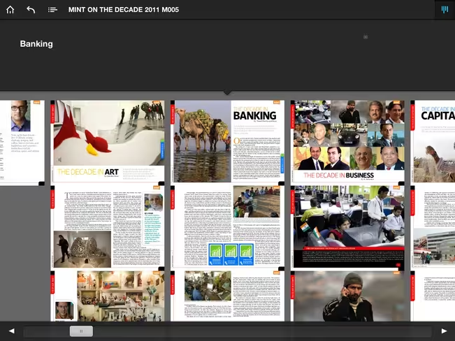
The apps are built on a popular magazine format that is used by a lot of other iPad-specific publications. You swipe left and right to move between chapters and up and down to read further within a chapter. Controls at the top of the screen let you go to the starting page or back to the last chapter you were on, take a look at the chapters index and get an overview of all the chapters in the magazine. A scroll bar at the bottom of the screen lets you quickly skim through the magazine.
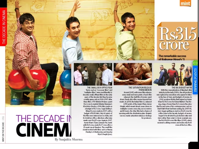
It works well but is not perfect. While Mint On the Decade supports both landscape and portrait orientations, Mint 1990s won’t budge from portrait mode, which disrupts the experience of reading something on your iPad. More seriously, the text sizes are unadjustable (as they are with most magazine apps on the iPad) and the default sizes are too small for most readers. They aren’t unreadable but you may find yourself straining your eyes to read them (take a look at the screenshot below).
If you can get past the font issue, however, the rest of the experience is pretty much second to none. We were impressed by the quality of the editorials in both apps and the sheer amount of information they have packed into these publications. Of course, we would expect nothing less from two of the biggest media powerhouses in India and the United States, but we were still taken aback by how good these apps are.
Each chapter talks about a specific field, so you have information about a decade’s worth of developments in literature, markets, politics, media, science, sports, technology and everything in between. There are 22 chapters in all, not including the editor’s note. They also includes slideshows, audio recordings, videos and the occasional aside. Some of it is unpolished—like how you have to tap on an image to zoom in and double-tap to zoom out, instead of using the familiar Multi-touch gestures—but most of it is of high quality.
Here’s the best part: neither of these magazines have any advertisements whatsoever. We would have gladly flipped past a few ads to get content like this at no cost, but you get it for free, no questions asked. At these prices and with the excellent articles and great look they provide at life in India in the past two decades—both for those who reside there and those who don’t—we can definitely recommend these two publications.
➤ iPad : Livemint
[Mint 1990s and Mint On The Decade are available for free on the App Store and compatible with all iPads running iOS 3.2 or later.]
Get the TNW newsletter
Get the most important tech news in your inbox each week.
