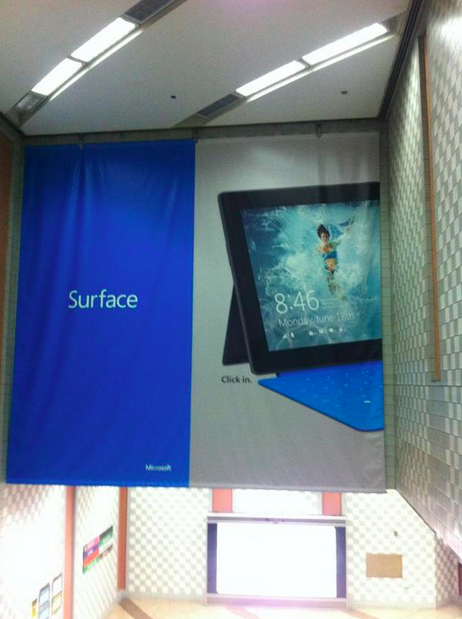
Out today is a very interesting physical advertisement for the Surface line of tablets. In the past, we have seen a great number of chalked or painted adverts for the devices.
This large tapestry, found in Chicago, is different. Take a look:

We have now seen enough Sufrace ads to understand their makeup. Here’s what TNW can discern of Microsoft’s strategy to sell its new devices:
- Blocky, Metro advertisement design. This is no surprise.
- Inclusion of the ‘Click in’ slogan that appears to be the official Surface tagline.
- Image or representation of the Surface device and an attachable keyboard, either linked, or distinct.
And that’s it. The above image includes a Microsoft logo. Other adverts don’t. We have yet to see any mention of Windows 8 in the ads, which is exceptionally odd. Microsoft appears to be pushing the Surface not as a method to deliver Windows 8 to consumers, but instead as a separate brand that doesn’t need to lean on Windows.
At the same time, the implication is that Windows 8 doesn’t need the Surface, just as the Surface doesn’t need it.
TNW asked several of its editors to weigh in on the yet under-the-radar ad campaign. Here’s our staff’s take:
Alex Wilhelm
This directly underscores how critical Microsoft’s OEM strategy is no small move. The company is working to foster a fully new line of products that requires no support; this is similar to what the company did with the Xbox line, of course.
‘Click in’ isn’t that good a slogan, however.
Harrison Weber
By marketing Surface on its own, Microsoft is effectively establishing an entirely new product family, as it did with the Xbox. The problem is, Surface is linked directly with Windows 8, which makes the separation confusing in the long run.
Brad McCarty
The good: Microsoft is keeping a minimalist style to its advertising, eschewing the over-the-top, sweaty Steve Ballmer days.
The bad: People will never, at any point, look at an advertisement for a computer that says click and think of anything but a mouse. When you’re advertising a platform and an OS that’s heavily reliant upon touch, “click” anything is the wrong message to send.
The ugly: Unfortunately, this same mixed message carries over into the onboarding process of Windows 8. There are so many logic holes that average users are going to be thoroughly confused. That’s another blog post entirely, but it reeks of the same problems as the advertising.
That’s our take. The comments are yours: let us know how you view the campaign.
Top Image Credit: D.Begley
Get the TNW newsletter
Get the most important tech news in your inbox each week.


