Big, terrifying changes are afoot: there’s going to be a new default font in Microsoft Word. Please, don’t panic. You can riot, sure, but no panicking.
This decision was announced on Microsoft’s blog. In the piece, the company explains that it has commissioned five different fonts that could potentially replace the current default, Calibri.
The piece itself provides a balanced view of all these different options, going into an admirable amount of depth about why they may be suitable to become Microsoft Word’s next default font.
Unfortunately though, we didn’t see this news on the blog. Instead, we saw it on that bastion of rational discussion, Twitter. Have a look:
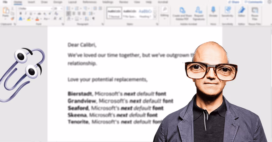
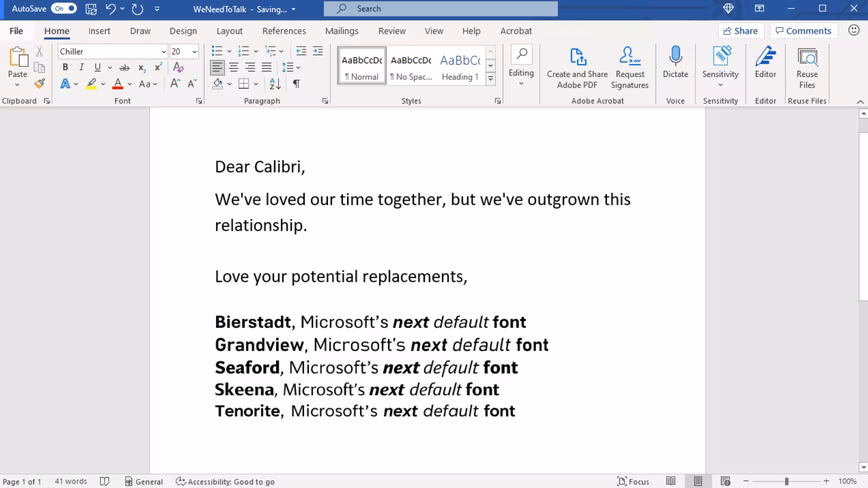
We need to talk. What should our next default font be? pic.twitter.com/fV9thfdAr4
— Microsoft (@Microsoft) April 28, 2021

The 💜 of EU tech
The latest rumblings from the EU tech scene, a story from our wise ol' founder Boris, and some questionable AI art. It's free, every week, in your inbox. Sign up now!
Is a social network famous for being one of the most toxic environments on the internet the best place to engage in dialogue about a default font? Yes. Definitely. Why bother even asking that?
Anyway, we decided to ask TNW’s VP of Design, Alexander Griffioen, to wade in with his opinions.
But in order to keep the spirit of Microsoft’s social media post alive, we only showed him the image below and asked him to provide only Tweet-length comments. We’re nothing but precise and fair.
First things first, Griffioen said the “samples are too short to say anything sensible about.” Which is a great start to this article.
On the evidence he did have, Griffioen immediately vetoed the Grandview and Tenorite fonts as being “too outspoken for body text.” On top of that, he said that Bierstadt looked like Helvetica’s ugly cousin.
More positively, Griffioen thought Skeena could work, but “its stroke contrast makes it look dated.” Ugh, totally agree.
But… if he had to put his money anywhere, Griffioen would choose Seaford. We have a winner for Microsoft Word’s next default! Well, sort of. He said he actually prefers Calibri over Seaford. That must hurt, Microsoft.
What have we learned? All complex and nuanced discussions should now take place solely over Twitter and similar networks.
Oh, and SEAFORD FOREVER! LET’S TEAR THESE STREETS APART. ᵃˡᵗʰᵒᵘᵍʰ ᶜᵃˡᶦᵇʳᶦ ᶦˢ ˢᵗᶦˡˡ ᵏᶦⁿᵈᵃ ⁿᶦᶜᵉ
Get the TNW newsletter
Get the most important tech news in your inbox each week.