Today Microsoft has unveiled Outlook.com, a new email product from the company that will eventually be the home of the hundreds of millions of Hotmail users.
TNW has extensively tested the product. It’s our view that Outlook.com is a well-designed webmail product that has the potential to reverse Microsoft’s lengthy slide in the product category to Google’s Gmail.
Background
In Microsoft’s view, the last major ‘disruption’ to email came with the introduction of Gmail and its 1 gigabyte of provided storage. In that time, free megabytes for mail cam in the dozens, making Gmail’s entry into the market a shakeup point. Gmail now offers over 10 gigabytes to its users.
Gmail was introduced in 2004. In Microsoft’s view, Outlook.com is ‘what’s next’ for webmail.
Hotmail has long languished, with an interface that is hardly modern. However, Outlook.com is set to change that, as it will be the eventual home of all Hotmail users. That process will take time, however, with a period of time in which Hotmail users can move over voluntarily. At some undisclosed point in the future, all users will be moved to Outlook.com.
Does Outlook.com live up to Microsoft’s aspirations? Let’s take a look. From this point on, I’m just going to call the product Outlook. It’s simpler and make for better reading.
Interface
Used the Windows 8 Mail application? You’re going to feel at home. If you haven’t, fret not, training will only take a minute.

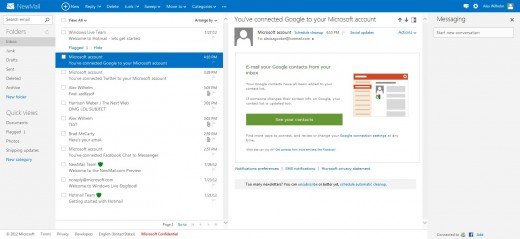
Outlook is a few columns and a bar. The far left column is a list of folders, and ‘quick views,’ something that Hotmail users will already be comfortable with. The second column is your mail feed. As always, the notes are displayed in chronological order. As with Hotmail, you can ‘flag’ notes, and have them stay pinned to the top of your inbox. Think of this as a hybrid of Gmail’s starring and Priority Inbox feature – it’s common to use Priority Inbox as a to-do list.
Your next column will be where you do most of your email reading. Click on the Settings button (upper right) and select ‘Reading Pane: Right.’ Trust. This is best way to set up your Outlook account. Why? Because the service is designed for wide screens, such as larger desk monitors or the coming Microsoft Surface. Thus its better to have a column for reading, and not set the pane to the bottom – your screen isn’t nearly as tall as it is wide.
Finally, your fourth column is likely a set of squares at the moment. Those are ads. We’ll get to them in a bit. Click on ‘Messaging.’ You are now setup properly. Outlook is customizable only to an extent (you can change the color of its theme to match your socks, etc.), but you can arrange, resize, and shift the columns, which means that you can design your account to best suit your unique computing setup.
That, combined with the stripped down interface, makes Outlook pleasant to look at. Spend an hour in Outlook, and Gmail feels chaotic when you return.
Something new in Outlook is its top bar, which changes based on where you are. Click on an email, and options appear. Have nothing selected and the only button is ‘New.’ It keeps the interface clean, and isn’t something that you will notice much. However, in use, it’s quite effective.

One final note in the interface of Outlook: hover over the logo in the upper left, and click on the down arrow – buttons for SkyDrive, Calendar, and People should appear. More on those shortly.

Features
If Outlook is webmail 2.0, it gets there by a thousand small steps. At its core, Outlook is ‘just another webmail provider’ because it, in effect, has to be – it has to manage the displaying and creation of mail. So, there are constraints. However, what makes Outlook different is polish of its design (see above), and its feature set.
I won’t go over every feature of Outlook, but I will highlight a few. The theme that I noticed while testing Outlook is that it is designed to make tasks that current email can’t handle well, simpler. File sharing is a good example. As every Microsoft Account has 7 gigabytes of storage on SkyDrive, Microsoft allows people to send files in that way. Instead of emailing a file, you can upload it to your SkyDrive (the option is directly in the email you are writing, so you don’t have to go anywhere to do this), and a link will be included for the recipient. This means you can share files that are 300 megabytes (SkyDrive’s single file size limit), and not gum up anyone’s inbox that can only accept small files.
The integration of other Microsoft products into Outlook goes further than that – the People app that is in Windows 8 is the same app that you use with Outlook. If one is prepped, so will the other be.
Skype integration is coming to Outlook, but not yet.
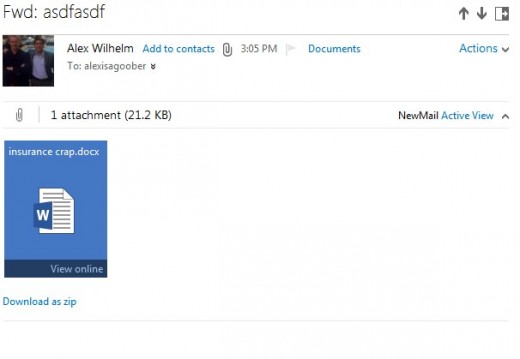
Continuing the integration trend, when you receive a file that Office can read and edit, you are given the option to open it in Office Web Apps, akin to opening files in Gmail straight to Docs.

Outlook will display information about the person you are emailing with next to the note, as well as snag an image of them from either Twitter or Facebook, assuming that you are linked. It’s a small thing, but it is nice.
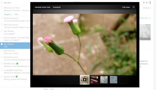
Another nice piece: if you are emailed a number of photos, in Outlook you can have them displayed as a slideshow, automatically. Small tool, but a good one.

Finally, Outlook has unlimited storage, so you won’t run out of space. That and SkyDrive’s 7 gigabytes means that users will have plenty of room to redole.
Ads
Ads in Outlook are a single column on the far right, and are often hidden. This is intentional. Microsoft seems to want to keep ads to a minimum in the product. As you expected, given Microsoft’s criticism of Gmail’s ad policy, the product doesn’t scan the bodies of your emails. However, it does tailor ads based on the email address of the sender, and the subject line of the email.
Better, worse, or an unimportant distinction I leave up to you.
Good enough to beat Gmail?
Frankly, using Outlook after Gmail feels a bit like moving to iOS after spending time on Android. Gmail’s terrifying list of settings (with a user interface that makes babies cry) means that it has everything that a power emailer could want. however, Outlook is a much cleaner, simpler product, and one that I suspect has power enough for 99% of all email users.
Now that the product is public, I’m going to personally move to it full-time for a week, as a test. I suspect that I’ll enjoy myself.
Will most Gmail users switch? From what I can tell, you can’t connect with Gchat, a service that has become the defacto chat client for the technology set, Gmail’s biggest fans (my opinion). That means that moving to Outlook from Gmail requires the surrendering of the Gchat network. Yes, you can link your Facebook and Messenger accounts, but the lack of Gchat will keep, I suspect, most power Gmail users away.
Peace, Hotmail
Hotmail is now on the chopping block. Outlook.com is a massive improvement over that product. While many features of the new Outlook product are actually old Hotmail fare, how they are presented makes for a wholly different experience.
Hotmail users will likely complain when they are switched over. Users always hate change, it’s a fact, but they are moving into a better solution.
My guess: Outlook.com will make Microsoft relevant again in email, and will force Gmail to clean up its interface.
Top Image Credit: Alec Perkins
Get the TNW newsletter
Get the most important tech news in your inbox each week.


