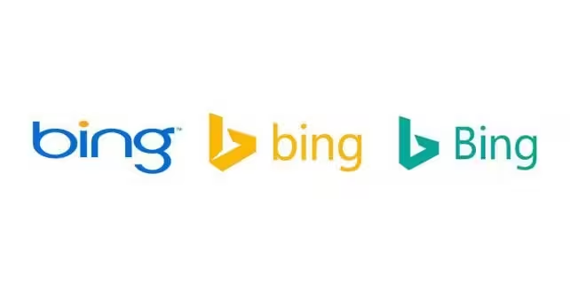
Microsoft has updated the logo for its Bing search engine, seen above on the right. The bright yellow has been replaced by a tame green and switched the ‘b’ to upper case.
The abstract ‘bird’ that you’d no doubt noticed in the geometric ‘b’ shape has also lost its tail. Microsoft said it made the change because green “is easier to see over yellow,” but at first glance, it looks a lot less exciting than the last iteration, introduced in September 2013.
The redesign comes as the company celebrates the continued success of its search service, which turned a profit for the first time in October 2015.
Rik van der Kooi, Microsoft’s corporate VP of advertiser and publisher solutions, said:
We expect Bing to continue to grow and are thrilled with our trajectory. We are the only search engine that is experiencing steady, consistent growth and have increased our share for 26 consecutive quarters. And we’re not slowing down.
Unfortunately, the new logo doesn’t convey the same enthusiasm. Google had much greater success in giving its brand a new look when it revamped its iconic wordmark last year. Its new logo is colorful, animates well and has a smaller file size than the previous version.
Microsoft hasn’t yet rolled out the logo across all its properties yet, so it may be a little while before you begin seeing it online.
What do you think of Bing’s new logo? Let us know in the comments.
➤ Microsoft Updates Bing Logo as Search Service Grows Up [Ad Age via The Verge]
Get the TNW newsletter
Get the most important tech news in your inbox each week.


