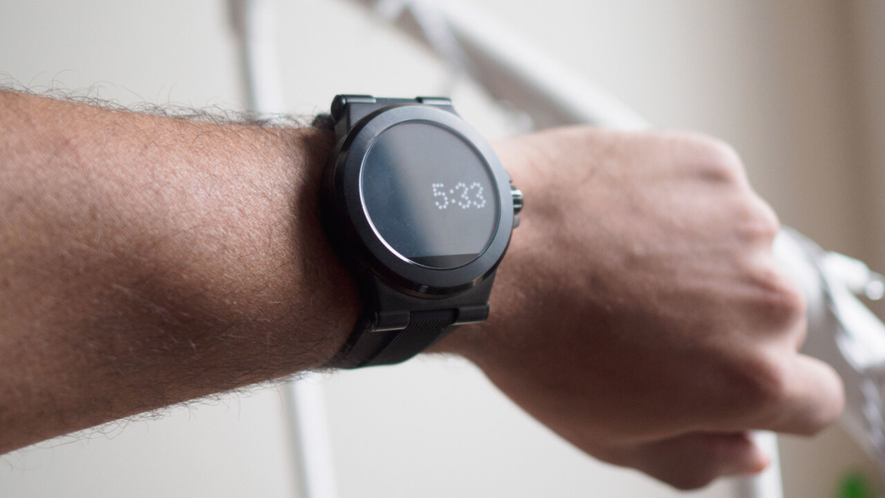
Android Wear’s biggest advantage over the Apple Watch is arguably its sheer variety, which has allowed an increasing number of fashion brands to release their own timepieces. One of the latest such smartwatches is the Access line by Michael Kors. It’s not for everyone, but it gets the job done.
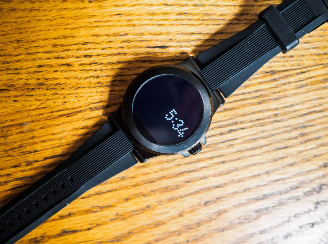
The Access comes in men’s and women’s designs (‘Dylan’ and ‘Bradshaw,’ respectively). I tried the former, although they’re both the same size. That’s a large size, mind you. The Kors makes no attempt to being a slim watch, and is among the bulkiest smartwatches I’ve tried. That doesn’t bother me as much as some other folks, but worth keeping in mind.
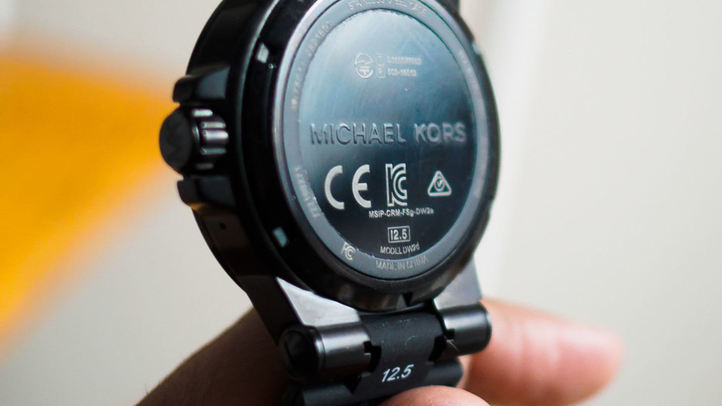
It’s well built though. The black model I tried out had a solid heft to it (some might say too heavy), and felt like a high quality product. It’s also water resistant to 10 meters, which is better than the usual simple splashproofing. It also comes with a screen protector installed, which I discovered after I worried I’d scratched my unit up only to discover it was just the top layer.
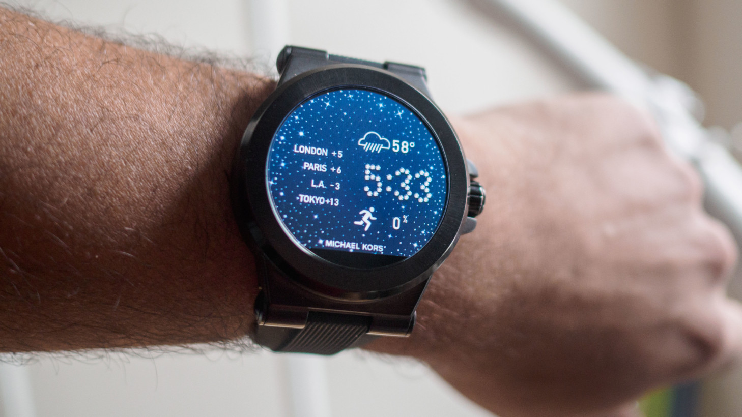
Speaking of the display, it’s a resounding ‘meh.’ After seeing the excellent panels on devices like the Huawei Watch and Gear S2, the dull colors and low resolution of the Kors are conspicuously last-gen. It also has the Moto 360’s flat tire, without at least fitting an ambient light sensor there.
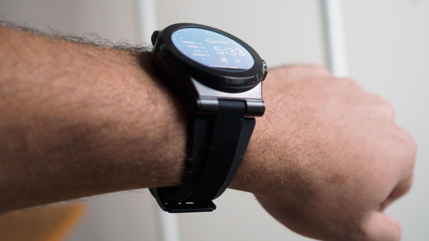
But then, those aren’t things anyone is going to notice from a distance, and it isa nice looking watch. More importantly, the watch uses a reflective technology that makes it really easy to read in daylight.
Performance is also good. It detected my voice commands quickly, was responsive with smooth animations and nary a slowdown. There’s no hear rate sensor, so don’t expect detailed fitness data, but then I’ve yet to try an Android Wear watch with particularly impressive heart rate tracking anyway.
One of the device’s advantages over competitors is its fairly robust set of pre-installed watch faces, which can be adjusted with a number of informative and interactive complications (basically the watch version of widgets).
It’s a nice selection, but they won’t be so unique once Android Wear 2.0 rolls out in early 2017, with its much improved support for functional and informative complications.
Battery life is middling. I generally struggled to get the watch to last a full day with my typical fairly heavy usage, though I suspect the average buyer for these will be okay.. But biggest biggest problem with the watch, however, is the charger. It sucks. Michael Kors tries to imitate Apple’s magnetic charger, but the magnet is simply too weak, and the slightest of nudges can break wireless loop. It also just takes forever.
All that being said, I can’t really recommend the Michael Kors to anyone who reads a tech blog. . Here’s the thing though: this isn’t really a smartwatch for tech geeks. If you’re someone looking for features and specs, Motorola, Samsung, Asus, Huawei and others all have better options.
But this is a Michael Kors watch. If you ask me, it’s pretty awesome to see fashion brands creating real tech products, and I hope more join in. Smartwatches are fashion accessories as much as gear, and I look forward to the day we make choices on what looks and feels the nicest – just like a traditional timepiece.
Get the TNW newsletter
Get the most important tech news in your inbox each week.


