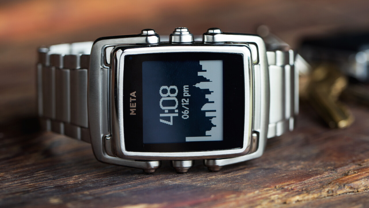
The latest trend is for smartphone makers to expand into the watch market, but many of them lack the experience of designing for your wrist. Meta Watch, a spin-off of Fossil, approaches the smartwatch space as an experienced watchmaker with a technology background.
Originally announced at the beginning of the year, Meta’s M1 watch begins shipping today with units expected to arrive next week. The new premium model is designed by Frank Nuovo and ranges in price from $249 to $449. The watch internals remain the same across price points, but the extra money goes toward different band styles and finishes.
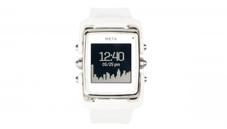
The M1 design still sits somewhere between a traditional watch look and the boxy smartwatch style that Pebble and Samsung have favored. I’ve been testing the white M1 for the past week and have been more willing to wear it out in public than other smartwatch models.

The last watch I owned was a Fossil, so M1’s design fits my style. To be honest, I stopped wearing a watch once I started carrying a cell phone, but the M1 strikes a decent balance between form and function. Enough so that I’d consider wearing a watch again.
Beyond looks, Meta’s experience with watches shines through in the comfort of the device. The rubber band fits well, the watch unit isn’t too heavy and the lugs keep the band flexible.
Based on my limited experience, the M1 also wins on battery life. I started using the watch last Monday, and I’m still on my first charge. The device wasn’t connected to my phone for the whole week, but my usage was consistent with a normal week for me. The low-battery indicator is on at the time of writing, so I’m estimating it will last about 9 days of light to normal use. To charge it up again, you’ll need to attach a clip and micro-USB cable to the back of the watch.

One big complaint I have about the M1 design is its light function. Pressing the top left button illuminates a row of lights at the top of the watch, but it’s not enough to actually see the whole display in the dark. As such, I found myself squinting at the top row of a notification just to make out what it said. I haven’t tried other models to see if it’s a problem across the whole line, but it felt like a design oversight to me.
I also had some trouble keeping the watch connected to my phone over Bluetooth LE. Occasionally, the two devices would get disconnected and my iPhone wouldn’t be able to reconnect. To re-establish the link, I’d have to reset the watch.
As far as functionality goes, the M1 sticks to the bare minimum for a smartwatch. You can customize notifications from your iPhone or Android device. You’ll also have access to the weather, sports scores, a basic calendar and music player controls. There’s no touchscreen, so you’ll need to use a set of four buttons to navigate between screens and then scroll up and down through content. I’m not fond of the interface, but it works for simple tasks like taking a peek at the weather forecast and then switching back to the clock face.

Notifications on the M1 were a mixed bag. Google Maps provided useful turn-by-turn alerts that I could glance at while driving. However, the way my email notifications are set up on my iPhone made it so that every time I got an email, the watch just showed me the same unread email from months ago.
The Meta app lets you filter out notifications from apps that you don’t want to hear from, but I’d like to see even more granularity for notifications. Most of us don’t want every phone notification to go off on our wrists, so having more choices, like allowing emails and messages from specific contacts, would make the watch more useful.
With a new batch of smartwatches like Motorola’s highly-anticipated Moto 360 just around the corner, the M1 is facing tough competition. In spite of the few complaints I had, there’s a lot to like about the device. I’m personally going to wait for a more full-featured smartwatch to come along, but the M1 should appeal to watch enthusiasts and professionals interested in a connected watch that still looks like a watch.
Related: It’s about time: September ticks over with another smartwatch explosion
Get the TNW newsletter
Get the most important tech news in your inbox each week.


